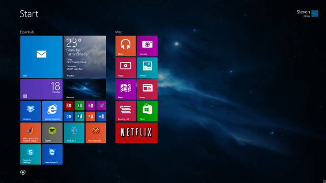
Since the first beta leak.. well.. since the first pre-beta image leak, Windows 8 has had a mixed reaction. Some believe that the new Metro-- or Modern-- interface has seriously affected their workflow, whereas some accepted the Start Screen as a welcomed addition and replacement to the cluttered almost 20 year old Start Menu.
Whatever your view is on the new interface, Jacob Miller, a UX designer for Microsoft that worked on Windows 8, has shared some personal views and responses to criticisms on the /r/technology subreddit of Reddit under the username "pwnies."
"I want to talk about why we chose Metro as the default instead of the desktop, and why this is good in the long run - especially for power users.
...but not in the way you might think.
At this point you're probably expecting me to say that it's designed for keyboard execution, or some thing about improved time trials for launching programs, or some other way of me trying to convince you that Metro is actually useful. I've talked about those in the past extensively on reddit, but for this discussion let's throw that all out the window. For this discussion, assume that Metro is sh*t for power users (even if you don't believe it to be)." - Miller
Miller continued on to explain that the design team split users into two groups: content creators and content consumers:
- Content creators were explained to be power users: they have multiple windows open across multiple monitors, they sometimes even have virtual machines that also have their own nested levels of complexity.
- Content consumers were explained to be casual users who just use basic social media platforms, view photos, and so on. They were described as the computer illiterate younger siblings, the older grandparents, or the mother "who just wants to look up apple pie recipes."
Windows 8 was designed for the latter group: the content consumers. This is also where Metro stems from: it is a platform that is "simple, clear, and does one thing (and only one thing) relatively easily." Miller described Metro as the antithesis of a power user.
However, all was not doomed. Miller continued to explain that prior to Windows 8 and Metro, the two aforementioned groups had to share the same space.
"It was like a rented tuxedo coat - something that somewhat fit a wide variety of people. It wasn't tailored, because any aggressive tailoring would make it fit one person great, but would have others pulling at the buttons. Whatever feature we wanted to add into Windows, it had to be something that was simple enough for casual users to not get confused with, but also not dumbed down enough to be useless to power users. Many, MANY features got cut because of this." - Miller
Miller continued on to cite multiple desktops as something that was cut as a result of this. As he explained, multiple desktops has been a feature that power users have been requesting for over a decade, and it is a feature that is available in GNU/Linux, OSX, and "even OS/2 Warp has it. But Windows doesn't." It was revealed that Microsoft has tried to implement it multiple times, however it is always received poorly in user testing and confuses the casual users, who are explained to be a large part of the demographic of Windows-- much larger than those of GNU/Linux and OSX... and rightfully so. The Windows market share trumps consumer operating system share by leaps and bounds, so it is understandable why the confusion of the casual users would cause concern for the designers at Microsoft.
"Our hands were bound, and our users were annoyed with their rented jackets. So what did we do? We separated the users into two groups. Casual and Power. We made two separate playgrounds for them. All the casual users would have their own new and shiny place to look at pictures of cats - Metro. The power users would then have free reign over their native domain - the desktop." - Miller
Miller went on to comment on why Metro was made default, and there was no boot to desktop option included in Windows 8. He explained that casual users "don't go exploring," and that if they made the desktop the default-- as it's always been-- the casual users would never have migrated to "their land of milk and honey"-- the casual-friendly Metro interface. He explained that they would have occupied the Desktop as they always did, and that Microsoft would have been right back where they started. This was softened in 8.1 when they gave power users the option to boot directly to the desktop.
Now that casual users are aware of the Metro interface, or their "land of milk and honey" as Miller calls it, the Microsoft team can start "tailoring" the interface (in reference to his tuxedo jacket metaphor above). It was explained that there will be some time before the focus turns to power users, however once the focus returns that Microsoft would be able to implement the power user features that it wasn't able to before. Using Miller's own example: one feature we are able to predict for the next major iteration of Windows will be multiple desktops.
The user 'mindbleach' asked questions behind the reasoning for including the Metro interface-- which we've learned was intended for casual users-- in Server 2012, however Miller commented that he wasn't involved in its development and assumed it was to avoid code fragmentation. This comment however did solidify a concept that is often mentioned: that Microsoft iterations operate on a tick/tock cycle:
"Windows 7 couldn't have existed without the lessons we learned from the mess that was vista. Xp couldn't have existed without 2000. Hopefully Windows 9 will be a solid refinement on all this" - Miller
Before you load your weapons however: Miller pointed out that the "tick" cycles, that is Windows 2000, Vista, and Windows 8, are not betas or test beds for the next iteration, and that they just have more issues than the "tock" cycles. Which is understandable: the "tick" iterations have always introduced significantly new features in Windows, and these new features usually affect things such as driver compatibility, system requirements, or general accessibility. Vista, for example, introduced draconian-like UAC control which really annoyed some users. Regardless of how UAC was initially received, it was leaps and bounds ahead of Windows XP's security offering. Eventually toned down in Windows 7 (well, by Vista Service Pack 1, but Windows 7 did improve it further), it was a necessary evil to endure.
But why should power users be forced to use a touch interface? Unfortunately the answer is not so simple. It was explained that the interface was designed for keyboard use as well. The Metro UI was designed for keyboard navigation, and Miller believes it provides much more capabilities for keyboards than the old Start Menu did.
All in all, Miller's comments make sense. Computers have consumed the world we live in much more than we could have ever anticipated 20 years ago. We didn't realize the penetration that computers would have into our lives-- professional and personal. Having two UI's for different tasks, in my opinion, is a welcomed addition. I often crave the power functions I have in GNU/Linux when I need them, but I welcome a simplified OS for when I get home from work and just want to watch a movie, or play a game with my little brothers and sisters.
However you look at Windows 8, it seems that Windows 9 will be a welcomed improvement. A refined Metro UI for the casual users, a more powerful desktop environment for the power users, and the end of confusion from either side.
"Familiarity will always trump good design. Even if something is vastly better, if it is unfamiliar it will be worse. That's why people act like a unicorn was murdered every time facebook releases a new redesign. The windows 7 start menu IS better because it is familiar. We've used that design paradigm for the last 20 years. Metro is going to take some getting used to. As I mentioned, this is a long term strategy for MS. We knew full well casual users wouldn't like it initially. Hopefully in 5 years we'll look back and see we made the right decision." - Miller
The full reddit thread with all of Miller's comments is available here, and the bulk of this article covered the things discussed from this comment thread.


322 Comments - Add comment