Windows 11 has been available to Insiders for the past couple of months now. While there has been some criticism regarding the confusing messaging around the minimum requirements, things seem to be going somewhat smoothly now. It is also important to remember that the operating system is still under active development so there"s still some time before things are finalized.
Although we have covered Windows 11"s new features and capabilities multiple times, we feel that now is as good a time as any to dive deeper into specific features, compare them to Windows 10, and see how they can be further improved. As such, we"ll be starting with Windows Search in this piece. Please note that the screenshots are from Windows 11 version 22000.132 released a few days ago and Windows 10 21H1 version 19043.1165.

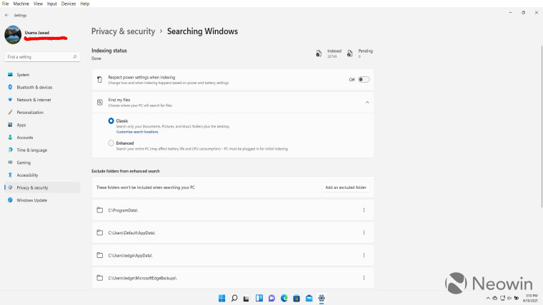
Before we dive into what has changed in Windows 11 Search compared to that present in Windows 10, we feel it is better to quickly walk through some features which have not been changed, or at least, have not been modified significantly. First up, we have the Windows Search settings (pictured above) which can be found in the "Privacy and security" settings.
The configurations available are almost identical to what you would find in "Searching Windows" in Windows 10. You have the regular indexing configurations, excluded folders, two options for "Find my files", and some information related to indexing. Microsoft has only shuffled around the order of these settings and changed a bit of the wording, the general purpose is still the same.

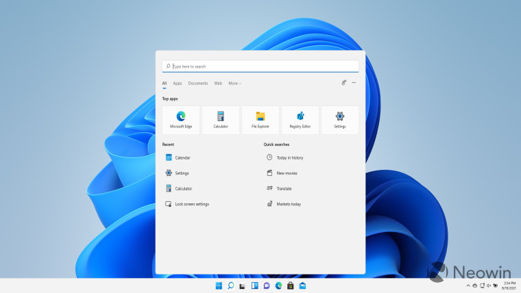
The same is the case with the options available on top of the Search UI which has categories like "All", "Apps", "Documents", and more, exactly like Windows 10. There are also the "Give Feedback" icon along with the three-dotted menu on the top right corner which will be familiar to Windows 10 users.
However, this UI has changed significantly compared to Windows 10. For one, you can"t add a search box in the taskbar. For people such as myself you hid that UI anyway, this is not a major concern. For people who did have a search box of considerable width across their taskbar, this change will likely come as a disappointment.
The Search UI itself has been altered a bit as well. Compare it to Windows 10 above, and you"ll immediately notice the presence of the search bar at the top of the component in Windows 11 rather than at the bottom. The Windows 11 Search UI also has rounded corners similar to other components of the OS too, and it also appears cleaner. There are also some additional "Quick searches" available in Windows 11 such as "New movies", "Translate", and "Markets today", although that could be related to regions and preferences.
This look is perhaps also enhanced by the fact that the Windows 11Search UI hovers slightly above the taskbar and does not touch its top pane. This gives it the impression of being a separate "windowed" component and makes it feel less cluttered.
One nifty Search-related feature that I really like in Windows 11 is the "hints" capability shown above. Essentially, when you hover over the Search icon, you get your three most recent searches displayed in a small window. You can either jump to them directly through this UI or you can click on the search bar at the top to display the full UI. This capability is not present at all in Windows 10 and I personally welcome it.
Moving on to the main purpose of Search, which is, well, searching. I don"t have any hard figures to back this up since I don"t have two identical configurations to test both operating systems. I have Windows 10 running on a Core i7 machine with a 512GB SSD and 16GB of RAM. Meanwhile, Windows 11 is running in Oracle VM VirtualBox on the same machine and uses 50GB of SSD storage and 4GB of RAM from the same resources.
Despite this clear disparity in resources, Windows 11 Search feels much, much snappier compared to that present in Windows 10. It keeps updating results in close-to-real-time on the virtual machine while Windows 10 noticeably stutters and jitters while responding to keystrokes and updating results at the same time. I"m not technical enough to attempt to dig deep into the implementation of the component on both these operating systems, but in my experience, Windows 11 Search is clearly superior in terms of performance. I realize that Windows Search has to sift through more files on Windows 10 since that is not a fresh install, but to tackle this scenario, I searched for Windows Settings configuration items so both operating systems prioritize that, and Windows 11 still outperformed its predecessor.
One of my pet peeves with Windows 10 Search is its tendency to favor web search results rather than on-device results. A very good example of this is in the side-by-side screenshot I captured above. As mentioned, I am running Windows 11 in a VM inside a Windows 10 guest machine so the left side of the screen shows the Search results for Windows 10 whereas the right side shows results from Windows 11.
For testing purposes, I created a "Test" directory on the desktop of both operating systems. And then fired a search query for "Test" while keeping case-sensitivity in mind. As you can see above, even though the directories are same - on each independent OS -, Windows 10 favored Bing search results for COVID-19 tests and internet speed tests, while Windows 11 quickly grabbed the correct directory. Even secondary search results for "Test" show Windows 11 configurations, and web results are at a much lower priority. So, it"s clear that Microsoft has significantly upgraded its Windows Search implementation, which may account for some speed improvements as well, but mileage may vary for different use-cases.
Finally, another relatively minor change we have in Windows 11 is that the Search UI has also been added to the Start menu. In contrast, Windows 10 did not have a Search bar in the Start menu at all. While I welcome this change, the implementation is very odd, to say the least. When you click on the Search bar in the Start menu, the menu closes and the native Search UI opens instead. Considering that this is a rather poor user experience right now, I hope Microsoft will be updating this ahead of the general release to make it seem more native.
Overall, there is a lot to like about Search in Windows 11. The performance seems better, the search results are better, whoever added the "hints" on hover should be given a raise, and the UI is much cleaner. That said, there is still room for improvement. Personally speaking, I would prefer that the white space in the UI is better utilized or reduced, the Search in the Start menu be baked in to the component better, and the search bar in the "hints" to work directly in the smaller window instead of blowing up to the full UI. The good news is that we"re still a few months away from general availability so if you have some nitpicking to do as well, please let us know in the comments section below and report it to Microsoft via Feedback Hub.