Microsoft released Windows 11 Dev Channel build 22557 a week ago and it packs tons of new features that could eventually make their way over to the generally available (GA) version of the OS. Given the rollout of the new capabilities, we resumed our Closer Look series to discuss these features and their impact in more detail.
So far, we have talked about the enhancements to the Start menu and the Task Manager revamp. Now, it is time to talk about some Snap Layouts improvements.

People who have followed my coverage of Windows 11 in the past know that I am a big fan of Snap Layouts and Snap Groups in the OS. The former allowed you to hover your cursor over the "Maximize" button on a window and the OS will show you possible positions to snap it to. You can then arrange different windows in a layout and have them open or close with a single click as a "Snap Group".
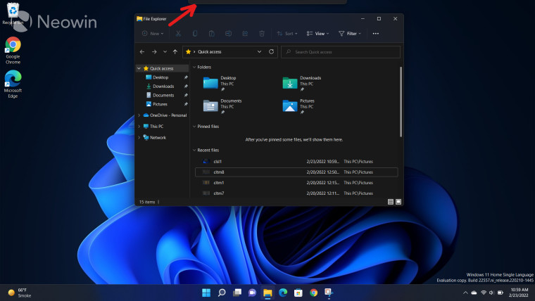
Microsoft has made some changes to Snap Layouts in Windows 11. Essentially, you can now do leverage from this feature in a different way. Rather than relying on the maximize button, you can simply drag your window to the top of your display, where you will see a pane, marked by the red arrow in the screenshot above.

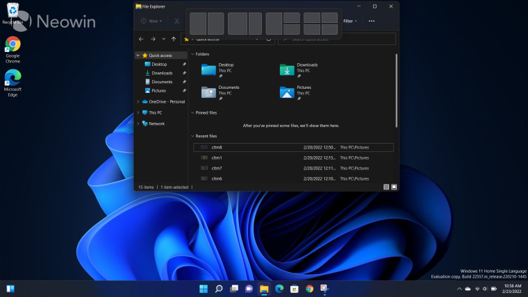
When you drag the window on top of the pane, you will see a preview of some layouts that you can use. This arrangement can be different, depending upon the size and resolution of your display. An example can be seen in the screenshot above.
However, Dev Channel build 22557 goes a step further by showing you a preview of where your window will reside. This happens when you start dragging your window across different slots of the Snap Layouts pane and get a minimized version of your window in the pane versus a blurred area to show the space it will occupy once you select that slot.
Personally, I love this change. It"s a minor improvement but one that could improve the UX in many multitasking use-cases, especially those that are touch-based. You can still use the Maximize button but I think the new implementation is much more intuitive. I think it makes more sense to see Snap Layouts when you are dragging around your window rather than when you are minimizing or maximizing it.
One thing I would like to see improved further in this implementation is that rather than showing a blurred area, maybe there is more utility in showing an actual preview of your desired window? I think that would allow me to make a better decision about whether snapping the window in a slot would still make it usable for me without having to squint my eyes too much. But then again, this is an in-development build so hopefully, Microsoft expands upon this idea further in future iterations.
Of course, you can still use the "old school" method of Win + directional keys if that"s what you"re used to, but I personally prefer this implementation. And at the end of the day, it"s all about giving the customer more options, right? The new implementation coupled with the ability to see a preview of occupied space is a neat improvement and I"d love to see it make its way to the GA version of Windows 11 eventually.
What do you think about the latest changes to Snap Layouts in Windows 11 Dev Channel build 22557? Let us know in the comments section below!