Windows 11 is under active development with a general release date somewhere around the end of the calendar year. For those interested in giving the operating system a go before then, now is a good time to enroll in the Dev or Beta channels in the Windows Insider Program.
While the OS is still under development, we have started taking a closer look at some of its features and capabilities, and also comparing how it stacks up against its predecessor. Although some of these might change depending upon feedback from Windows Insiders, the idea is to give our readers who have not used Windows 11 yet a hint as to what to expect come the OS" global launch.
A couple of days ago, we took a deep-dive into the Windows Search functionality, and today, we"ll be taking a closer look at widgets. For the purpose of this hands-on, we"ll be taking a look at Windows 11 build 22000.160 released just a couple of days ago versus a publicly available up to date Windows 10 (version 21H1 build 19043.1165).

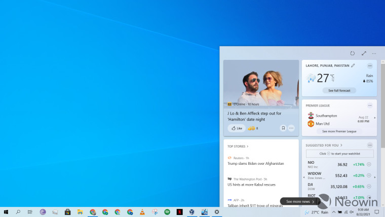
Before we discuss widgets in Windows 11, it is important to note that the feature debuted quite recently on Windows 10. It is called "News and Interests" on the OS and can be accessed from the taskbar. As the name suggests, it"s essentially a news feed that sits on the right side of your taskbar by default, and shows you the weather. However, when you hover or click on it, it expands in a fly-out window (screenshot above) showing you the weather, news, scores from sports, stock market trends, and more. You can click on the three-dotted menu on the top-right corner to manage your interests and can also click on the "expand" icon next to that, which will open the "My Feed" tab in Microsoft Edge. This will essentially show you the same information but in more screen estate. The same will happen if you want to view a particular item in more detail. It will always open in Edge and not respect your browser preferences.

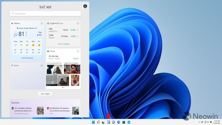
If we move to Windows 11, the launch experience is quite different. The widgets icon now - see red arrow in screenshot above - sits along with your regular pinned taskbar items rather than the far right. It does not automatically launch on hover (this behavior can be disabled on Windows 10 too, by the way), and it does not take any space on your taskbar to show the weather. The only way to launch it is by clicking on it or using the Win + W shortcut. On Windows 10, this shortcut launched the Windows Ink Workspace UI.
In terms of the post-launch experience, you"ll see that the widgets launch on the left side of the screen rather than the right. Eagle-eyed readers will also notice the rounded corners in the windowed component, which seems to be a staple in the Windows 11 design. Another noticeable change is that the widgets hover over the the taskbar and are not adjacent to the borders of the taskbar, which is something that we noted in the Windows Search UI a couple of days ago too.
While the general look appears to be the same, there are some key differences. The UI shows the time at the top, the "expand" and "refresh" icons from Windows 10 are gone, and the controls-related icons on the top-right have been reduced to just your account"s picture. When you click on this, you"ll be able to manage your interests, similar to Windows 10.
That said, there are a lot more widgets here than what are present in Windows 10. Looking at the screenshot above, you"ll see that it contains options like Outlook Calendar, To Do, and traffic information too. In fact, by default, the Windows 11 widgets also have the Photos widget pinned. This typically shows you memories from your OneDrive albums. It is important to note that you can unpin widgets anytime you want and can even hide it from your taskbar by simply right-clicking on the icon and clicking "hide from taskbar".
While the widgets UI in Windows 11 will likely be welcomed by people who like to check news and stock market trends without launching the full browser experience, I feel that it could do with a lot of improvements. Again, this section is not intended for people who don"t plan to use widgets altogether, and they have the option to hide it.
I believe that the widgets fly-out window takes up way too much space on the screen. If I just want a quick look at the news, weather, or stock market trends, I do not want it to take up roughly 35% of the width of my screen - as can be shown above - and horribly obstruct what I"m doing in the background. In essence, it does not offer multi-tasking capabilities at all. If you click on anything outside of the widgets UI, the window closes.
In the next few builds leading up to the general release of Windows 11, I believe that Microsoft should invest significant effort into redesigning its widgets UI from a multi-tasking perspective. Maybe provide some control to the user as to where they want the widgets to appear and how much space they should occupy.
For example, in my case, I would prefer that if I click on widgets, they appear at the bottom right corner of the screen, and occupy 20% of the width and 30% of the height. Furthermore, they should not close unless I explicitly click on the widgets icon or some "X" button on the top-right of the widgets window itself. From a personal user experience perspective, this would allow me to continue with my regular activities on the main screen estate while occasionally scrolling through news and match scores on the right.
Lastly, since I use Chrome as my primary browser, I do not appreciate the fact that widgets on Windows 10 and Windows 11 do not respect browser preferences and open in Microsoft Edge, regardless of anything. There definitely needs to be more control given to the user on this front.
Overall, I appreciate the changes that Microsoft is making to widgets in Windows 11 and adding new capabilities that take advantage of information from your Microsoft account, I do feel that there is a ways to go before I consider integrating widgets into my regular usage, come Windows 11. In the same vein, if you have feedback for Microsoft too, consider reporting it to the company via Feedback Hub and let us know in the comments section what you think about widgets as well.
Take a look at the section here or select from the links below to continue exploring Windows 11 in our ongoing "Closer Look" series: