Last week, we published an article detailing five great features and improvements coming soon to Windows 11 customers. Now it is time to look at the not-so-impressive or straight irritating changes Microsoft is considering implementing in the upcoming releases.
Note: Microsoft treats the Dev Channel as a test field to trial early and experimental features, and the company has made it clear that some of those changes might not see the public release. Send Microsoft your feedback using the Feedback Hub if you do not like some new capabilities or tweaks the software giant has implemented in the recent preview builds. Finally, articles like this are always subjective—some users might like what I do not and vice versa. As usual, everyone"s opinions and hot takes are welcomed in the comments.
1. Recommended websites
Update: Microsoft decided to ditch this idea.
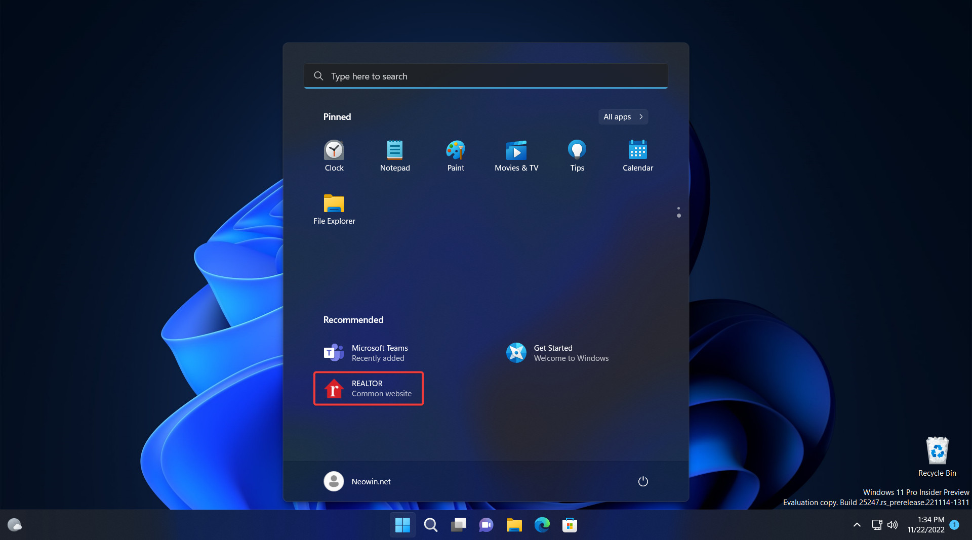
Microsoft stubbornly refuses to give up and allow users to disable the "Recommended" section on the Start menu. Moreover, the company is pressing on with the idea to the extent of displaying ad-like recommendations of various websites.
Besides being plain annoying, this change clashes with the purpose of the Start menu. Why would anyone want to click a website after opening the Start menu where users place their hand-picked apps? Luckily, you can force-disable website recommendations in the Start menu, as our dedicated guide describes.

2. Search Highlights
I like the new Windows Search box on the Start menu, but I wouldn"t say I have the same feelings toward Search Highlights (small images representing holidays and other events) Microsoft places in that box. Apart from confusing the users with constantly changing graphics, those highlights create an illusion of extra misaligned apps on the taskbar—a place I carefully curate and keep sanitized just for my most frequently used applications.
Here is a guide detailing how to disable Search Highlights in Windows 11 Dev builds for those who also do not like this feature.
3. More attempts to impose Edge
Microsoft does not want to deal with the fact that some users prefer browsers other than Edge. Therefore, the latest improvements to the Suggested Actions feature are yet another way to shove Edge down users" throats. Selecting text in Windows 11 now displays a small banner with a button allowing you to search the internet. Of course, Bing-only and Microsoft Edge-only.
To be fair, Microsoft has yet to make up its mind. Hidden feature IDs in Windows 11 show that the company is considering allowing users to use the Suggested Actions in conjunction with other browsers. Still, those IDs are buried deep inside the operating system, leaving Edge and Bing the only default option.
4. Warnings in the wrong places
Microsoft thinks it is an excellent idea to place various Settings-related alerts in the menu that appears on the screen when you click your profile on the Start menu. It can display ad-like prompts to set up OneDrive, sign in with a Microsoft Account, back up files (in OneDrive, of course), or complete your profile.
Including this "feature" in this article might look a bit far-fetched to some, but I think it is just another example of Microsoft placing things in the wrong places. Such recommendations can live peacefully in the Settings app, where I will most likely change or enable something (like the new and correctly placed OneDrive alerts). All I want when clicking my profile on the Start menu is either to lock my system or sign out.
Finally, Microsoft tries to make those recommendations look like something critical. They use the same orange dot that appears on the power button when Windows wants to complete the update procedure. Does the operating system want to tell me something important? Oh, never mind, it is just a OneDrive ad...
5. Please use our search filled with ads
History repeats itself in this one. Remember Microsoft displaying banners above the taskbar to promote the new Edge? Those are back to drive attention to Windows Search filled with ads. Although Microsoft tries to excuse itself, claiming that the change is here to "improve the value of Search shortcuts and reduce friction in the broader Windows Search experience," I think users do not need explanations of the magnifying glass icon.
It is sad to see Microsoft trying desperately to make everyone use Windows Search and shoving more recommended/promoted content instead of making the search less lame. It cannot even find the Recycle Bin (not to mention that most of its features stop working once you move outside the US), and I will keep mocking Microsoft for that until the company does something.
What do you think about the features listed below? Do you think Microsoft should keep, rework, or drop them? Is there something else annoying you in Windows 11 preview builds? Lets us know in the comments.