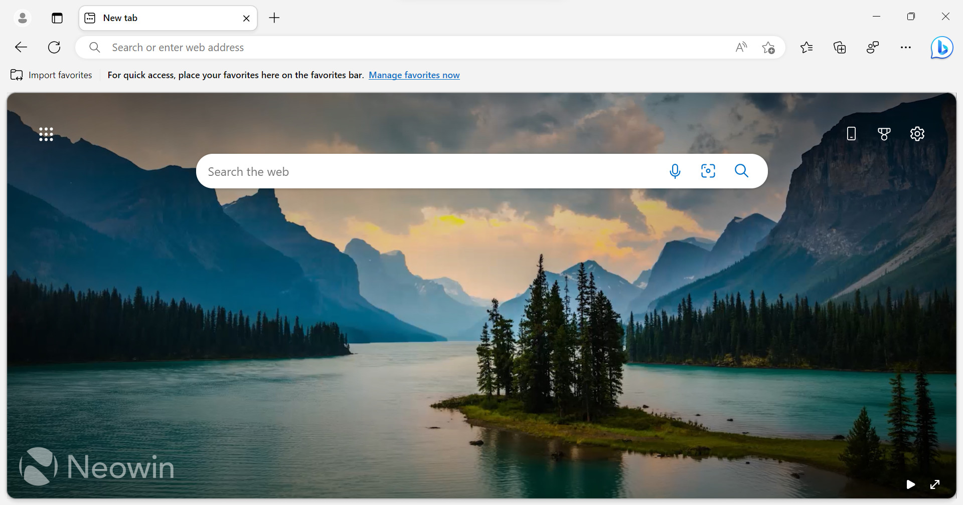
Several weeks ago, Microsoft unveiled a significant redesign for its browser. It features reworked tabs, a large Bing Chat button, rounded corners for web pages, and other changes. The redesigned Edge turned out to be controversial—users quickly jumped on Microsoft for enforcing questionable design choices with no options to disable them. After getting lots of customer feedback, Microsoft is fixing the situation.
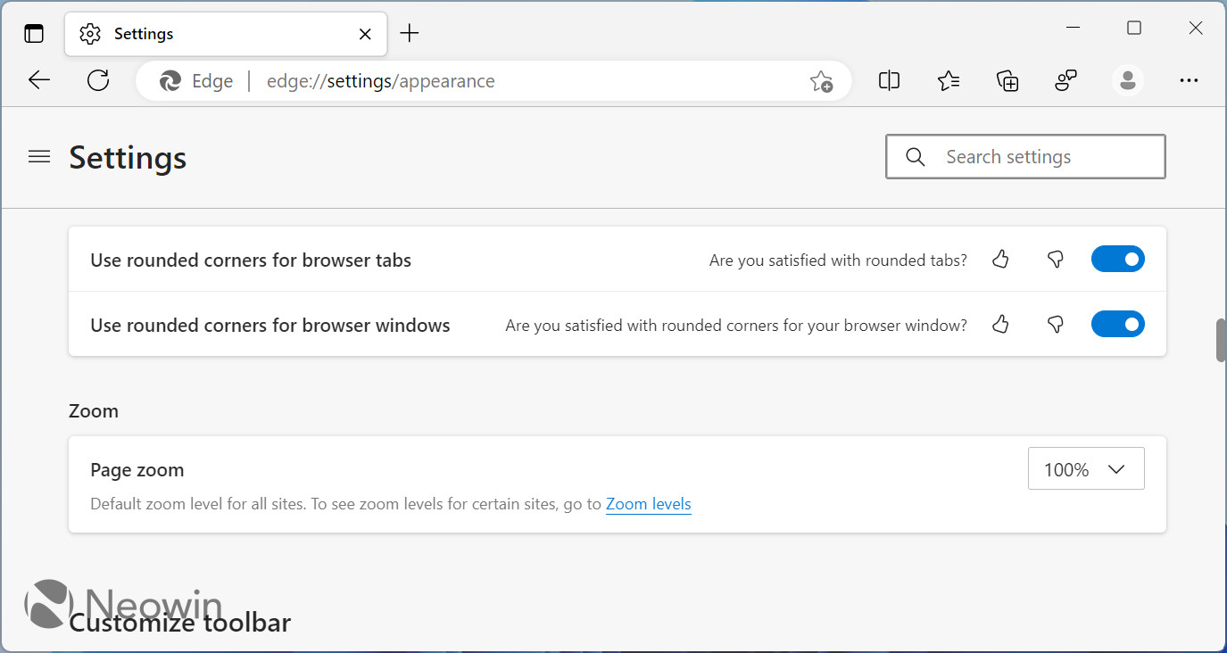
Microsoft has already addressed the problem around the Bing button—one of the recent Edge Canary updates brought the option to disable it with a single click (you can use a policy to remove the Bing button while we wait for Edge 113 to arrive in the Stable Channel). Now the company is making another move to show it listens to consumer feedback. Edge Canary 113.0.1743.0 lets you toggle off rounded corners for web pages (via @PhantomOfEarth on Twitter).
You can toggle on or off rounded corners for browser windows in the Appearance settings section. Navigate to Settings > Appearance, find the "Use rounded corners for browser window" option, and restart your browser to apply the changes. Like with other new features in Edge, you can help Microsoft better understand what users think about changes in the browser by giving the option a thumbs up or down.

It is safe to say that the rounded corners for websites, or "browser windows," as Microsoft calls them, are the most hated part of the redesign. Such design robs you of screen real estate and creates visual confusion (most computer screens are still perfectly squared, not rounded). Still, some people like such an unorthodox decision, so Microsoft has decided to do the only right thing: let users decide for themselves.
What do you think about rounded corners in Microsoft Edge? Do you like them or not? Let us know in the comments.