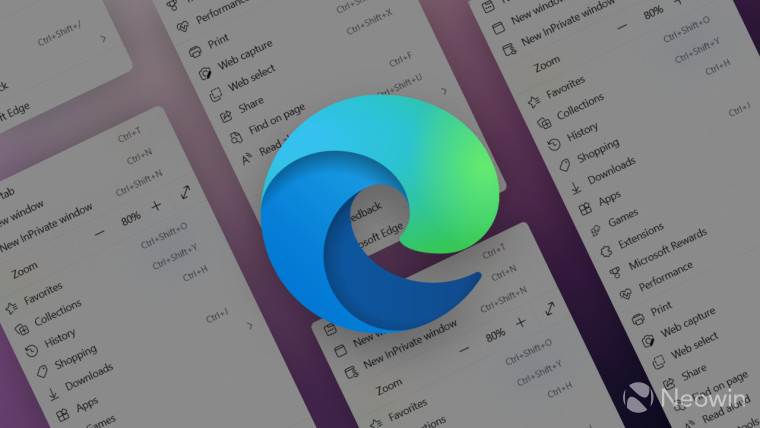
Microsoft"s feature-packed browser each month gets new capabilities and features with one weird side effect: they no longer fit inside the browser"s menu. It has become so big that users have to scroll it. Edge"s "plus-sized" menus are a popular complaint from frustrated customers, and Microsoft finally has a solution.
The latest Edge Canary update attempts to shrink its massive menu to more reasonable sizes by moving less popular and unnecessary tools to a submenu. The already existing "More tools" option will soon host more features, such as Read Aloud, Performance, Battery, Share, and more.
Interestingly, the Games section appears too important to move to the submenu, so it sits higher than built-in accessibility and resource-optimizing utilities that now require more clicks to access. However, it is too early to dunk on Microsoft for poor priorities—the updated menu is available only to some Edge Canary users, so future updates may tweak the menu more and reposition various tools and options. If you test pre-release Edge updates, send your feedback to Microsoft to help improve the browser.
What do you think about Microsoft"s attempt to make Edge"s menu more compact? What features do you think Microsoft should move to the submenu? Lets us know in the comments.
Source: Leopeva64-2 on Reddit
