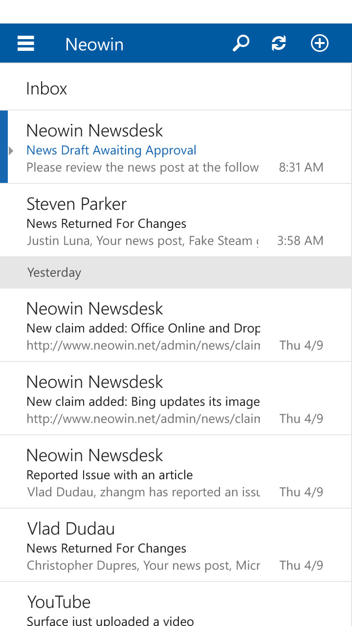
When Microsoft introduced Windows Phone several years ago, they created their own style of interface with live tiles, and required apps to follow a specific set of design guidelines. With Windows 10 for phones set to arrive this year and preview releases now out in the wild, Microsoft is moving away from metro and towards a utilitarian approach.
Windows Phone"s design guidelines set out to achieve a goal of making all apps operate in a similar fashion. The idea was that this would make the entire UI feel cohesive, and it would make it easy for consumers to use new apps, as they would all operate under the same design principles.
The problem that this caused was that it required established apps that have their own design to rethink their apps specifically for Windows Phone. Or in other words, they could build one UI for Android and iOS but for Windows Phone, they had to do additional work to make it match the theme of the OS. This additional overhead is one of the reasons why the app ecosystem never took off of on Windows Phone.

Why so? It"s one thing to have a small install base, but Microsoft was also asking top tier companies to build apps for Windows Phone, and neglect their own design instead playing by Microsoft"s rules. This could confuse a company"s dedicated users as well as incur extra development charges as they reworked the UI from iOS/Android. This means that they could not simply port an app, but had to rework the interface to fit the guidelines; this is a big ask of developers when you only have 3.5% of the market.
With the latest release of Windows 10 for phones, we can see how Microsoft is dropping the pivot/carousel style for its own apps. This can be spotted with the new calendar and Outlook apps as well as other areas like the phone dialer, and even the People app has some new UI elements too.
Seeing as the company is moving away from the previous rigid guidelines of the apps for its phones, it would make sense that they will let third-parties use their own style as well. This should be good news from Windows Phone users, as it removes one of the barriers for top tier devs to port their apps to Windows Phone; they only need to change the underlying code, the UI can stay the same.
This is a big shift for Microsoft, but it is the right one for the ecosystem. By allowing devs to use their own designs and not be forced to follow Microsoft"s strict guidelines, it should help alleviate some of the constraints for the platform.
This change was also necessary to make the Universal apps work across the ecosystem. It"s quite obvious that the modern app style would not work on the desktop, and if Microsoft wants devs to take advantage of its ecosystem, they can"t expect a complete UI rewrite for each targeted device.
Keep an eye on how Windows 10 for phone progresses, as you will likely see further shifts away from a rigid design environment to one that has more room for freedom of expression.