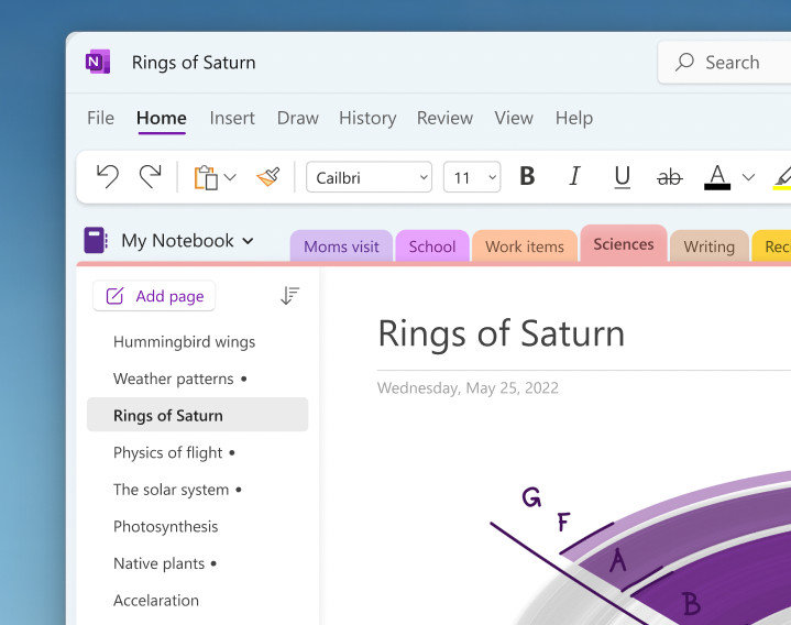
It was back in December of last year that we learned how Microsoft wanted to introduce a new and more accessible layout to OneNote for Windows. It has taken roughly a month to complete developing the new layout, as the software giant has now started to roll out the new Vertical Tabs for the OneNote Windows client.
Instead of Horizontal Tabs being the only option, Microsoft has now introduced another way: a left-sided Vertical Tabs layout. We are not seeing it for the first time in OneNote, however. You have already seen the left-side navigation layout if you are familiar with the design of the OneNote web, Mac, and iPad clients. All Microsoft has done is bring the same feature to the OneNote Windows client.
You can access the Vertical Tabs by navigating to View > Tabs Layout > Vertical Tabs. If you don"t like the new layout, you can switch to the old horizontal tabs, and all section tabs will appear at the top of the canvas. You can do this by going to View > Tabs Layout > Horizontal Tabs.
Microsoft is currently rolling out Vertical Tabs for the OneNote Windows client, but the current availability is presently limited to Insiders running Version 2302 (Build 16124.20000) or later. Microsoft has also noted that the new layout is not available on OneNote for Windows 10, which is expected as Microsoft has already confirmed that it is in support mode until 2025. The app that will replace it is the new OneNote for Windows, which arrived in the Microsoft Store last year.