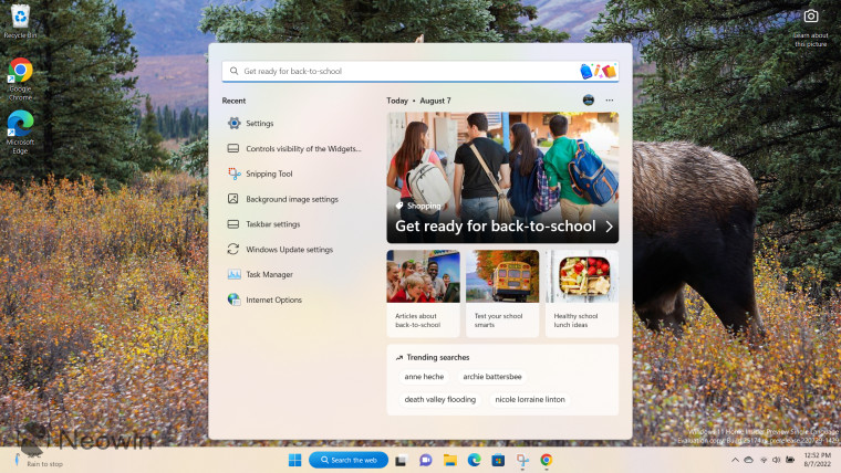
The redesigned Start menu is arguably one of the most divisive features in Windows 11. However, Microsoft believes that it is a great piece of engineering and provides an amazing user experience, something that it regularly advertises to consumers. However, it is interesting to know that a former Microsoft executive who is quite authoritative in this domain isn"t a fan of Windows 11"s Start menu either.
As spotted by WinFuture.de, Microsoft"s ex-Director of User Experiences Jensen Harris - who spent five years in this role out of the over 16 years he spent at the company in total, leaving in 2014 - has slammed the UX of Windows 11"s Start menu on Twitter, saying that he is "shocked" by the design:
The Start menu is Microsoft"s flagship user experience. It should represent the very best UI design the company is capable of.
— Jensen Harris (@jensenharris) August 29, 2022
Today I searched for "chrome" in Windows and was shocked by the user experience. pic.twitter.com/GZq386qqzK
The Twitter thread is quite long and if you want, you can view it in full by clicking the embedded tweet above. However, we will explain some of his grievances directly in this article.
Harris claims that the banner advertisement for the Bing Wallpaper app looks like a virus, has a dated background color choice, and the text is misaligned too. Additionally, the left side of the banner has a rounded corner while the right has straight edges. The former executive went on to say that:
The bigger issue here though: why are there banner ads in the Start menu? Is the amount of $ made by this wallpaper app worth cheapening the experience people have in this very high-touch piece of UI? It erodes trust—I wasn"t even searching for "wallpaper." Which brings me to:
Great UI should help people achieve a task with minimum friction. But the next section down (referring to the "Switch to the browser recommended by Microsoft" section) is expressly designed to introduce friction into my experience. It"s the largest UI in the Start menu, and it"s designed specifically to distract me away from achieving my intended task.
Moreover, the "Open results in browser" hovering button at the bottom is covering two buttons below it. There are other inconsistencies that Harris has highlighted too:
And shall we take a look at the corners of this bottom section?
— Jensen Harris (@jensenharris) August 29, 2022
The top corners are rounded. ✅
The bottom-left corner is rounded but the upper "slab" starts to have its curve merge awkwardly with the surface under it. 🤔
And bottom-right? You guessed. Inextricably square. 🤣 pic.twitter.com/0bvOw7WkrU
Harris then dived into the history of the Start menu and how the previous iterations were built with so much thought and effort put into the intricacies of the design:
Design matters. Details matter. Especially in UI as iconic as the Windows Start menu. I remember the team creating a special ligature in the Segoe UI font (used in Windows) to make "S" and "t" align beautifully for the word "Start". That"s how important Start was to Microsoft.
Microsoft has many brilliant designers who care deeply about the work they do—I worked with many who are still there! It just comes down to a question of what you prioritize. User experience needs to be architected with as much intensity as you architect your tech investments.
Finally, Harris has concluded his thread by saying that he"s not a fan of the Start menu being moved to the center too as it also goes against the recommendations of Fitts" Law. That said, our readers should know that you can left-align the Taskbar/Start menu, if you want.
Overall, it"s clear that Harris isn"t a fan of the revamped Start menu and he is making his feelings known to the public. Obviously, he doesn"t hold a position at Microsoft anymore so he can"t directly influence the design process at the company, but it"s interesting to see that a person who is more of an authority on Windows 11"s design than regular consumers isn"t a fan of the new UX either.
Do you agree with Harris or do you think that the Windows 11"s Start menu isn"t as bad as he claims it is? Let us know in the comments section below!
Via: WinFuture.de