Windows 11 has been out for over a month, but due to its staggered rollout, it's not available to everyone just yet. While Microsoft recently stated that it's speeding up the pace of availability due to "positive" feedback regarding the OS, that doesn't mean that Windows 11 is perfect. Far from it, in fact. If you've read my review on the OS, you know that I find it to be a mixed bag overall.
Last week, I talked about the top five things I love about Windows 11, but today, I'm going on the opposite extreme and will be talking about five things I hate about Microsoft's latest operating system. As usual, this is a purely personal perspective so feel free to disagree with it. Another few things I'd like to emphasize are that this list is in no particular order and the OS possibly has other problems apart from the ones I mention too, I just don't feel that strongly about them. With that out of the way, let's begin!
1 - Taskbar
_story.jpg)
I know that this list is in no particular order, but let's start with the most glaring feature first. The Taskbar in Windows 11 is extremely stripped down, so much so that it actually ditches some very useful functionalities that were present in Windows 10 for no apparent reason other than simplification. And that's because it borrows from the now-defunct Windows 10X, a simplified OS that was being designed for dual-screen devices. This results in a Taskbar that is arguably aesthetic but crippled for a lot of use-cases.
You can't drag and drop apps to pin them to the Taskbar, which means that you have to rely on context menus. The context menu for the Taskbar is essentially gone too, but you can still use its capabilities by right-clicking on the Windows/Start icon. Then there's the Taskbar clock, which has seemingly lost the ability to display time to the accuracy of settings based on Microsoft's whims. In the same vein, the Taskbar is locked to the bottom for some weird reason as well. You can't adjust its height, show labels and never combine apps, or even change the size of app icons. Even the Agenda view for the Calendar in the system tray is absent.
And that's just the tip of the iceberg. I'm sure that there are lots of other capabilities that I don't actively use but are likely missing as well. There's hope that Microsoft will eventually listen to all the negative feedback with thousands of upvotes in its beloved Feedback Hub and restore at least some functionality, but the fact that it thought that the launch version is good enough is just unacceptable. You can read more of my thoughts in the dedicated Closer Look piece here.
2 - Default apps settings

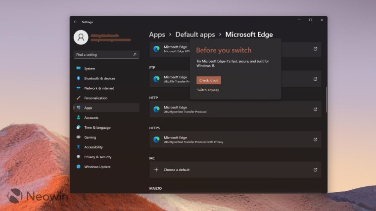
Oh boy, if you thought this list was going to go easier on Microsoft, you couldn't have been more wrong. Default apps settings is yet another change in Windows 11 that I highly despise. In Windows 10, Microsoft allowed you to set default apps for categories like Email, Maps, Music player, Photo viewer, Video player, and Web browser. This is no longer the case in Windows 11.
Microsoft actually wants you go through a painful process where you set the default app for each extension protocol. You don't have a category called "Web browser" where you can just set Chrome as the default browser and be done with it, you have to manually set it for each extension. Check the screenshot above to get an idea of what I'm talking about if you haven't gotten around to using Windows 11 yourself.
Granted that it's a one-time activity, but it's so much extra effort just to change your default browser or any other app, really. Microsoft's sheer audacity to implement such an anti-competitive tactic in an OS that is used by millions is just infuriating. While third-party developers and firms are attempting workarounds to bypass Microsoft's restrictions, it does seem like that they'll face a difficult time. You can read more of my rant on this topic in the dedicated piece here.
3 - Context menus

This is a bit of an odd duckling, and that's because "hate" is a bit of a strong word for this. The new context menu (or the right-click menu depending on what you call it) is an interesting experiment into making a UI element more accessible and simplified while still retaining all functionalities via workarounds.
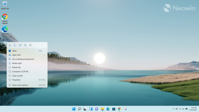
Essentially, as you can see in the screenshot above, Microsoft has grouped some common items such as cut, copy, rename, share, and delete to the toolbar at the top of the context menu while some other functionalities are at the bottom. But you'll notice that many third-party apps that gave you an "open with" option or other similar to that are not visible by default. You actually have to click on the "Show more options" at the bottom of the context menu to get the Windows 10 version back which will have all the verbs.
In an effort to organize the context menu a bit better, Microsoft now expects developers to update their apps according to a new integration mechanism through which their app's verbs will be grouped neatly in the taskbar. I don't see a fault in the approach itself, but the issue is that this puts way too much responsibility on an app developer to update all their old apps to integrate with Windows 11. So if a developer has moved on to newer projects or abandoned their software completely, you as a user will be out of luck unless you implement some workarounds to integrate verbs to the native context menu.
You could use the "Show more options" button to just utilize the old context menu, but it obviously requires an extra click that is not good for a streamlined user experience, and there's actually no knowing if Microsoft eventually decides to do away with it completely and leave old apps and their consumers out in the cold. There's just too much uncertainty at this point for it to be enforced upon developers, and more importantly, consumers in this way.
I actually like the look of the updated context menu, but given that Microsoft seems to have sacrificed functionality for aesthetics in so many elements of the UI already, I fear that the old context menu will get the ax soon as well, which makes the updated context menu a very difficult sell for me. Check out more of my thoughts on this topic here.
4 - Start menu

Ah, yet another core part of the OS that did not get the treatment it deserved. When I initially talked about the Start menu in my Closer Look piece several weeks ago, I mentioned that since I don't use it much, its deficiencies don't bother me a lot. However, I don't know why, but I have been using the Start menu considerably more in Windows 11 compared to Windows 10. I don't know if it's something to do with the centered position of the Taskbar which encourages me to click on the Start menu more than usual, or if it's something else, but that's just how it is.
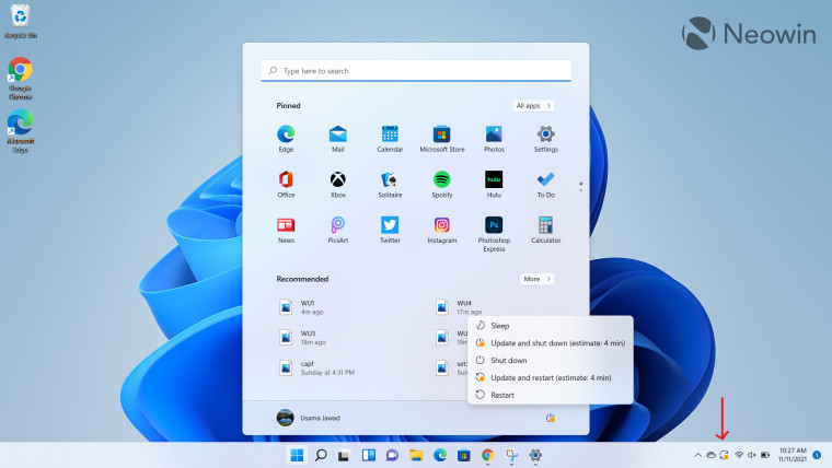
The problem with the Start menu in Windows 11 is the same. Aesthetically, it's very pleasing to look at but in terms of user experience, it leaves a lot to be desired. There's no love lost for the absent Live Tiles, but I do miss the functionality that went away with it. There is no way to group apps which means that you'll potentially have to scroll a lot if you have lots of apps pinned that you actively use.
The other downer is that "Recommended" section that takes up the bottom section of the Start menu to show you files that you recently used. While you can disable it if you have privacy concerns, especially when sharing your screen online, the problem is that all that space is wasted. Microsoft doesn't extend the Start menu's app list to utilize all the whitespace, it's just left unutilized, which seems like a major design and engineering oversight.
But perhaps the worst culprit is the search bar that has been integrated into the Start menu. You would expect that if you click on it, you'll be able to quickly fire in some search queries, but it actually has a massive jitter as it stutters and opens up Windows Search, which is actually a separate interface. The integration is so jarring that you can only gaze in wonder about how Microsoft thought that it was good enough to ship.
5 - Widgets

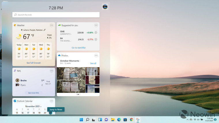
Let's get one thing out of the way: I don't hate the idea of Widgets, I just hate how Microsoft has implemented them in Windows 11. I do use Widgets occasionally, but I find it extremely annoying that rather than opening up in a pop-up window at some corner of your screen, it takes up almost the full height and 40% of the width of my 15.6-inch display with a resolution of 1920x1080.
What this means is that if you're on a single display, you can either view your Widgets or use your primary window, there's absolutely no concept of multitasking. If you click on the primary window, the Widgets flyout closes, it's super-annoying.
While you can customize it to your liking, to show you topics that interest you, I do have to talk about the integration between Calendar and Widgets. You can only sync your calendar agenda to Widgets if you use an Outlook.com account. If you're using any other email provider, you're out of luck. Given the lack of integration of the Agenda view with the Calendar flyout in the system tray, what this means is that if you want to view your daily agenda with a third-party email provider, you necessarily have to open the dedicated Calendar app because Microsoft has decided that it's not going to help you out. Long live simplification!
Have you started using Windows 11 yet? What are some features that you dislike about the OS? Let us know in the comments section below!


137 Comments - Add comment