Windows 11's general availability is mere weeks away, and this also means that we are getting a near-final look at the OS' first release, at least in the Beta Channel. Although we have discussed Windows 11's major features from a bird's eye view, we have been discussing those features, and more, in our regular Closer Look articles.
So far, we have taken a look at Search, Widgets, the Start menu, Snap Layouts and Snap Groups, the Taskbar, quick settings and notifications, and Virtual Desktops in Windows 11. Today, it is time to discuss the power and battery configurations available in the OS.
For the purpose of this hands-on, we'll be taking a look at Windows 11 build 22000.184 that was released to the Beta Channel a couple of days ago versus a publicly available and up-to-date Windows 10 (version 21H1 build 19043.1202). As usual, it is important to note that the OS is still under active development so it's possible that some of the features we talk about may change by the time of Windows 11's general availability.
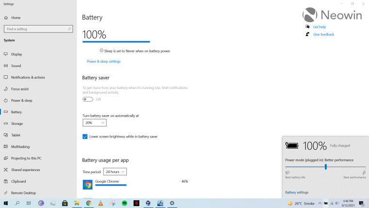
Before we discuss the capabilities present in Windows 11, it's important to discuss what is on offer in Windows 10 first. You can click on the battery icon in the taskbar to open a flyout menu which shows you your battery's current status and also offers you a slider through which you can manage your battery plan. You can either click on the "Battery settings" or navigate directly from the Settings app to view more detailed battery information.
And when I say "more detailed", there's not a lot really. You can configure battery saver, power and sleep settings, and battery usage per app. The last item does warrant more discussion though.
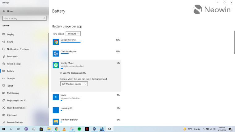
Battery usage per app gives you a relatively more detailed view of which software is hogging your battery. It shows you data related to either the past 24 hours or the past week. Along with showing overall consumption, you can also click on individual apps to see how much battery was utilized in active use versus how much of it disappeared in the background.
Certain apps which have the "Managed by Windows" label also enable you to configure if you want the app to run in the background or not. For example, in the screenshot above, we can see that Spotify consumed 4% battery in active use and 1% in the background. I can then choose between three options: Always, Let Windows decide, and Never when deciding which app I want to allow in the background.
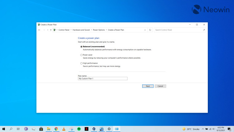
Finally, another associated setting worth mentioning is the legacy UI that Windows 10 offers to create power plans. There's nothing Windows 10-specific to speak of here, but it's just kind of silly that this UI hasn't been integrated into the main Settings app.
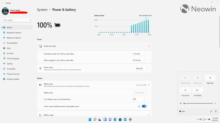
When we come over to Windows 11, the launch process for power and battery configurations is somewhat similar but there are a few caveats to be aware of, especially when launching from Quick Settings on the taskbar. If you've been reading our Closer Look articles, you'll recall that I complained about the fact that clicking on a taskbar icon opens all Quick Settings rather than only the relevant one, contrary to Windows 10. You can see in the screenshot above that even though I clicked on the battery icon, I got a cluttered flyout menu with all the available settings.
But that's not even the main problem. My concern with the current UI in Windows 11 is that you can no longer directly manage your power plan using a slider in the taskbar flyout. This, in my opinion, is a major step back. When you live in a country like Pakistan where power outages are common, easy access to power plan settings does wonders in Windows 10. For some reason that I haven't been able to figure out yet, Microsoft has done away with the power plan slider. If the reason for this is that the company wanted to make the UI simpler, I think that this design was led by someone who is either connected to a power outlet 24/7 or lives in an area where power outages don't happen at all. And that's a disappointing message from a company that makes an OS used by billions of people. Sure, you can click on the "battery saver" quick setting but again, if Microsoft wants me to use that, it should show me only that setting rather than having me sift through the Quick Settings. But I doubt that this is the reason because there is still no way to trigger the "best performance" power plan from Quick Settings.
But moving on from that, you can launch detailed battery configurations either from the Settings app or by clicking the battery icon on flyout menu. As you can decipher from the screenshot above, the main feature to talk about here is the presence of a graph which shows you the trend of the battery usage, but more on that later. All the Windows 10 configurations seem to have been ported over to Windows 11 and are much better categorized. A notable difference here is that screen timeout and sleep settings have been merged into two toggles rather than the four separate ones that were available in Windows 10. Personally, I think this is how it should have always been considering how closely the two behaviors are linked, but please do let me know in the comments below if there are some edge use-cases that me (and Microsoft engineers!) missed.
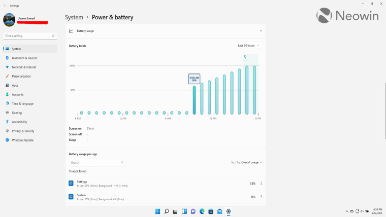
The standout feature related to power and battery settings in Windows 11 is the addition of a neat graph that shows you the trend of battery consumption - provided that you're on a laptop or any device that isn't solely powered by an external power source. The lowest level of granularity it offers is at an hour level while the highest level of granularity is split by day, but the latter is only visible if you change the drop-down filter to "Last 7 days" instead of "Last 24 hours". The latter option shows you data in a bar chart (screenshot above), while the former displays data in a line chart.
You can click on a particular segment to see how much battery was consumed while the screen was on, when it was off, or when your laptop was on sleep. It also indicates with an icon when your machine was plugged in. While I was initially confused about how my laptop's charging increased after 10am even though the battery icon is shown at 5pm, that can likely be explained by the fact that I have Windows 11 running in a virtual machine (VM) and that VM isn't always on. I shut it down around 10 a.m., and then turned it on again when my laptop was plugged in and fully charged. I doubt this is a notable use-case for people who will be using Windows 11 directly on their primary machine, but it can be a bit misleading in edge cases like mine.
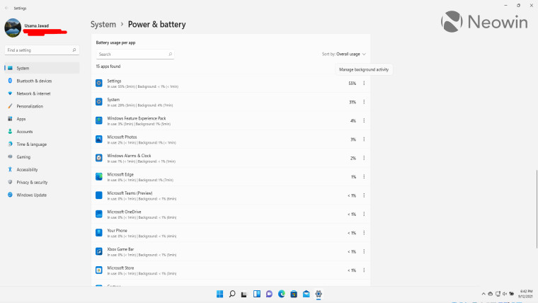
At the end of the page, we have the battery usage per app details, which is similar to that present in Windows 10, except for a couple of nifty improvements. You can sort apps by overall usage, name, background consumption, and in-use consumption. And you can also search for particular apps using the search bar at the top. Both of these capabilities were not present at all in Windows 10.
Furthermore, apart from showing battery consumption in percentage, Windows 11 shows data related to time as well, which I think is pretty neat. You don't need to individually click on these apps to view this data like in Windows 10, it is instead shown by default.
That said, Windows 11 does take some steps backwards in terms of design here too. Although you can configure background battery consumption for individual apps by clicking on the three-dots menu and clicking on "Manage background activity" as shown in the screenshot above, this launches the full settings for that app via "Apps & features" instead of letting you manage them inline like in Windows 10. This breaks the battery management flow for me a bit and I'm not a fan of this change.
The second design flaw I see here is that unlike in Windows 10 which had a label for apps whose background usage you (or Windows) could manage, there is no such hint in Windows 11. You have to manually click on the three-dot menu for each app to find out whether you can manage its background battery consumption or not.
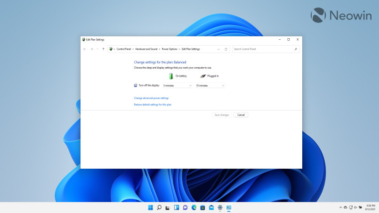
The power plan settings are once again hidden in the legacy UI. Notably, the screen timeout and sleep settings have been merged similar to the Settings app. That said, if the legacy UI can be modified, this is surely precedent enough to include these configurations in the new Settings app. Sadly, that is not the case.
Overall, while I appreciate the changes to battery usage per app and the brand-new graph to indicate trends, I feel like Microsoft has taken some steps backward in terms of design too, at least when it comes to my use-cases. A prominent example of this for me is the lack of a slider for power plans in Quick Settings.
Moreover, while the battery consumption chart is a step in the right direction, I can't help but feel that there's a lot of room for improvement here. As someone who has dabbled a fair bit in business intelligence tools, I feel like Microsoft can utilize some its Power BI expertise here, there's just so much potential. I, for one, would really welcome more visualizations like pie charts, stacked bar charts, color-coded key performance indicators (KPIs), and more. I really hope that Microsoft doesn't just think that it's done enough already, as I feel like this is a great opportunity in terms of expanding Windows 11's feature-set and further differentiating it from Windows 10. Finally, Microsoft, you really need to include the legacy power plan configurations into the main Settings app, please.
What are your thoughts on power and battery settings in Windows 11? Do you like the visualization and nifty improvements? How would you like to see Microsoft enhance them further? Let us know in the comments section below and inform Microsoft via the Feedback Hub too.
Take a look at the section here or select from the links below to continue exploring Windows 11 in our ongoing "Closer Look" series:
- Closer Look: Search in Windows 11
- Closer Look: Widgets in Windows 11
- Closer Look: Start menu in Windows 11
- Closer Look: Snap Layouts and Snap Groups in Windows 11
- Closer Look: Taskbar in Windows 11
- Closer Look: Quick settings and notifications in Windows 11
- Closer Look: Virtual Desktops in Windows 11


6 Comments - Add comment