It's been a few weeks since Windows 11 started rolling out generally (check out our review here), but since it's being distributed in a staggered manner, not everyone has it yet, even if they're on a supported machine. Although there are ways to skip the queue and trigger the update immediately, it's perhaps advisable to know what you're getting into before you decide to make the jump to Microsoft's latest OS. This is exactly why we have been discussing Windows 11's features in more detail in our ongoing Closer Look series.
So far, we have taken a look at Search, Widgets, the Start menu, Snap Layouts and Snap Groups, the Taskbar, quick settings and notifications, Virtual Desktops, power and battery settings, default apps configurations, File Explorer, context menus, Teams integration, the updated Clock app in Windows 11, the Microsoft Store, the Snipping Tool, the Paint app refresh, the lock screen, the revamped Photos app, and the voice typing experience. Today, we'll be discussing storage settings in Windows 11.
For the purpose of this hands-on, we'll be taking a look at the generally available Windows 11 build versus a publicly available and up-to-date Windows 10 (version 21H1 build 19043.1288).
Although we usually follow a format in our Closer Look articles where we first discuss the Windows 10 offerings before comparing it to Windows 11, we'll be deviating a bit from that this time because, frankly, it's not worth it considering there are smaller enhancements here and there rather than a full revamp.
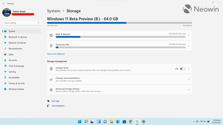
When you launch storage settings in Windows 11, you'll notice that the landing page has been redesigned. Now, you get the most essential information - which is your drive's storage space on the top -, while other information is nested at the bottom. For some reason, Windows 10 showed Storage Sense at top, which is fortunately not the case here.
Below the drive's storage, you'll get some more granular categories such as Apps & features and Temporary files, but if you want to see more categories, you'll be directed to a dedicated page rather than a list being populated on the same page like Windows 10.
The nesting of information in menus that you can expand according to your liking is a very neat touch. It means that you can now view all essential data on the same page without scrolling and can dive into specific settings only if you want too. Space is utilized very smartly here, and I'm a big fan of these changes, particularly because it does not require me to scroll past or even see settings that I barely use.
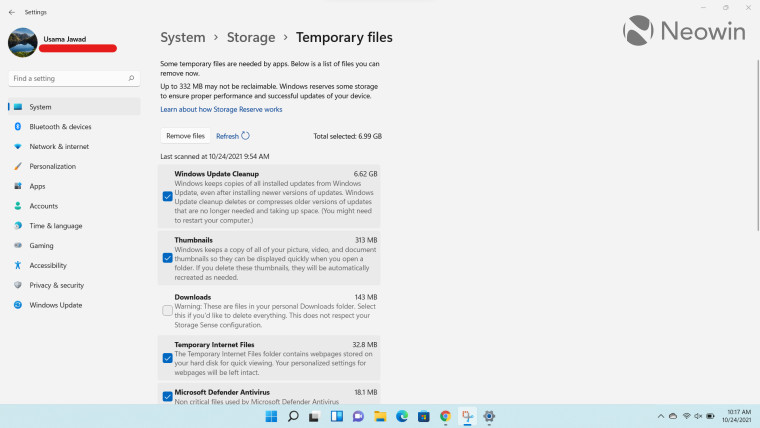
If you click on any of the dedicated categories, you'll be taken to their respective dedicated page. I noticed that Microsoft has made some nifty changes to the color contrast here so now it's easier to read highlighted content, and there's a clear division between each list item too.
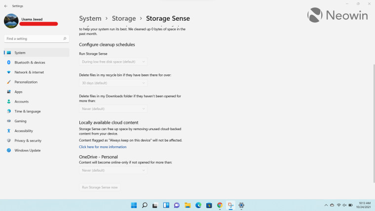
Apart from offering the regular configurations present in Windows 10 already, Storage Sense now integrates directly with your locally available OneDrive content too. It offers you the ability to make files online-only if your don't open them for more than a specific amount of time.
Personally, I'm a bit paranoid about automatic deletion of files from local or cloud storage, so I don't use Storage Sense, but Microsoft offers a decent set of options for those who feel the need for this capability.
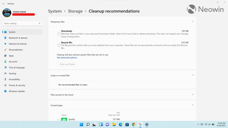
Storage settings in Windows 11 provides a handy "Cleanup recommendations" section too, which does exactly what the name implies. It offers you recommendations about deleting temporary files, large or unused files, files synced to the cloud, and apps that you haven't used recently. I think this is a decent option to have if you want to quickly free up small amounts of storage while having manual control over what you are deleting.
Going back to the landing page of the Storage settings menu, you'll notice that all of the capabilities from Windows 10 have been carried over and are now nested under "Advanced storage settings". That said, there are a couple of changes that I'd like to highlight.
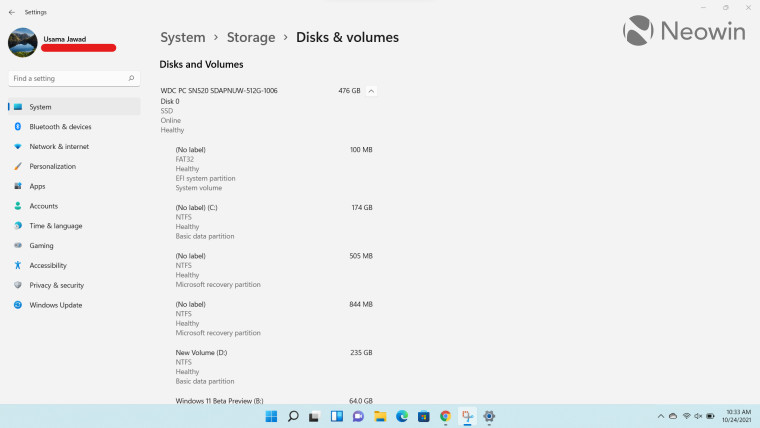
There is a new dedicated page called "Disks & volumes". This shows you high-level information about your storage device, its partitions, and their respective health statuses at a glance. You can also click on any partition to view its properties such as BitLocker encryption status and also change the label. I find this to be a very useful page even though it's not part of my daily workflows.
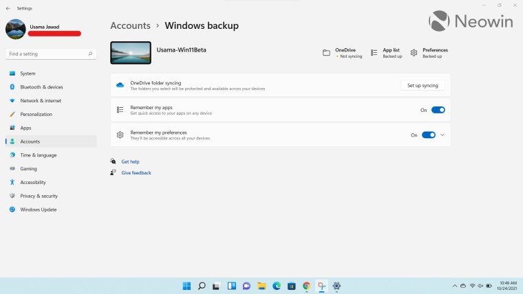
"View backup options" from Windows 10 has been replaced by "Backup options" in Windows 11. It now redirects to the Windows Backup page, from where you can backup your content to OneDrive, and remember apps and preferences. Windows 10 also offered an option called "Backup using File History", and while that setting can still be accessed using the native UI, it's no longer directly visible inside Storage settings. I'm assuming that this was done due to low usage and to push people towards OneDrive backups, but this is just speculation on my part.
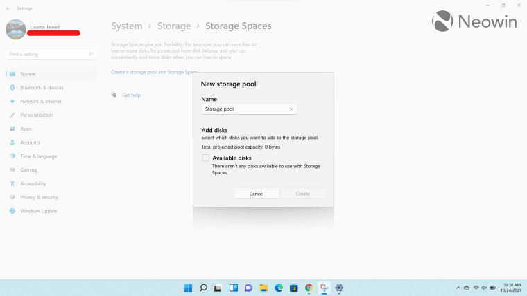
Another thing I noted was that while Windows 10 also allows you to create Storage Spaces where you can store your files redundantly across different drives via storage pools, it did so via the legacy Windows interface that opens in a dedicated window. Microsoft has changed this up significantly in Windows 11 so that you can now configure this capability directly inside the Storage settings page, complete with a native Windows 11-look. I know it doesn't make a huge difference, but I think it's a step in the right direction in terms of giving the OS a consistent look and feel.
Unfortunately, this change has not carried over to "Drive optimization", which still opens a dedicated legacy UI. Yes, it has rounded corners but it's outside of the native Windows 11 Settings app, which is a bit jarring.
Overall, I think that although Microsoft hasn't treated Storage settings to a full revamp, it has still made some notable and positive changes to the overall UI. Whitespace is utilized much better and the nested menus ensure that you can easily find what you're looking for. I welcome the tighter integration with OneDrive as it also gives a more unified feel across Microsoft products. The new pages for Disks & volumes as well as Storage Spaces are decent changes and tie in well with the overall Windows 11 design, while providing useful capabilities. Some may bemoan the absence of backup via File History but I personally never used it so I don't miss it. Eitherway, the capability hasn't been completely removed so you can still access it if you want via the legacy Windows UI.
Take a look at the section here or select from the links below to continue exploring Windows 11 in our ongoing "Closer Look" series:
- Closer Look: Search in Windows 11
- Closer Look: Widgets in Windows 11
- Closer Look: Start menu in Windows 11
- Closer Look: Snap Layouts and Snap Groups in Windows 11
- Closer Look: Taskbar in Windows 11
- Closer Look: Quick settings and notifications in Windows 11
- Closer Look: Virtual Desktops in Windows 11
- Closer Look: Power and battery settings in Windows 11
- Closer Look: Default apps settings in Windows 11
- Closer Look: File Explorer in Windows 11
- Closer Look: Context menus in Windows 11
- Closer Look: Microsoft Teams integration in Windows 11
- Closer Look: Clock app in Windows 11
- Closer Look: Microsoft Store in Windows 11
- Closer Look: Snipping Tool in Windows 11
- Closer Look: Paint in Windows 11
- Closer Look: Lock screen in Windows 11
- Closer Look: Photos app in Windows 11
- Closer Look: Voice typing in Windows 11


7 Comments - Add comment