It's been almost a month since Windows 11 started rolling out generally but since it's being distributed in a staggered manner, not everyone has received it yet. Regardless of whether or not you have received the update yet, it's worth discussing its features in more detail given that the OS is still quite new. This is exactly what we have been doing in our ongoing Closer Look series for the past couple of months.
So far, we have taken a look at Search, Widgets, the Start menu, Snap Layouts and Snap Groups, the Taskbar, quick settings and notifications, Virtual Desktops, power and battery settings, default apps configurations, File Explorer, context menus, Teams integration, the updated Clock app in Windows 11, the Microsoft Store, the Snipping Tool, the Paint app refresh, the lock screen, the revamped Photos app, the voice typing experience, the storage settings, and the touch keyboard. Today, we'll be discussing the updated Calendar app and its integration with Windows 11.
For the purpose of this hands-on, we'll be taking a look at the generally available Windows 11 build versus a publicly available and up-to-date Windows 10 (version 21H1 build 19043.1320). Typically, we start with discussing the capabilities of a specific feature before we move on to Windows 11, we won't be doing that this time, because frankly, it's not much of an update. In fact, if anything, the Calendar app's integration with Windows 11 has been crippled almost completely, to some extent.

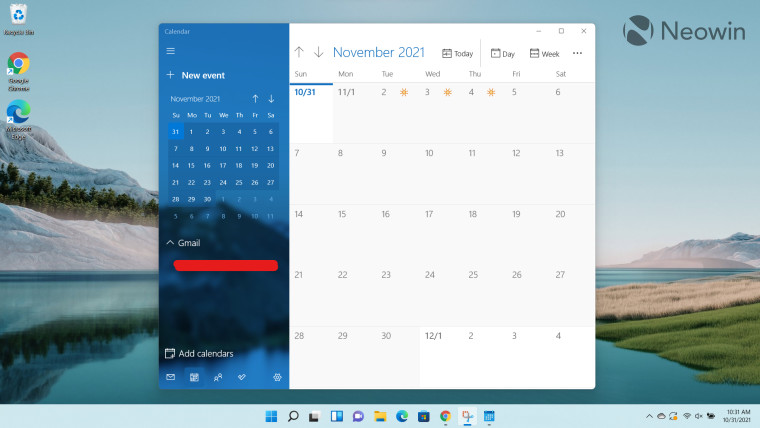
Talking about the Calendar app in Windows 11, you'd be forgiven for thinking that there's no difference when compared to its Windows 10 counterpart, because there really isn't any major difference. In terms of the feature-set and the general UI, it's exactly the same. The only slight difference is the rounded corners, a design staple of Windows 11, but nothing mind-blowing.

While I really like the emphasis on rounded corners, it is equally infuriating to see design inconsistencies in a native app. A glaring example of this is the Settings UI which has basically been lifted straight from Windows 10. You'll notice sharp corners and a lot of wasted space. It just leaves a bad taste in the mouth thinking that the development team thought that it was not worth updating the full UI of a native app that ships with Windows 11.

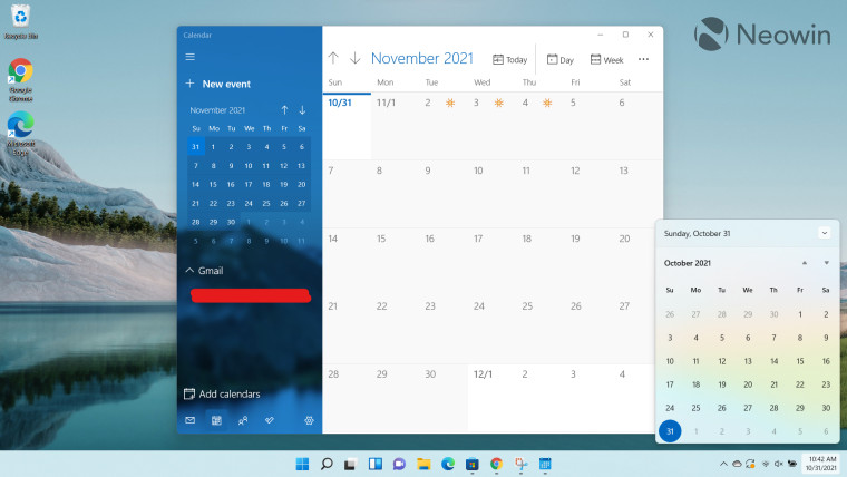
But perhaps the most controversial change when it comes to the Calendar app is its integration - or lack thereof - with Windows 11. I really liked the fact that the calendar flyout in the Windows 10 Taskbar integrated with the Calendar app and showed your agenda directly in the Taskbar. But with Windows 11, Microsoft apparently decided that it should make the lives of its customers more difficult so what better way to do that than to completely remove the integration from the calendar flyout? The (crippled) Taskbar that just keeps on giving.

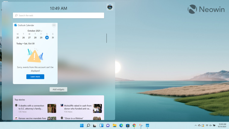
What aggravates this problem even further is that Microsoft apparently wants people to utilize the Calendar app in its Widgets instead, as pointed out by Windows Latest. This move is already being protested by thousands of people on the Feedback Hub. I decided to give Microsoft a second chance and added the Calendar app to the Widgets. To my disappointment (seriously, I should be used to this by now when dealing with half-baked Microsoft software), it showed me a strangely-worded error message that "Sorry, some events from this account can't be displayed".
Clicking on the "Learn more" button directed me to a Microsoft FAQs page and neatly tucked away at the bottom, I found this gem:
If you created your Microsoft account using an email address that is not from Microsoft, that email address can’t be used to display calendar events. To see calendar events in the widget, you’ll need to create an Outlook.com account so you can use the Outlook.com email address with the Calendar widget.
Sorry Microsoft, you can't bully me into creating an Outlook.com account just so I can view agenda events from Calendar.
All in all, the Calendar app's integration with Windows 11 is a massive disappointment. It grinds my gears to know that a company could be so dismissive of clear use-cases that it would trade functionality for apparent simplicity. The icing on the cake is that it forces you to create an Outlook.com account just so you can view your agenda items from an Outlook calendar instead of a calendar of your choice, the audacity.
If you just want rounded corners and don't really care about the Calendar app, you'll be right at home with the Windows 11 app. However, if you're an active user of the Calendar app and its integration with the Windows 10 Taskbar, either don't upgrade to Windows 11 until Microsoft fixes this blunder, or, look around for third-party workarounds to accomplish the same. But at this point, Windows 11 just seems like a half-baked experiment where Microsoft shipped the bare minimum and asked third-party developers to build functionality on top of it to fix its own blunders.
Take a look at the section here or select from the links below to continue exploring Windows 11 in our ongoing "Closer Look" series:
- Closer Look: Search in Windows 11
- Closer Look: Widgets in Windows 11
- Closer Look: Start menu in Windows 11
- Closer Look: Snap Layouts and Snap Groups in Windows 11
- Closer Look: Taskbar in Windows 11
- Closer Look: Quick settings and notifications in Windows 11
- Closer Look: Virtual Desktops in Windows 11
- Closer Look: Power and battery settings in Windows 11
- Closer Look: Default apps settings in Windows 11
- Closer Look: File Explorer in Windows 11
- Closer Look: Context menus in Windows 11
- Closer Look: Microsoft Teams integration in Windows 11
- Closer Look: Clock app in Windows 11
- Closer Look: Microsoft Store in Windows 11
- Closer Look: Snipping Tool in Windows 11
- Closer Look: Paint in Windows 11
- Closer Look: Lock screen in Windows 11
- Closer Look: Photos app in Windows 11
- Closer Look: Voice typing in Windows 11
- Closer Look: Storage settings in Windows 11
- Closer Look: Touch keyboard in Windows 11


13 Comments - Add comment