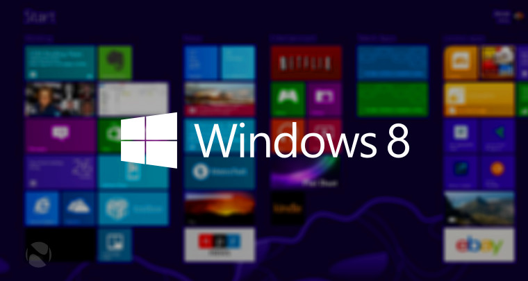
It was about 10 years ago when Microsoft unveiled its newest operating system, Windows 8. Windows 8 was a hybrid tablet/desktop OS that featured one of the most radical user interface changes since Windows 95.
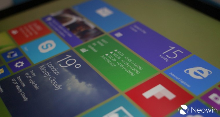
This is because Windows 8 did away with the iconic Start button and menu in favor of a brand new "Start Screen" featuring Live Tiles that dynamically updated. While the new UI functioned well on tablet computers with a touch screen, it frustrated PC users who were still using a mouse and keyboard. Overall, the OS received mixed reviews and heavy pushback from the press, and failed to rejuvenate falling PC sales at the time.
10 years since its release, former Windows Division President Steven Sinofsky, one of the main architects of Windows 8, talked to Benj Edwards of Ars Technica about the origins of the OS, its development, and what he personally feels about the OS now. You can check out the full interview by hitting the source link at the end of this article, but we’ve compiled some of the most interesting bits for you.
On Windows 8's interface design changes

Edwards asked Sinofsky if the iPad, which was a popular product from Apple at the time, was the driving force behind Windows 8’s design changes. He answered by saying that the primary motivations for changing Windows 8's interface was because "Windows had run its course." He expounded further:
If you look at how Windows was thinking when we built Windows 7 (2006–2009), the world was very focused on how the PC would be computing for what the industry called "the next billion." Windows 7 ended up being built at the tail end of a vision that would never be realized: The PC powering computing for the billions using PCs.
He further mentioned that because more people were starting to use iPhones and Android devices at the time, the only hope for growing the dwindling PC market was to have an experience more aligned with smartphones. He claims that the whole design of Windows 8 was about taking the essence of a PC and pushing it beyond smartphones.
On the tile-based Metro interface
Metro is one of the design languages created by Microsoft. The design language evolved in Windows Media Center and Zune, and was used in Windows Phone 7.
According to Sinofsky, the tiles arose from a "synergy" with the Metro design language, which itself was an evolution at Microsoft. While they considered various alternatives, they found that the combination of the Start screen and Live Tiles addressed the major shortcomings they saw with how the Start menu, taskbar, system tray, gadgets, and notifications became "unusable" in Windows.
On the evolution of his opinion on Windows 8
One of the biggest complaints about Windows 8 was the removal of the Start menu. According to Sinofsky, however, the feature had already reached its functional limits. "In many ways, I think the feedback overplayed the role of the Start menu much the same way the early Windows critics overplayed the removal of "C:\>" from the core experience," he said.
What's more, he mentions that a majority of computing is now done via grids of apps and launched by touch. "Desktop computing is on a decline. That assumes desktops are used at all, and for a few billion people, they will never see desktop computers as traditionally envisioned," the former Windows chief claimed.
All in all, Sinofsky says he and his team tried to bring Windows to the natural next step of computing. He states that their vision for doing that was "too much and too soon," which resulted in Windows ending up not moving forward and retaining its position in a shrinking desktop world.
On what Windows 8 did best and worst
Sinofsky believes that Windows 8's feature called "Contracts" was its greatest innovation. Contracts are agreements between Windows and a developer's app that allows them to integrate Windows 8 features into their app. For instance, Windows 8 lets users share content from one application to another by using the Share contract. "Apple did not extend this to third-party apps until 2014, I think, and as late as iOS 13, though much of what was done in Windows 8 still hasn’t made its way there," he said.
He also mentions that small things such as swipe gestures from the edges or typing to launch programs was also one of Windows 8's best features.
On the other hand, Sinofsky states that the least satisfying aspect of Windows 8 was that "there was no real Windows 8.1 and 8.2," because like any Microsoft project, they started knowing that they were on a 10-year journey.
He also has one regret with Windows 8:
Unlike most everything Microsoft ever did that was successful (Windows itself, Microsoft Word, Windows NT, and more), Microsoft really did just back completely off the idea of transforming Windows when really the platform (WinRT API), the hardware (Surface for ARM), and the overall user model could have made substantial progress had the company stuck with it. While that’s not the "worst feature," it is the thing I think of the most when I think of what could have changed with a future of Windows 8.
On what he wants people to remember Windows 8 for
Sinofsky says that Windows 8 will be remembered for how it worked in the market. "My hope is that, over time, some people will reflect on what was done, revisit the initial reactions, and realize that what Windows 8 tried to do was the classic effort businesses should do—it is always better to disrupt yourself than to get disrupted by another company. That's what we tried to do," he said.
He also states that Windows 8 is an example of something that failed because it had "too much" innovation. "The market couldn't absorb all that at once, even though all the pieces turned out to be relatively prescient on so many fronts," he concluded.
Did you use Windows 8 when it came out? What do you think about the OS 10 years later? Let us know in the comments section below.
Source: Ars Technica


36 Comments - Add comment