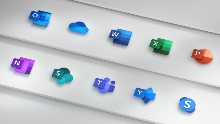
In late 2018, Microsoft announced a big redesign of the icons for its Office apps. The new set replaced the flat and simple variants introduced in 2013 in an attempt to "honor heritage and welcome the future." Now, six years later, Microsoft is cooking another set of icons for its productivity apps, and it wants to know what you think.
User jbgski on X posted a screenshot of the redesigned Office apps icons that Microsoft included in an email survey, asking users to help the company "better understand preferences and opinions about our exploration of different iconography designs for Microsoft 365." To offer users an extra incentive, Microsoft is giving $10 gift cards to each survey participant.

Judging by the email's wording, the offered icons are likely not final, and they might ship in a slightly different form (if they ship at all). It also looks like Microsoft wants to align all of the Microsoft 365 apps with the look of the new Outlook app, which so many people openly hate. The offered variant looks more vibrant with more gradients, rounded corners, and volume or depth to each icon.
The new icons also align better with the recent redesign that the company announced for its illustrations in September 2024. Microsoft is now leaning towards more skeuomorphic and 3D-like icons and illustrations after over a decade of mostly flat design across its operating systems, apps, and services. You can read more about Microsoft's new design concepts in a post on the Microsoft Design website, where the company also hosts its multiple wallpaper collections, including the recent 50th-anniversary images.
Do you like the new icons for Office apps? Share your thoughts in the comment section.


37 Comments - Add comment