Visiting websites designed primarily for desktop viewing on phones is fairly straightforward thanks to web browsers on Android and iOS. Doing the opposite, however, can be a bit of a challenge. If you'd like to view the mobile version of a site on your desktop for whatever reason, we've got you covered.
Here's a simple guide to show you how to view mobile versions of sites on desktops. This tutorial will work on Google Chrome and Microsoft Edge.
Step 1: Open up the website on the desktop browser of your choice. We've chosen Chrome for this guide but Edge will do as well. Once the page has loaded, press F12 to toggle the developer tools.
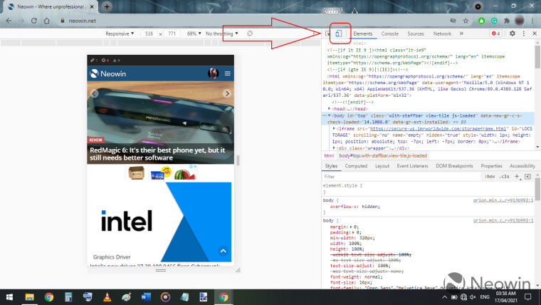
Step 2: Once the dev tools have opened up, find and locate the device toggle button that we've highlighted in the image below and click on it.

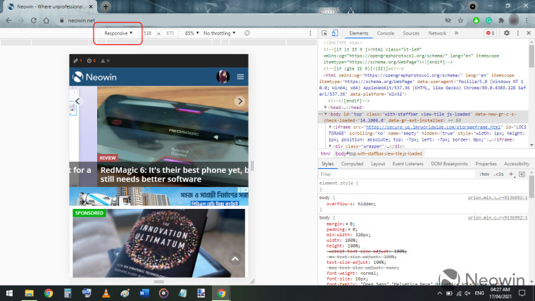
Step 3: You can click on 'Responsive' to select the device that you want to simulate. A drop-down menu with several options to choose from will appear. Alternatively, you can also customize the resolution of the simulation to suit your needs.

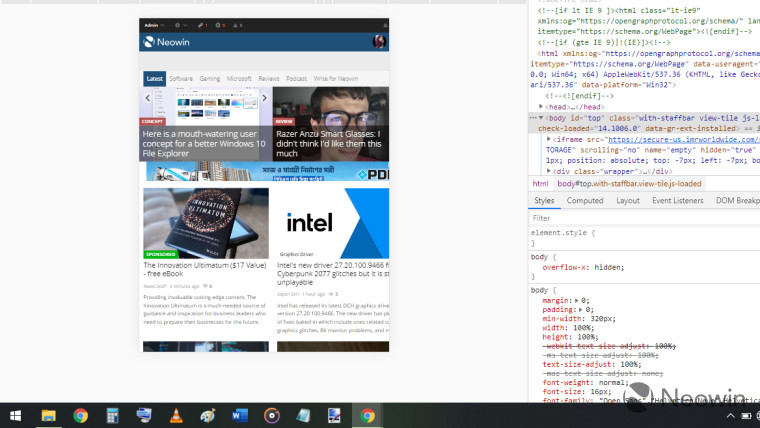
You can find sample mobile simulations of the same website on Chrome and Edge for your comparison in the below images.
| Google Chrome | Microsoft Edge |
|---|---|
 |
 |
We hope you found this short guide easy to follow and helpful. If you have any questions or requests, let us know in the comments below!


3 Comments - Add comment