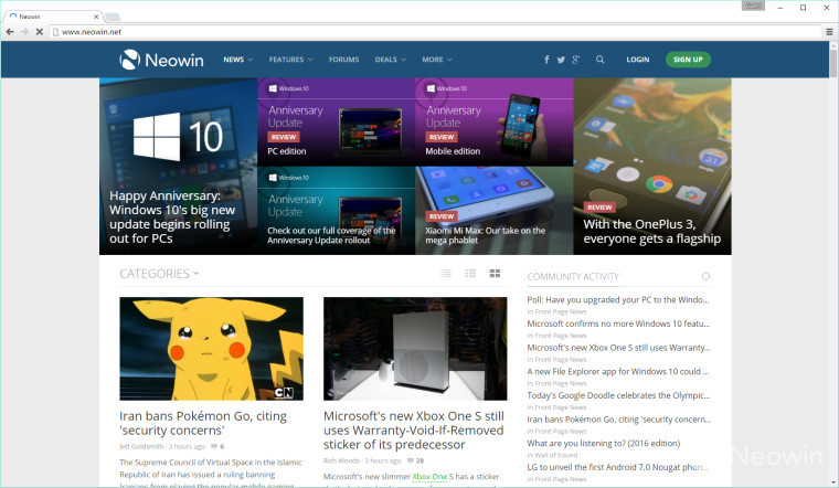
Along with the release of Chrome 52, a lot of users reported having a refreshed Material UI for Chrome switched on by default. Some of the people who had it switched on by default didn't like it, and some people who didn't have it switched on by default want it, so here's how to toggle it either way.
1. Go to the address bar and type in chrome://flags and hit Enter/Return (protip: typing chrome:flags gets you to the same place with less characters)
2. Scroll down to or CTRL+F for "Material design in the browser's top chrome", which should look something like this:
3. Switch it to either "Default" for the original Chrome look or to "Material" for the new Material UI. When you do that, you should get a little message saying that you need to restart Chrome for the changes to be applied:

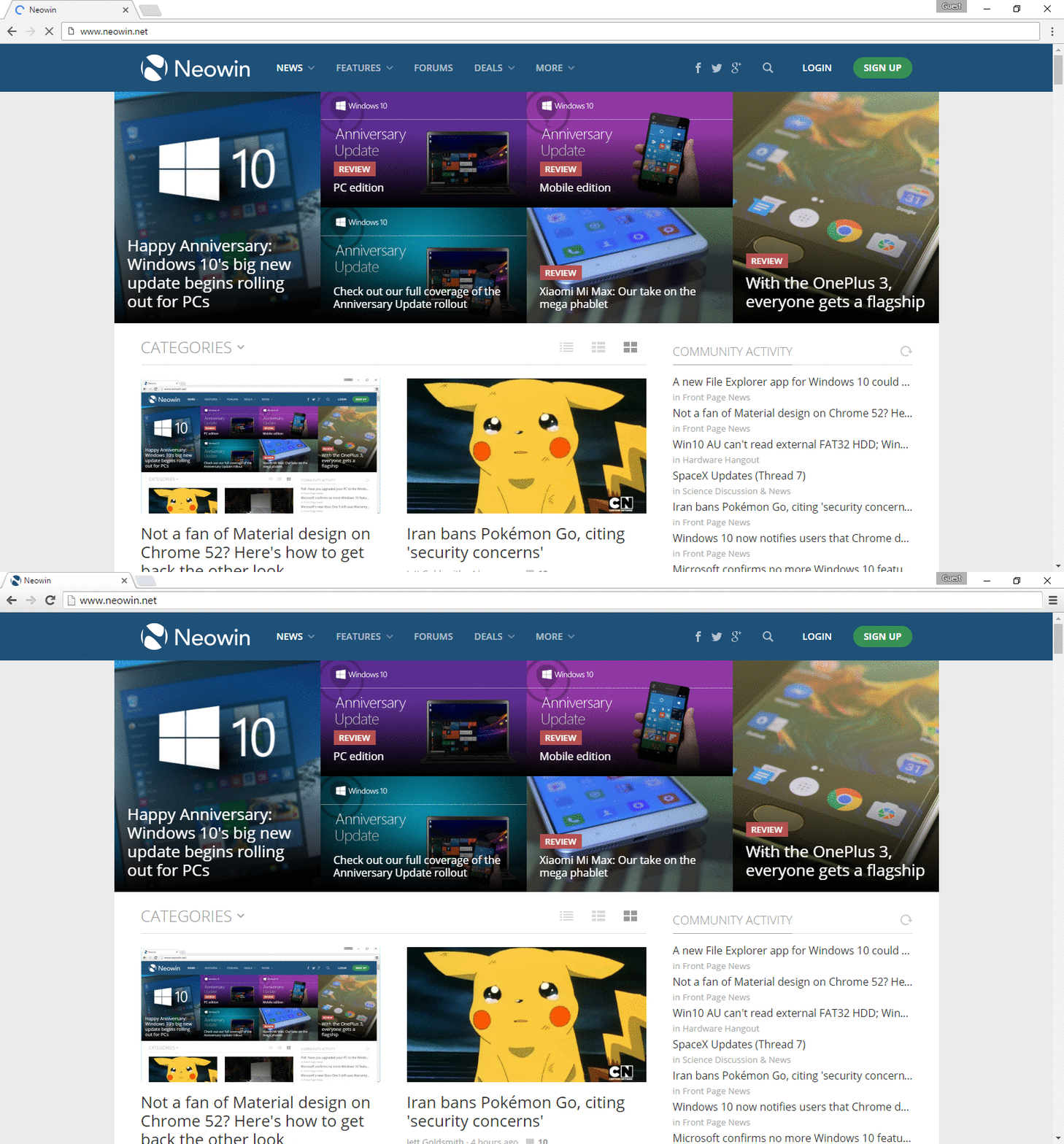
4. Hitting the blue "Relaunch Now" button would then restart Chrome and apply the style changes. Once it's back up, you'll end up with the new look. If you were coming from the new Material design back to the old one, you should end up with a Chrome window that looks something like the one below.

The differences extend all the way through Chrome with various levels of change - a more dramatic change is, say, the download manager that appears at the bottom of the Window. The download manager is completely different in size, shape, how it looks and to some degree on how you would interact with it as well.
Below is a gif illustrating the differences on just a general tab:


41 Comments - Add comment