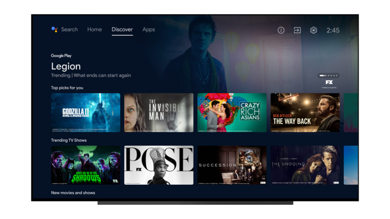
Google is giving Android TV a major UI redesign that's similar to the Google TV UI available on the new Chromecast. The updated design will introduce three new tabs on the homescreen: Home, Discover, and Apps.
The Home tab is the one that Android TV users will see by default when they start their TV. Its UI is similar to that of Netflix, with apps and content recommendations being shown in a carousel. The Discover tab will show content streaming recommendations based on your viewing history, what's trending, and more. Lastly, the Apps tab will show a row of all the apps installed on your Android TV.

The updated Android TV UI will start rolling out for all smart TVs and set-top boxes running Android TV in the United States, Australia, Canada, Germany, and France from today. A wider rollout in other countries will follow in the coming weeks. There was no word from Google on whether the updated UI will be available for all Android TVs irrespective of whether they are running Android TV 9 or Android TV 10.
Google does intend to bring the new Google TV UI to Android TV and it is possible that this is a stop-gap solution from the company until that happens.


17 Comments - Add comment