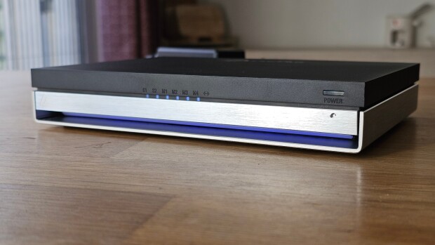
The M4 Mac mini was supposed to turn heads with its sleek new design, but instead, everyone has been buzzing about one major issue: the power button placement. Laptop Mag reports that some have even gone as far as 3D printing extenders just to make it easier to press. Since the redesign dropped, the power button has basically stolen the spotlight.
Reactions are all over the place. A lot of people are not happy about having to tip or lift the mini just to turn it on or off, especially when it is all hooked up to cables. Not exactly convenient. Some people are really vocal about it, calling it a “dumb design choice” and comparing it to other Apple products with similarly awkward design choices (looking at you, Magic Mouse charging port).
Apple finally addressed the issue in an interview, where execs John Ternus and Greg "Joz" Joswiak basically said, "You don't really use the power button that much anyway." They also explained that the ultra-compact design of the M4 Mac mini is what forced them to put the button on the bottom. While this is likely an attempt to bring the conversation back to the Mac mini’s impressive size, is it a fair excuse to brush off the complaints?
It really depends on how you use your Mac mini. If you mainly use it as a desktop, the power button is not something you hit often, so maybe Ternus and Joswiak have a point. But the new Mac mini is so small you might take it on the go like a laptop. In that case, you will be using the power button a lot more, and the awkward placement could be a pain.
At the end of the day, the power button placement is not a huge deal, kind of like the odd charging port on the Magic Mouse.


54 Comments - Add comment