Windows 11's general availability date is a little over two weeks away. Starting from October 5, the OS will begin to roll out to supported PCs in a staggered manner. Given its nearing release date, we have been taking a look at some of its features and capabilities in more detail in our ongoing Closer Look series.
So far, we have taken a look at Search, Widgets, the Start menu, Snap Layouts and Snap Groups, the Taskbar, quick settings and notifications, Virtual Desktops, power and battery settings, default apps configurations, and File Explorer in Windows 11. Today, we'll be taking a look at a relatively smaller feature, namely the Windows 11 context menus (or "right-click menus", depending upon what you call it).
For the purpose of this hands-on, we'll be taking a look at Windows 11 build 22000.194 that was released to the Beta Channel a week ago versus a publicly available and up-to-date Windows 10 (version 21H1 build 19043.1237). As usual, it is important to note that the OS is still under active development so it's possible that some of the features we talk about may change by the time of Windows 11's general availability.
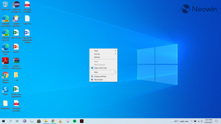
Starting off with Windows 10, you can essentially open the context menu by right-clicking on items. That essentially displays a menu containing some quick settings and configurations options. For example, in my case (screenshot above), when I right-click on the desktop, I get some basic settings related to desktop customization, some configurations related to display, and another "Open with Code" option because that was an association created when I installed Visual Studio Code on my laptop. Options that are not available are grayed-out, such as "Paste" and "Paste shortcut" in the screenshot above because I have no items on my clipboard to paste.
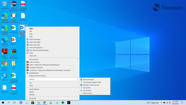
Depending upon the item you right-click on, the context menu will expand to show all the available options to you. For example, when I open the context menu on a Microsoft Word file on my desktop, I get new options and third-party associations with Notepad++ and WinRAR, along with native associations like Microsoft Defender. Some items also have hierarchical or nested menus that you can explore by hovering over the relevant option, as can be seen in the screenshot above. The same behavior is mimicked in File Explorer. Essentially, the context menu offers quick access to some configurations that may be useful for the item that you are interacting with.
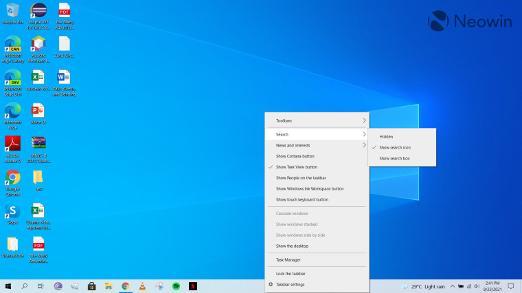
While you would like to think that the design language of the context menus is same across the OS, this is unfortunately not the case. A prominent example of this is the taskbar context menu (screenshot above), which seems to have a completely different UI compared to the ones for desktop and file items.
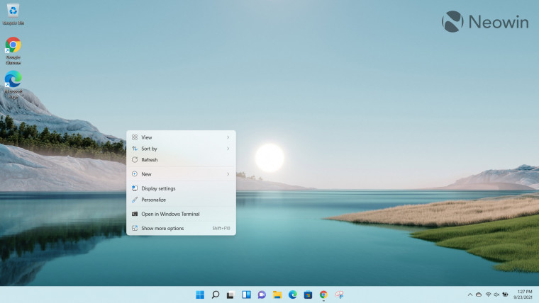
Coming over to Windows 11, you'll notice that Microsoft has significantly revamped the design. You get brand-new iconography along with the rounded corners that is a staple design pattern in the OS. When you right-click on the desktop, you'll see a somewhat familiar context menu that contains all of the settings from Windows 10. It also adds a "Open in Windows Terminal" option by default.
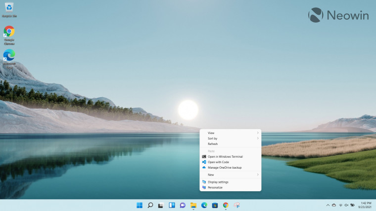
However, if you'd rather use the legacy context menu, you can press Shift + F10 or just click the "Show more options" item in the context menu to open it. Microsoft has emphasized that it has not removed any Windows 10 context menu functionality completely from the new OS as of yet.
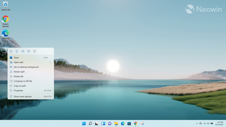
The difference between the context menus present in Windows 10 versus Windows 11 is a bit more evident when you right-click on a specific item like a file. In the screenshot above, I simply pasted an image file to my desktop and right-clicked on it. The first thing you'll likely notice is that certain Shell verbs or common commands such as Cut, Copy, Rename, Share, and Delete have been moved to a simplified ribbon on top of the context menu, similar to the design of the File Explorer. If you have an item on your clipboard, this ribbon will automatically adapt to show you the Paste icon where relevant. The rest of the options are present in a list along with a default "Copy as path" utility which I think will be quite useful especially when you're writing code and quickly want to copy the path of the file to utilize in your code. The capability is present in Windows 10 too but is accessed in an indirect way.
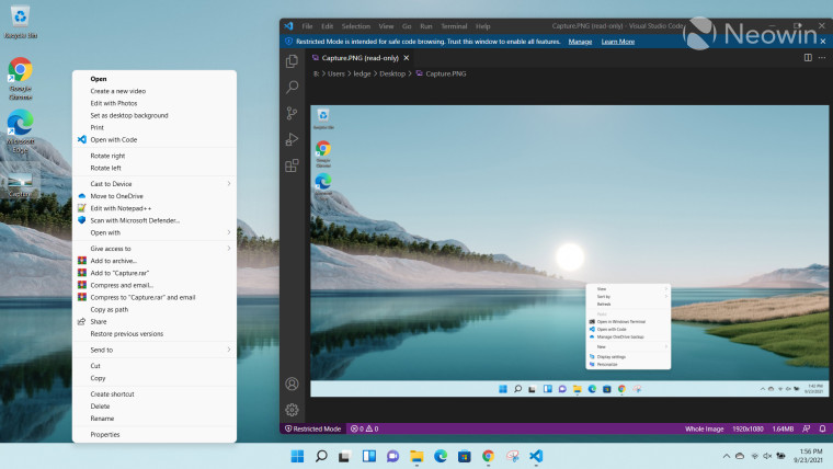
However, you'll also notice that other associations such as those for Visual Studio Code (yes, it can open images), WinRAR, and Notepad++ are noticeably absent. While you can still access them by using Shift + F10 or "Show more options" via the legacy context menu (screenshot above), this is very much an intentional design change.
Microsoft argued back in July that the reasons for this UI revamp are that the Windows 10 context menu is overly long, common commands are not grouped together, and it also contains options that are barely used. I'm somewhat inclined to agree. The context menu present in Windows 10 is indeed too cluttered and unless you have developed muscle memory for what option you want to actually use, sifting through the entire list is fairly overwhelming, depending upon all the associations you have linked with first- and third-party apps.
However, this design change also begs the question: Will people always have to click on "Show more options" to utilize the legacy context menu if they don't find the relevant item in the list? The short answer is "no". That's because Microsoft has stated that third-party developers can use app identity and IExplorerCommand to extend the context menu and have their app listed as well. Third-party items will be grouped separately below Shell verbs.
That said, this also means that the onus to have apps properly linked to the context menu for a quick action is solely the responsibility of the developer. As you may be able to discern, not many developers have made effort on this front yet, which can also be attributed to the fact that Windows 11 is not generally available yet. In fact, Microsoft's own "Scan with Defender" option is hidden behind the legacy context menu. Until developers update their software to work natively with Windows 11, the only way to access their verbs will be via the legacy context menu.

And oh, if you were wondering about whether the taskbar context menu is consistent with the other context menus, I have good news and bad news. The good news is that it is consistent, but the bad news is that it's so severely crippled that it contains none of the immediate functionalities that Windows 10 offered. I have discussed this in detail in my dedicated Closer Look piece about the taskbar in Windows 11.
All in all, I like the simplified context menus (except the one associated with the taskbar) as it's aesthetically pleasing to look at, and it's easier to find basic commands. However, I understand that power users will not be happy with some of the changes such as certain verbs behind hidden behind another context menu. That said, I hope the situation will improve once Windows 11 becomes generally available and developers start to update their apps to adapt to the OS.
What are your thoughts on the revamped context menu in Windows 11? Let us know in the comments section below!
Take a look at the section here or select from the links below to continue exploring Windows 11 in our ongoing "Closer Look" series:
- Closer Look: Search in Windows 11
- Closer Look: Widgets in Windows 11
- Closer Look: Start menu in Windows 11
- Closer Look: Snap Layouts and Snap Groups in Windows 11
- Closer Look: Taskbar in Windows 11
- Closer Look: Quick settings and notifications in Windows 11
- Closer Look: Virtual Desktops in Windows 11
- Closer Look: Power and battery settings in Windows 11
- Closer Look: Default apps settings in Windows 11
- Closer Look: File Explorer in Windows 11




28 Comments - Add comment