Windows 11's general availability is just a couple of weeks away, and while we have covered its main features from a bird's eye-view already, we have also been diving deeper into the capabilities on offer to provide our thoughts on the changes via our Closer Look series too.
So far, we have taken a look at Search, Widgets, the Start menu, Snap Layouts and Snap Groups, the Taskbar, quick settings and notifications, Virtual Desktops, power and battery settings, and default apps configurations in Windows 11. Today, we'll be taking a look at a crucial part of the OS - from an end-user perspective -, namely, File Explorer.
For the purpose of this hands-on, we'll be taking a look at Windows 11 build 22000.194 that was released to the Beta Channel a couple of days ago versus a publicly available and up-to-date Windows 10 (version 21H1 build 19043.1237). As usual, it is important to note that the OS is still under active development so it's possible that some of the features we talk about may change by the time of Windows 11's general availability.

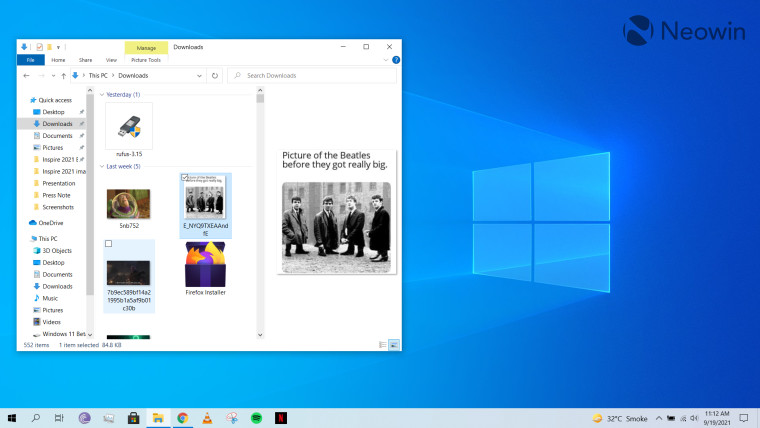
Instead of discussing the features and capabilities present in Windows 10 this time, I just want to focus on the UI of File Explorer. This is because it will take me a lifetime if I start writing about each and every feature. Frankly, I'm not even aware of all the capabilities it offers, and that's because my usage of File Explorer is highly dependent on my use-cases. There might be faster and better ways to perform the activities I do in File Explorer, but I don't Google (or Bing, or anything else for that matter) the most optimal way to complete a task on the software, unless I am blocked.
So, I'll just briefly talk about the UI. File Explorer offers a ton of customization options on this front, you could have checkboxes next to each item, file previews, file extensions, thumbnail size, sorting and filtering techniques, and whatnot when it comes to UI. There's also a ribbon which shows you categories like File, Home, Share, View, and more, depending upon the file you have clicked on. I find it quite satisfactory to use and I think it's a powerful utility to have.

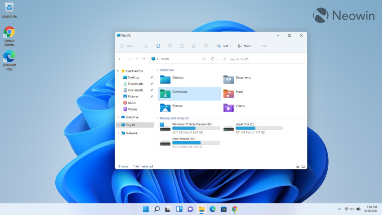
Coming over to File Explorer in Windows 11, the first thing you'll likely notice is the new icons for Windows folders like Desktop, Documents, Downloads, Music, Pictures, and Videos. This extends to other system icons like that for devices and drives as well as user-created folders. The new File Explorer also contains rounded corners, which is a design staple for Windows 11. I personally like the design revamp because it just feels fresher.
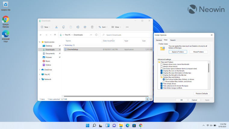
Another thing you'll likely notice is that Microsoft has done away with the traditional File Explorer ribbon, which has now been replaced with a set of quick action buttons. Depending upon the file you have clicked on, you'll see a set of quick action items such as New, Cut, Copy, Paste, Rename, Share, Delete, Sort, and View. This has all the options I need for most use-cases so I'm not bothered by this change at all. In fact, it simplifies the UI for me so I can quickly perform common tasks.

But if you're thinking about how you would perform other more advanced tasks, fret not. Microsoft has added a drop-down in the same quick actions pane that offers you some more customization, and groups other in the "options" category.

While I haven't done a one-to-one comparison between all the configurations present in Windows 10 versus Windows 11, but I was able to most of the options I was looking for. As stated previously, I have never used all the utilities available in File Explorer anyway, but Microsoft hasn't detailed any functionality being deprecated from File Explorer in Windows 11. So if the company did remove any functionality behind-the-scenes without announcing it, I am yet to find it.

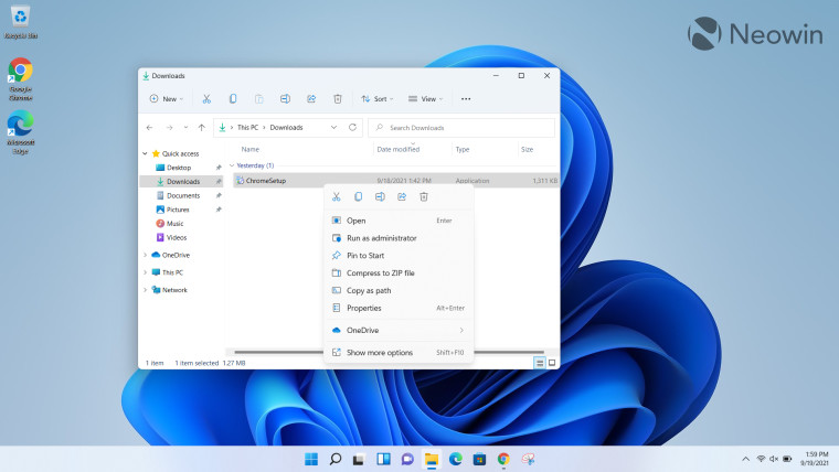
There is a new context menu (or "right-click menu", depending upon what you call it) and just like the simplified ribbon in File Explorer, you'll see a set of quick actions like Cut, Copy, Rename, Share, and Delete in the pane at the top followed by some other functionalities below it. All the other options that you are likely used to on Windows 10 have been moved to the "Show more options" setting. That said, this is not a File Explorer-specific setting but is similar across the desktop's context menu too. As such, I plan to cover it separately in a dedicated Closer Look article in the near future.
That's pretty much it when it comes to File Explorer in Windows 11. No new functionalities to speak of (or nothing that I have found yet) but a bunch of design changes that I welcome. The UI is much more simplified and easier to use, especially for people like myself who only use the most common functionalities.
That said, if there was one new capability I would really appreciate in File Explorer, that would be the ability to have tabbed instances in the same app. I think this would enhance my productivity tenfold. Microsoft announced this interface revamp under the brand name "Sets" back in 2017, but the project was shelved in 2019. It isn't a part of Windows 11 either, which is a bit disappointing. I wasn't expecting it to be there at all, but given the mockups and general enthusiasm we have seen for the feature online, I really hope Microsoft considers starting development on it again.
What do you think of File Explorer in Windows 11? Do you like the design revamp and simplification? Are there any features that are present in Windows 10 but not available in Microsoft's upcoming OS? What else would you like to see the company improve? Let us know in the comments section below!
Take a look at the section here or select from the links below to continue exploring Windows 11 in our ongoing "Closer Look" series:
- Closer Look: Search in Windows 11
- Closer Look: Widgets in Windows 11
- Closer Look: Start menu in Windows 11
- Closer Look: Snap Layouts and Snap Groups in Windows 11
- Closer Look: Taskbar in Windows 11
- Closer Look: Quick settings and notifications in Windows 11
- Closer Look: Virtual Desktops in Windows 11
- Closer Look: Power and battery settings in Windows 11
- Closer Look: Default apps settings in Windows 11


46 Comments - Add comment