The general availability of Windows 11 is just a month away, and for the past couple few weeks, we've been taking a closer look at the OS. The idea is to discuss its features in detail and to see how they stack up against those offered in Windows 10. The OS is under active development, but we feel that it's valuable for our readers who aren't in the Windows Insider Program to get a feel of what to expect, come October 5.
So far, we have taken a look at Search, Widgets, the Start menu, Snap Layouts and Snap Groups, and the Taskbar in Windows 11. Now, we feel like it's time to take a look at the quick settings and notifications center too since it has been revamped significantly as well, as discussed in our last Closer Look article.
For the purpose of this hands-on, we'll be taking a look at Windows 11 build 22000.176 that was released to the Beta Channel a couple of days ago versus a publicly available and up-to-date Windows 10 (version 21H1 build 19043.1165). An important change this time is that we are not using build 22449 which was also released to the Dev Channel at the same time. This is because Microsoft has now split builds from different branches and the Dev Channel does not represent what customers will be getting on October 5.
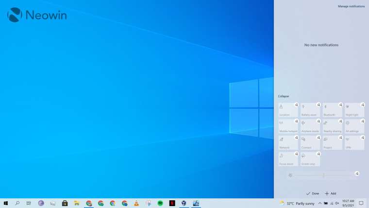
Windows 10 has a UI called Action Center that can be accessed from the icon on the extreme right of the taskbar. This collectively shows you all your quick settings on the bottom half of the panel on the right and all your notifications on the top half of the same panel. It's fairly straight forward to use; you can open or swipe notifications, or utilize and unpin your quick settings directly from one place.
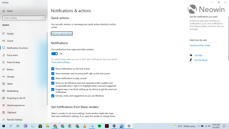
The associated settings are quite straightforward too. You can edit quick actions, disable notifications from certain senders or configure other cosmetic things like sounds.
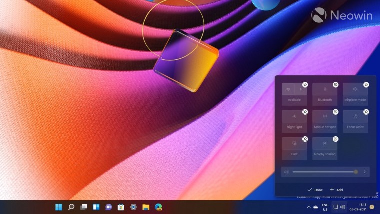
When we go to Windows 11, the situation is considerably different. The major difference is that Microsoft has split quick settings and notifications into their own separate trays. The quick settings panel can be displayed when you click on any of the system icons (such as volume or internet connectivity in the screenshot above). Similar to Windows 10, you can right-click on any of the quick settings, choose the "Edit quick settings" option, and unpin or add more settings. A faster way to do this is also via the "pencil" icon that you can see in the bottom-right corner of the panel.
The drawback of this approach is that in Windows 10, you could click on the system icons on the taskbar to open only the settings relevant to that icon. For example, if I click on the volume icon in the taskbar on Windows 10, I just get a volume slider in a pop-up. Clicking on the same in Windows 11 opens all the quick settings which I personally find a bit annoying as it wastes screen estate.
_story.jpg)
Similarly, notifications now have a separate panel too. Whenever you get a notification, you'll get a badge next to the date and time on the taskbar. Clicking on it will open the calendar at the bottom and the notifications area at the top. I don't know why Microsoft has coupled the calendar and notifications area in Windows 11, I personally haven't found a productivity use-case for it yet.
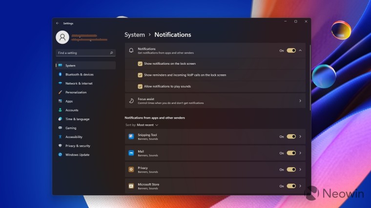
The associated settings for notifications and quick settings are mostly the same, there's not much to talk about except that they are grouped a bit better.
Overall, I appreciate the fact that Microsoft has decoupled notifications and quick settings in Windows 11. It makes sense from a usability perspective and saves up a lot of space that previously used to be taken up by the Action Center panel on the right of the screen when you opened it. Now, you get relatively smaller and more manageable panels.
But talking about screen estate, the fact that I have to see either all the quick settings or none of them bothers me. I liked the simplicity of Windows 10 where clicking on the volume system icon only opens a slider, but in Windows 11, I have to look at the whole panel of quick settings, which is a waste of space. The system icons behavior for quick settings definitely needs to be decoupled, and maybe Microsoft should add a dedicated system icon for quick settings à la Action Center - but only for quick settings - in Windows 10.
In the same vein, the fact that notifications open alongside the calendar is a bit of an odd design decision too. Maybe I'm missing some popular use-case but I personally think it wastes more screen estate. It might be worth it to give users an option to add a dedicated system icon for this too.
Overall, I like the direction that Microsoft is going in, but given the seemingly odd coupling of certain system icons, I'm not sure if I prefer it over the Windows 10 implementation yet. Personally, I feel Microsoft needs to invest some more effort into its design before the general availability of Windows 11.
In the meantime, what are your thoughts on the quick settings and notifications panel in Windows 11? Do you like the changes? How would you like to see Microsoft enhance it further? Let us know in the comments section below and inform Microsoft via the Feedback Hub too.
Take a look at the section here or select from the links below to continue exploring Windows 11 in our ongoing "Closer Look" series:






16 Comments - Add comment