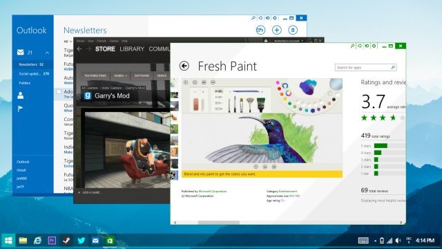
Even though there are rumors that Microsoft may be working on restoring the Start menu to a future version of Windows, there are still plenty of people who have their own ideas on how the company can improve on the current Windows 8.1 user experience. This week, a 20-year-old designer named Jay Machalani offered up a highly detailed proposal for Windows 8.2 that not only includes a version of the Start menu, but seems to successfully merge the Desktop and Start screen interfaces.

Machalani, who labels himself as a "UX/UI & Branding Architect" on his website, has been working on his future Windows design for a few months. He writes that he personally "loves Windows 8" and that he thinks it is "the best OS for productivity and awesomeness." That being said, he also thinks Windows 8 "is filled with massive flaws."
In a post entitled 'Fixing Windows 8', his concept for Windows 8.2 attempts to bring back a revamped Start menu to the Desktop UI, but one that has a Modern look and feel. Machalani states:
You can make it bigger or smaller, pin your apps and live tiles, resize them, get a quick access to the Classic apps Jumplist (loved that feature from Windows 7), access the notification center, settings, power options and search. It makes sense.

The Modern Start screen has received a smaller makeover in Machalani's concept. There's a 'Computer' section that offers a quick way to look at a PC's file structure, along with any connected hardware devices like a smartphone. The Charms bar has also been modified so that it brings up any notifications.

The concept also allows for Windows 8 apps to run on the Desktop UI and even for Modern and Desktop apps to be operated at the same time. Machalani has put a lot of effort into this design and he won't mind if some of his ideas show up in a future Windows release. He states, "Microsoft this is all yours, please take all of it."
Source: Jay Machalani via The Verge | Images via Jay Machalani


91 Comments - Add comment