Early last month, speculation heated up rather quickly with regards to a possible acquisition of GitHub by Microsoft. In fact, it only took a bit over two days for the acquisition to be formally announced by the latter for a rather sizeable $7.5 billion, a significant hike from initial estimates of $2 billion. Google would later reveal that it was also in the running to snatch up the world's largest source code repository.
Unsurprisingly, not everyone wasn't happy about the news, with tens of thousands of projects jumping ship to other platforms before the deal was made official, for a number of reasons. But now, it seems that one developer has sought to add a touch of bygone Windows to the GitHub interface courtesy of a user style.

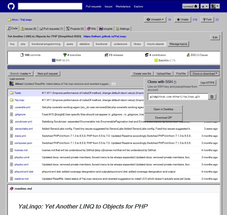
Dubbed "GitHub Windows Edition", the style transforms the GitHub interface into something clearly inspired Windows 95 or 98, if you happen to remember what they looked like back in the day. Most prominent are the dark blue title bars, gray form backgrounds, dated icons, and a variety of two-decade-old icons.
If you're feeling nostalgic, the user style works best with Chrome and Firefox used in conjunction with either the Stylus or Stylish extensions. However, there are a couple of known issues at the moment, specifically:
Due to requirement of elements to have multiple borders, size of some controls like buttons has been changed. If GitHub uses pixel sizes for buttons, they may be cut by a few pixels.
Due to tooltips being children of controls, they change full control size, so focus borders may be displayed incorrectly.
If you're interested in finding out how to install GitHub Windows Edition you can follow the instructions over on the code repository.
Source: The Register


22 Comments - Add comment