On the front-end, Google's Gmail has only received minor updates in the past few years. However, that is set to change soon as the company has now announced a new unified user interface that makes it easier to switch between applications.
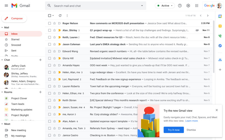
As a reminder, here is what the current interface looks like:

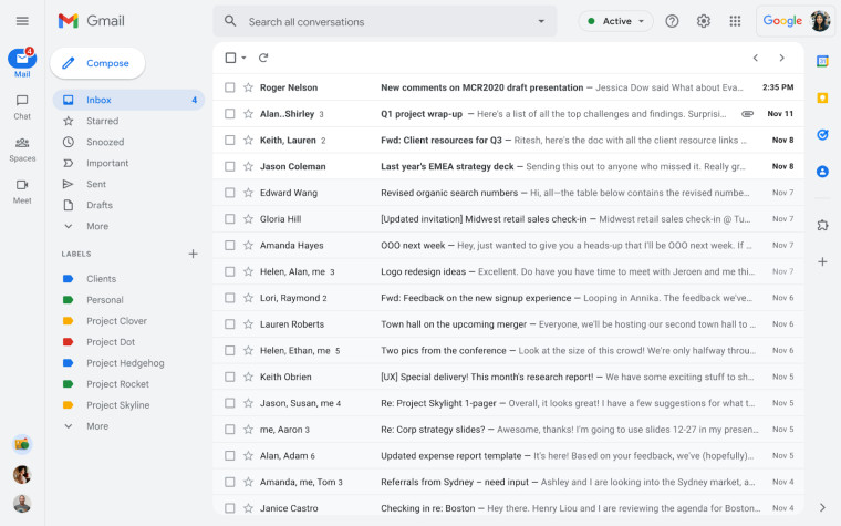
As you can see in the screenshot above, users will be prompted to optionally try out a new user experience for Gmail. Once they opt-in, this is the interface they'll get:

At first glance, it appears to be somewhat similar to Microsoft's Outlook, even though there are some differences. Applications are neatly tucked away in the left pane whereas options for labels and emails are now shown in full next to them too. With the applications being in their new position, you don't need to switch between tabs or windows in order to use Chat or Meets, you can do that directly in the same browser window. Notification bubbles will also be shown for each application. Moving forward, Google will also offer an unified search experience so that it shows results from integrated applications such as Chat too.
The new interface will be rolled out to everyone except Workspace Essentials customers, and admins won't be able to disable it. From February 8, users will start seeing the opt-in banner, whereas from April, even those who have not opted in will get the new UI with the ability to roll back to the classic interface.
By the end of Q2 2022, this will become the standard UI for everyone and it will not be possible to roll back. A streamlined navigation experience will also become available on dedicated Chat on the web and users will not be able to move Chat windows to the right side of Gmail.
_small.jpg)


66 Comments - Add comment