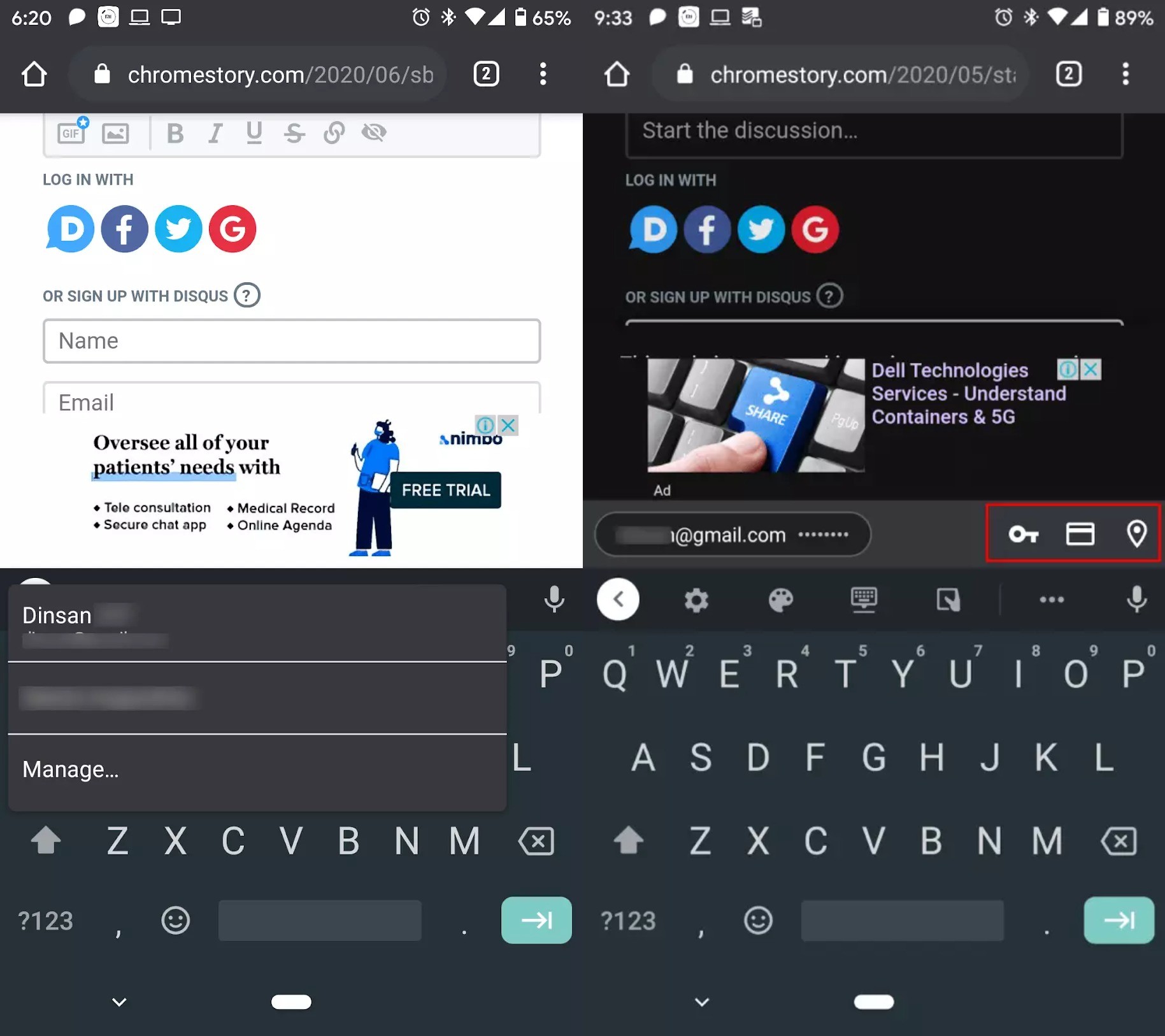
Google will soon roll out a new autofill UI in Chrome for Android which is currently available in the dev build of the browser. The new UI is noticeably better than the old one which displayed a drop-down list with all the available information whenever one tapped on a text box on a web page. This ended up blocking other elements on the webpage and did not really provide a good user experience. In comparison, the new UI puts the autofill content in a bar above the keyboard that looks sleeker and better designed. It provides quick shortcuts to passwords, addresses, and cards. The bar also scrolls horizontally to display more information whenever available.

The new UI is going to be useful for people who have multiple addresses or details linked to their Google account and it makes the process of selecting different parts from multiple addresses easy. A handy feature to have if the autofill feature in Chrome is not working with a particular site or you need to mix and match addresses for some reason.
As of now, the new autofill UI is a part of Chrome dev for Android 85 and it should likely make its way to the stable version of Chrome for Android 85 due to be released in August.
Source: ChromeStory


