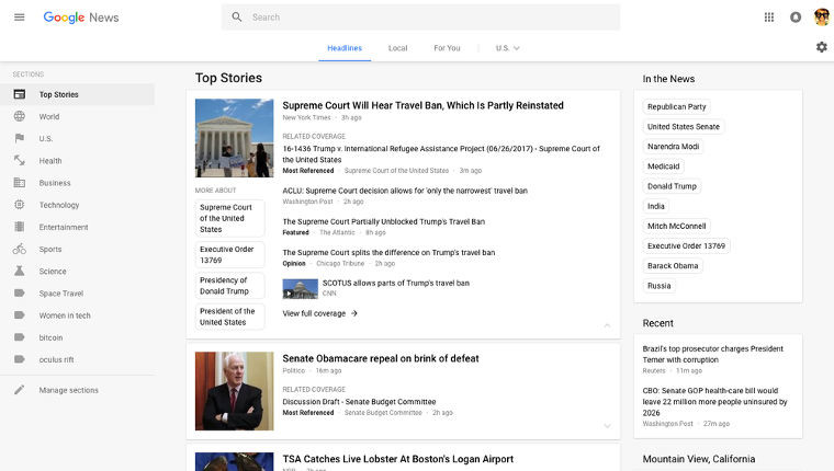
Much of the Google ecosystem has had a UI upgrade and now uses Google’s Material Design with a card format. Google News has been one of the longest holdouts, looking quite dated in comparison to the rest of the ecosystem; but as of Tuesday, Google has changed this by revamping the news aggregation website.
The new look, which is now a lot cleaner and less uncluttered, is designed to be easier to read and navigate. The main things to look out for are:
- A card format which makes it easier to browse, scan and identify related articles about a story.
- The new layout focuses on key elements, such as publisher names and article labels, and maintains your view and place on the page as you click in and out of stories and explore topics.
- Google dedicated the navigation column on the left to sections that can be customised. You can jump quickly to news you enjoy, whether it’s standard sections like Sports or Entertainment, or those created by you and powered by your queries, such as “FIFA World Cup” or “Bollywood.”
In its blog post, Google further explained that the navigation bar at the top of the page has also been included to help you more easily sort news:
“At the top of the page you’ll notice a new navigation bar for “Headlines,” “Local” and “For You.” Upon signing in, you can personalize the “Local” and “For You” tabs. In “Local,” you can track stories from any part of the world that you care about—from your hometown to where you do business to where you went to school. In “For You,” you can pinpoint niche interests and create your own mini news feed, whether it’s following your favorite team, or satisfying your inner geek with news on cool gadgets and gizmos.”
Google says that the new UI update will roll out globally in the coming days.
Source: Google


5 Comments - Add comment