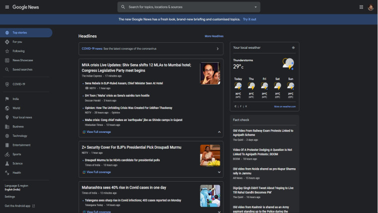
Google News has been updated with a major visual overhaul, along with changes that reflect its priorities in journalism. The redesign features a clutter-free UI, with focus on local news, top stories, and the topics you actually want to read about.
You can slide the image below to see the old and new UI of Google News:


There's also a new fact-checking section that shows the original claim next to a headline. Following the headline, it shows fact-checks from independent sources that tell whether the claim is false or not.

The "Your Topics" section is now customizable as well. Simply click on the Customize button on the top right and you can follow the topics you really care about, while removing the rest.
With the redesign, Google News is officially returning to Spain as well. In December 2014, Google dropped the local news offering in Spain as a law would have required paying publishers to use their content, including headlines.
However, a newspaper coalition pushed Google to restore news and Google announced plans for a revival last November. According to the new deal, Google could negotiate licenses with individual publishers instead of having to pay all of them.
The updated website is also supporting the Google News Initiative that is a campaign to support newsrooms for a long-lasting, diverse, and innovative news industry. Google has also started taking applications for the Global News Equity Fund that is meant for news for minorities and underrepresented groups.
Google is also funding $1 million for the Data-Driven Reporting Project that assists communities that have data-heavy investigations.

This year, Google News marks its 20th anniversary. The redesign now gives local news more priority, while also making sure what people read is relevant to them.

_small.jpg)


2 Comments - Add comment