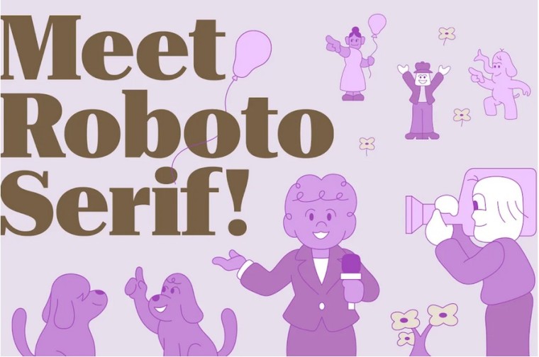
Google has developed Roboto Serif, a new typeface that attempts to make reading online easier. The new font still uses the same vertical proportions of Roboto Sans, which makes mixing the serif and sans-serif easier with little to no visual jarring.
Serif fonts have long been considered easier on the eyes. This is primarily due to the distinction each letter enjoys. The emphasis on the individuality of each alphabet in a word, gives the content a pronounced effect, making the entire text a lot easier to decipher quickly. These fonts, however, tend to take a little more space, making the sentences, and the content, appear longer.
Google has indicated that Roboto Serif addresses these limitations by tweaking the design of the font. The new font seems to have dynamic visual elasticity, which means it can automatically change and optimize the letterforms for different sizes of modern displays. In other words, Roboto Serif should look just as good, clean, and legible on a smartphone as it does on a large monitor.
Rob Giampietro (formerly of Google Fonts, now a UX manager at Google) initiated and guided the early development of the typeface with Greg Gazdowicz of Commercial Type. While speaking about the reasoning behind the new font, he said:
We wanted it to feel comfortable next to a sans-serif, and not to feel cluttered. It doesn't need to have serifs everywhere to drive home the point that, ‘I am a serif and have serifs in all the places serifs go
Greg Gazdowicz, the creator who collaborated with Google to develop Roboto Serif says:
Our aim has been to make a typeface that you could use for long-form journalism or a novel—something very long and involved; an immersive piece of text that you read on your phone—without wanting to complain about it.
Gazdowicz and his team reportedly “atomized” the letterforms, breaking down the serif typeface to its elemental parts. Then they built them back up by experimenting with various proportions, contrast types, terminal shapes, and serif shapes to find out what was most legible for each character.
Roboto Serif is open source and available now from Google Fonts. Last year, Twitter introduced “Chirp”, a font the platform specifically designed for the micro-blogging network. Google's Roboto Serif attempts to serve a completely opposite purpose: reading content with a lot of words, with the promised benefit of remaining comfortably legible on different-sized displays.


5 Comments - Add comment