Google Translate for the web was starting to look outdated in terms of its user interface, even more so since the search giant began rolling out its latest Material Theme design to its other products and services over the past several months. The initiative kicked off after the Google I/O conference earlier this year, with Google Drive and Chrome (version 69) having been recently revamped in line with that design, among other Google services.
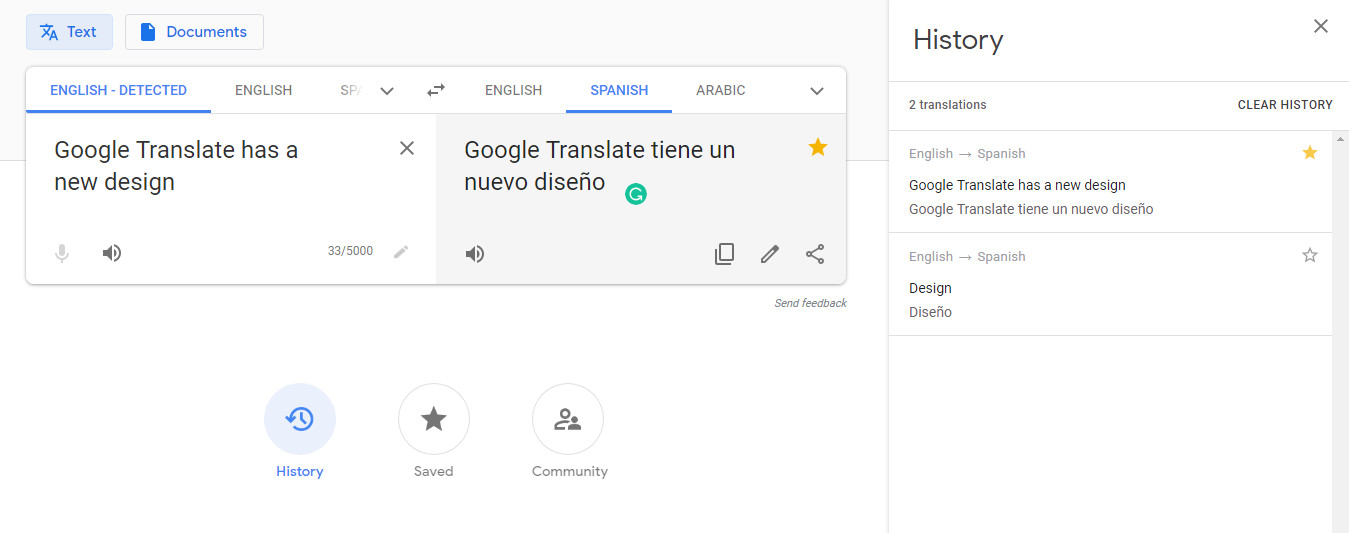
Now, it's Google Translate's turn. The Mountain View-based internet giant announced a new design for the multilingual machine translation service on the web, making it similar in theme with other Google products. Additionally, it's now easier to upload documents to be translated as that feature now sits next to the button for translating text.

Google Translate also adds three new buttons placed at the bottom to let you access History, Saved, and Community. With the History button, you can view the previous translations made by the service for you, displayed on the ride side. The Saved button allows you to pull up your saved translations, with the ability to sort and export them to Google Sheets. Plus, there's a language pair tag for each saved translation that makes sorting much easier.

Additionally, there's a new Community page that enlists volunteers to sign up in order to help improve Google Translate for the languages they speak. Finally, the service has received a responsive design that dynamically adjusts to your device's display, be it on mobile or PC.

The redesigned Google Translate for the web is now widely available, and you can check it out on its website.


7 Comments - Add comment