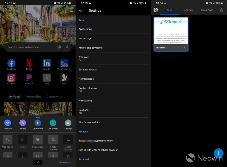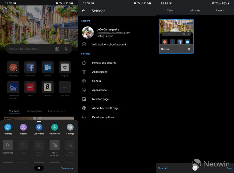
Today, a new version of Microsoft Edge for Android, from the Canary channel, was spotted on the Google Play Store. This release follows up on a promise Microsoft made a few weeks ago during its spring Ignite event, where it said it would be unifying the codebase for Edge across the desktop and mobile versions.
While Edge for Android was already based on the Chromium engine, it's actually using a fairly outdated version of it. If you visit whatsmybrowser.org in the stable release, you'll see that it says you're using Edge 77, while on desktop, Microsoft just released Edge 90 this week. With the new Edge Canary for Android, you'll now see Edge 91, which is the same version you'll see in Edge Canary on the desktop.
With that change come some significant performance improvements. We ran a couple of benchmarks on browserbench.org on both the stable release and the Canary version to see how big of a performance difference they would have. Starting with Speedometer, we can see Edge Canary handily beating the stable release by a pretty significant margin, and with less deviation from its average score, too.

|

|
We also ran JetStream 2, which specifically focuses on JavaScript and WebAssembly for advanced web applications. Edge Canary obtained a score of 95,381 while the stable release only managed 86,187.
In terms of real-life performance, our short time with the browser showed that it ran very smoothly, and potentially more so than the current release, though it was difficult to see a clear-cut difference.
But that's not all that's changed with this release, as there are a handful of UI changes as well. For starters, the first-time setup experience has been streamlined, and it also has a few more options now. For example, when setting up sync, you can now choose to sync your history and open tabs, while the stable release would force you to go into the settings after the fact to enable it. You can see a comparison of the two setup experiences below.


The UI changes continue when using the browser. Icons across the browser seem slightly larger, which makes the interface feel a bit more lively. The tab management page also looks a bit different.


The settings page has also seen a major revamp, and it looks much more organized and streamlined. For now, some features are still missing, like the coupons, news ratings, and content blocker that were developed in partnership with well-known browser extensions. However, Edge's tracking prevention feature is already here if you're worried about being tracked on the web.
We've also noticed that Edge Canary is a bit more animated, specifically when opening the tab management view. It's still buggy, but there's a new animation when entering the tab manager and choosing a tab, as you can see below.

Edge Canary also has a new extra feature, when you go into the sync settings and look at your saved passwords, you now get the option to use Edge as an autofill provider for other apps, similar to what you can do with Microsoft Authenticator.
Something we've noticed in our testing is that if you add a website to your home screen as a PWA, it now shows a navigation bar at the bottom, which blocks part of the content of the page. This is most likely a bug, something to be expected in a Canary build.
Finally, the last big change is that you can now head into edge://flags to customize certain hidden browser features. For example, you can enable the "Force Dark Mode for Web Contents" flag to make every website have a dark theme - one of my personal favorite flags to use.
That's all we've managed to uncover in this release of Edge Canary so far, but it already looks promising compared to the stable release. If you'd like to try it out, you can download Edge Canary from the Play Store.
Have you found something we didn't? Let us know in the comments below!


11 Comments - Add comment