The next few weeks will see numerous major elements of Microsoft’s global rebranding effort coming together, as the company continues one of the most ambitious and far-reaching design updates in corporate history. The branding overhaul goes beyond creating a family of new logos, of course, extending deep into the company’s product portfolio.
Before the year’s end, perhaps the single greatest component in this strategy – the dramatically redesigned Windows 8 operating system – will finally be released to consumers, while Windows Phone and the Xbox 360 will also see updates, building on the new design language that that they’ve already embraced.
But while some dislike this new look, and others simply adore it, there’s one thing that we can all agree on: no-one knows what to call it.
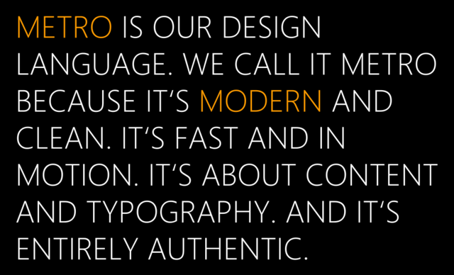
This is a problem that’s been created, and then exacerbated, by Microsoft itself. The design language itself is not a new development; it’s an evolution of the typography-dominated style that originated in Windows Media Center and Zune, and which the company came to refer to as ‘Metro’ with the release of Windows Phone 7.

But in early August, we got the first indications that Microsoft might be backing away from the Metro name, with a report the following day claiming that MS employees had been directed to use the term “Windows 8-style UI” instead. Just a week later, references on Microsoft’s own website pointed to newer terminology: the “Modern UI”.
Yet even as that nomenclature has seen increasing adoption, Microsoft hasn’t exactly been consistent in its usage. Perhaps more of us should have taken note of the words of caution tweeted in late August by Windows developer and blogger Rafael Rivera:
Modern is not an official replacement for Metro (yet?). Let's all be careful when using that word in our stories.
— Rafael Rivera (@WithinRafael) August 22, 2012
Now, it seems, Microsoft has introduced another term to define its design language: the “Microsoft design style”. Multiple references are made using this terminology on the ‘Make great Windows Store apps’ page of the Windows Dev Center and – perhaps more significantly – on a page entitled 'Index of UX guidelines for Windows Store apps'. (Further references can be found on pages linked to under 'Sources' at the end of this article.)

So why, after so many lurches from one term to the next, should we even begin to hope that this one might be ‘final’? It’s a leap, certainly, but there’s a degree of common sense to it. Microsoft’s design language extends beyond UIs and into core branding, marketing materials, signage and other promotional assets. Indeed, what Microsoft has created is a universal design system that encompasses not just a UI, but its entire brand identity, both on screen and off, interactive and static, and which is expected to remain 'modern' for some time to come without needing to hang that label upon it.
This design language defines Microsoft itself, not just the look of its products. It may lack the finesse of the popular ‘Metro’ name, but it makes perfect sense to call it the ‘Microsoft design style’.
Given how this saga has unfolded, though, don’t be too surprised to see another name next week…
Sources: Windows Dev Center ( 1 | 2 | 3 | 4 | 5 ) | via: WMPowerUser | Top image via Wikipedia


46 Comments - Add comment