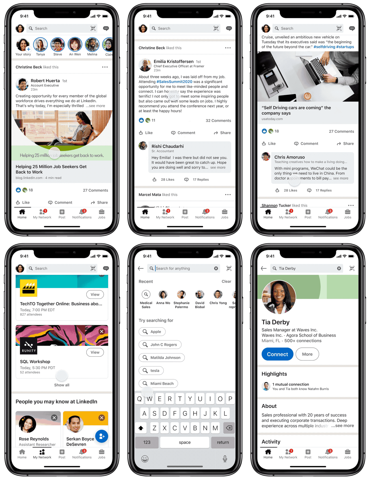
LinkedIn today announced a major design refresh for its web and mobile clients. The company says that this redesign comes almost five years after the previous refresh, and aims to make the experience “easy, inclusive, enjoyable”. As part of the refresh, the firm is bringing UI enhancements that improve navigation, new features for search, and focuses on accessibility as well.
The UI now brings more rounded corners, larger icons, and warmer colors. The larger touch targets and overall UI changes help improve interaction capabilities for those that use accessibility features and for the differently-abled. The Microsoft-owned company also plans to add a dark mode to the app and web client soon.
 |
 |
In addition to the look and feel, the company has also revamped the search experience. Search results are now organized by categories such as jobs, groups, courses, and more. The mobile versions of the service are also receiving keyword filters. Users can filter through these categories from a carousel at the top on mobile, or use the filters on the search results page itself, on the web. Search results are also personalized with the results displaying similar “liked” courses or “People also Viewed” lists in addition to the search query’s results.

The redesign also brings the ‘Stories’ feature that the firm has been testing internally. The company says that it “took the time to understand how this format fits in the professional context” and calls Stories a “more human way of sharing”. The feature is identical to Stories on platforms like Facebook and Instagram.
 |
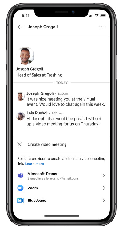
Another significant area of improvement is the messages section. The company is working to add support for users to directly connect to video meetings on Teams, Zoom, and other third-party services right from direct messages. Other features include the ability to edit, react to, and bulk manage messages.
The redesign begins rolling out today to users globally and will be available to everyone in the coming weeks.


5 Comments - Add comment