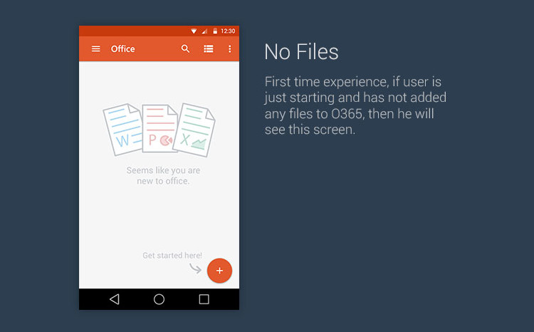
A UI/UX designer at Microsoft has created a complete concept of how things should look if the company ever adopts Google's Material Design language for Office on Android smartphones.

At last year's Google I/O conference, the company unveiled the Material Design language which debuted with Android Lollipop and most app makers have already started updating their apps to look right at home on the platform.

The current UI on the Android version of Office looks quite dated in comparison to apps that make use of Google's new design guidelines, and it might be a while until Microsoft pushes an update as the company is busy with other variants such as Office Touch and Office 2016.
In the meantime, here's what Microsoft India's Sudeep Phase feels the Office experience could look like with a Material Design makeover.

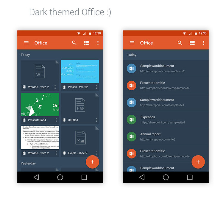
Files are shown with their respective thumbnails in GridView, and the floating action button (FAB) that is part of Google's new guidelines.

Further, there are some more new elements such as the updated navigation drawer and the card stack of open files.

Although, not all Office applications were covered, there was a lot of focus on PowerPoint, which is shown in landscape mode below.

And finally, there is a dark theme for those late night preparations when you just can't look at a bright screen anymore.

We've tried to include most of the images from Sudeep's project, but there are a few more which you can check out at the source. Do let us know what you think about Material Design and should Office Mobile get it?
Source and Images: Sudeep Phase on Behance


31 Comments - Add comment