If you need any proof that Microsoft does listen to feedback from Insiders, the company has updated the icons in the latest build of Windows 10.
Earlier this year, the Internet had an aneurysm after the Recycle bin icon was changed from what was used in Windows 8 to a new design. After strong feedback, the company implemented a new icon and now they have gone one step further and updated several more icons across the UI.
If you take a look at the image above, from build 10125, you can see the new folder/drive icons and below, you can see the icons from build 10122 that was released to Insiders last week.

The update is noticeable once you see them side-by-side and they do look a lot better than the previous icons.
While Microsoft isn't commenting if they will update the icons again before RTM, seeing that the engineers are now locking down their code and attacking bugs rather than building out significant new features, we suspect this may be the last large change for the OS.


New | Old
Another icon that got a small tweak is the File Explorer icon which you can see is a bit flatter to match the new icons shown above.
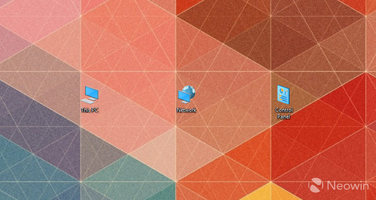
And finally, the PC, Network and Control panel icons have also been updated too.
So, the questions is, do you like these icons better than what Microsoft was previously shipping or were you attached to the old style? Take the poll below.


105 Comments - Add comment