Today, Microsoft has unveiled a new, simpler sharing experience for OneDrive.com.
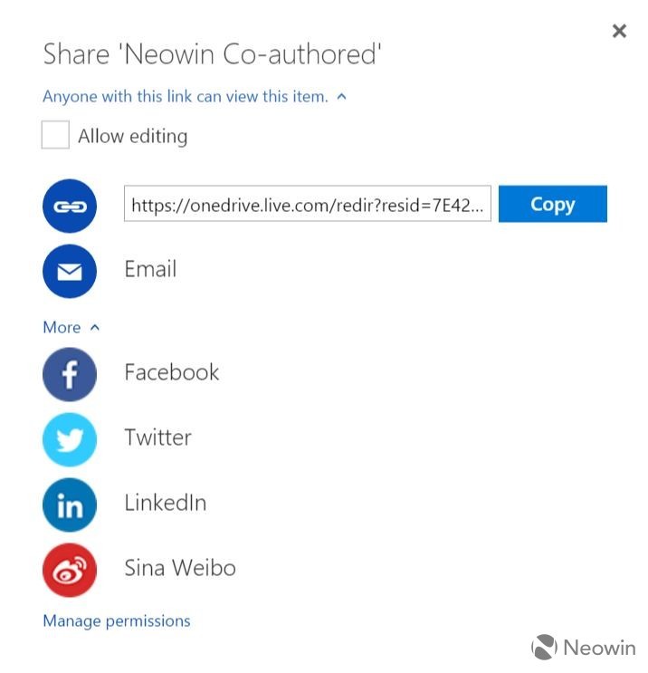
The new experience gets rid of the old "Invite People" and "Get a link" options and replaces them with two icons with the options to "Get a link" or "Email". The company said today in a blog post:
Previously, when you clicked “Share,” we presented you with the option to either “Invite people” or “Get a link.” The majority of people just wanted to get a link, but that wasn’t the default choice. When you selected “Get a link,” we also offered a number of ways to customize that link and restrict access. This resulted in a lot of confusion and broken links, and most of these options were used less than 0.01% of the time. We wanted to do better.

The user can also click "More" and be presented with a number of options to share to various social networks.

According to Microsoft, the goal was to be "not as messy" by showing the two most popular options for sharing. They did an A/B test with 28,000 users and, not surprisingly, it was a success.
Source: OneDrive Blog


13 Comments - Add comment