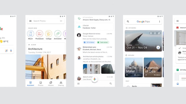
A new video from graphic designers Adam Grabowski and Nicolo Bianchino has surfaced on Vimeo that shows mock-ups for core Google apps including Gmail, Google Photos, Google Maps and more. The new video gives us a good idea about the interface changes of apps and services that the firm promised would be getting a facelift. So far, only Gmail on the desktop and Google News have received a UI upgrade.
In the description of the video on Vimeo, Bianchino writes:
“Adam Grabowski and I worked together with the Google Material Design team to create a piece showcasing their updated design system for their internal teams. Covering everything from fonts to FAB’s (look it up!) I’ve never been more excited about guidelines!”
To further prove the authenticity, Liam Spradlin, a design advocate at Google, tweeted about the video:
Spradlin did later write that the interfaces seen in the video shouldn't be interpreted as the final designs. With that said, they’re probably pretty close to what we’ll be getting in the near future.
Aside from updates to the apps, the keyboard used in the video, presumably a new version of Gboard, includes a different font to that which is being used now and it really emphasizes the 'L' and 'I' more than before which is quite nice. No date has been given for when we will see the new changes, but expect them sometime this year.
Source: Nicolo Bianchino (Vimeo) via Ars Technica


14 Comments - Add comment