Last week we received a review device of the Nokia N9, a phone that was "dead" before it launched, and was superseded this week at Nokia World when the Finnish phone manufacturer announced it's new Lumia line up. I've held off publishing a review like this until the Windows Phone variants were out, so I could look at them and honestly say how the N9 stacks up.
Specifications
Everyone loves reading these so we thought it'd be a great idea to include them. The table below shows how the N9 stacks up in terms of pure hardware.
| GSM Bands | 850 / 900 / 1800 / 1900 |
| 3G Bands | HSPA 850 / 900 / 1700 / 1900 / 2100 |
| Display |
3.9 inch 480 x 564 AMOLED 251 ppi pixel density 5-point capacitive multi-touch Gorilla Glass |
| Processor |
TI OMAP 3630 chipset 1GHz Cortex A8 CPU |
| Graphics | PowerVR SGX530 |
| RAM | 1GB |
| Storage | 8 / 16 / 32 / 64 GB |
| Connectivity |
WiFi 802.11 a/b/g/n |
| Camera |
8 MP rear camera with autofocus and dual-LED flash 1.3 MP front camera 720p video recording (rear) |
| Ports |
MicroUSB (charging) 3.5mm audio jack |
| Sensors |
Accelerometer Light sensor Proximity sensor |
| Battery | Li-ion 1,450 mAh non-removable |
| Launch OS | Meego 1.2 "Harmattan" |
| Launch Date | September 2011 |
| Size & Weight |
116.5 x 61.2 x 12.1 mm 135 g |
As you can see from the table above, the N9 pretty much comes in any flavor you like, with multiple storage options available, and the device will work on almost any network you can throw at it. You will, however, need a MicroSIM to use the N9.
Hardware

As soon as you open the box, you will fall in love with the N9. This is one of the most gorgeous pieces of smartphone hardware I've ever seen, and it feels excellent in your hand. The device is made out of polycarbonate (which feels like brushed aluminum in your hand) that is slightly curved to sit in your hand, with an edge-to-edge Gorilla Glass display on the front (which is also slightly curved).
It's a big statement to make, but the build quality on this device is on par with the iPhone. There are no seams, no harsh edges; almost no buttons. It's almost impossible to resist touching it.

The screen is actually an edge to edge touchscreen, and the lack of buttons is made up by MeeGo's love for gestures. If you want to wake up the phone, you double tap the screen. To unlock it, just swipe from the black bezel to the top of the screen. Simple, and elegant.

The back of the device is just as stunning. The matte aluminum is fantastic from any angle, and the simple Nokia logo and camera don't detract from its overall looks.
On the very top of the device (pictured below), is the 3.5mm audio jack, a well hidden micro-USB port and the MicroSIM slot. To open it, you have to press lightly on the slight bump, which pops up the door. If you want to get at the SIM, you then pull the edge of the second door towards the audio jack and it will pop up.


It's this attention to detail that makes the N9 so stunning: everything is tidy, and hidden away. There are no exposed ports (other than the audio jack) and even the front facing camera (pictured below) blends in with the screen nicely.

It's worth noting that if black isn't your favorite color, Nokia's got you covered there too. The N9 ships in blue, pink, black and glossy white (by December).
Software
This is what it all comes down to at the end of it all. Nokia, a company that has a large Symbian following saw itself floundering, becoming old and irrelevant. Initially, Nokia started working on MeeGo, which ships on the N9, but at some point along their journey, they decided to make an even riskier move to an old friend that they think could save them. Microsoft.
This meant the N9's version of Meego -- Harmattan -- wasn't the spotlight anymore. It's still getting love from Nokia, and the company claims it'll be updated for "years to come," but perhaps not as fast as many would like.
Coming from my point of view, I am a very big fan of Windows Phone. I've been a user since the very first Windows Phone shipped last year, and am still a big fan, so went into this review expecting to be disappointed. What I discovered when using MeeGo was that it's almost everything Windows Phone isn't.

MeeGo is bright, fun and beautiful (for lack of better buzzwords). It's stunning. The home screen isn't exactly the most innovative thing we've seen yet, it could almost be compared to the iPhone on first glance, but there's a lot more going on under the hood.
The N9 is fully gesture oriented. If you love buttons and hate gestures this is not the phone for you. To unlock, double tap the screen, then swipe from the very bottom edge of the bezel (or from the right / left bezels) to the top. To close an app, swipe from the top bezel (or bottom / left / right bezel) down. This approach is something that I almost don't want to live without now. I almost wasn't convinced that Nokia could get me to do away with those hideous capacitive buttons, but... this works.
The OS took the homescreen approach as a "three screens" design. You swipe left of the apps and you get a "feeds" view that shows your latest Facebook feed, Tweets, RSS feeds, News and more. You swipe to the right of the app screen and you get the multitasking drawer, where your apps run in the background. This simplicity really makes the N9 shine. You can get news from the media, as well as your social media friends in one place. It's the ultimate way to read what's happening in the world as it happens.
Any service you add to your N9 will show up here (you can turn them off, though). Some of the default ones include Facebook, Twitter, AP, Picasa, and a few basic RSS feeds (you can customize these to your hearts desire).

Multitasking is performed using cards, slightly similar to the way WebOS rocks them. Press and hold on an application to close, or, just close all. Simple.

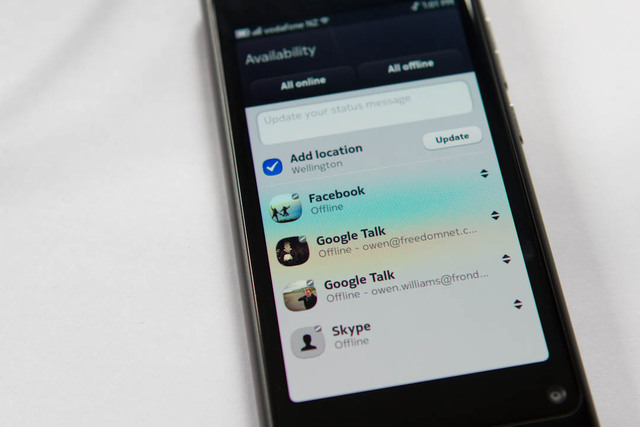
The OS itself has a lot baked in by default, and allows OS-wide chat. Not only does it support a range of chat networks, it's probably the best chat implementation I've seen on a phone. Windows Phone's Facebook/Windows Live chat is patchy at best, and leaves me wanting some Google Talk love too.

The N9, however, supports almost anything but Windows Live. I attached two Google Talk accounts, Skype and Facebook, and they all worked seamlessly, never dropping a message, and even offline messaging people if they dropped off suddenly. You can even update anything that isn't Facebook with your current location in your status field, which is a nice touch.

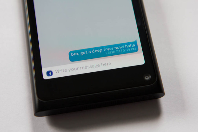
Messaging is universal, with SMS and Facebook unified in one place for simplicity, which is fantastic.

The experience is consistent across MeeGo too, for example in the music application, where the OS shows off your music in a visually pleasing way. If it hasn't got an album cover for your music, it won't leave it blank. It'll generate its own with a combination of color and large text.

The music application works as one would expect, and includes Nokia's Ovi Music store (which we didn't try) that attempts to find music that you'll like based on what you're listening to. Having come from Windows Phone's side of the fence and using Zune Pass, it was saddening to not be able to use my DRM-laden music, however MP3's and normal WMA's work just fine here.
One gripe with the music application though. Apparently the first iteration of MeeGo doesn't include fast media controls, so if you want to skip a song or pause it quickly, you need to unlock the phone and navigate to the music application to interact with it again, rather than it being built into the lock screen. The good news is that an incoming update is already pinned to include this, so this won't be a problem for long.

The camera application is one of the better ones out there, and includes a number of features by default. Oh, and you can save the settings too, unlike earlier iterations of Windows Phone. You can change the mode (macro, landscape, etc) enable or disable flash, change white balance, ISO, aspect ratio, quality, face detection, GPS features and more.

You can also share photos to any account you have attached, from the gallery app. Facebook, Picasa, MMS, Mail, Bluetooth or NFC were the options I was able to use. In the week we used the device though, we found it didn't include uploading to Twitter... even though it claims to, which is frustrating.

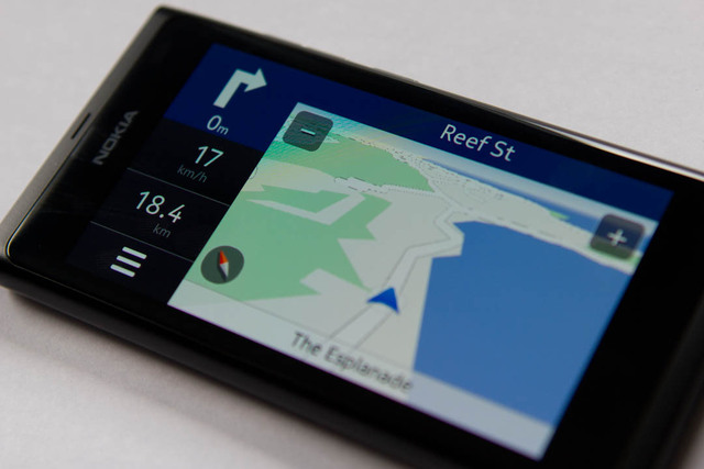
Apparently Nokia's well known for mapping overseas (ie: not in the US) and includes turn-by-turn navigation services and mapping applications that are built and maintained by them. I almost expected some sort of half-baked attempt like most of the GPS applications on Android but was pleasantly surprised by how immersive the turn-by-turn service was, and how similar it is to an actual GPS. It even got angry when I went the wrong way, and I could choose a man's voice instead of a woman's.


The dialer is almost similar to every other dialer out there...


Yes, Skype is built in at the OS level, and it's damn incredible. If you happen to have Skype credit and an awesome unlimited data plan (or WiFi everywhere) you could replace traditional calling with VoIP. The quality's pretty impressive, too. One catch though, even though there's a nice front-facing camera on the device... you can't use it. Skype doesn't support it yet, neither does Google Talk or any other third party applications... which is extremely strange.
However, an application by the name of "Peregrine" claims they'll support it soon, so it's not all bad.
Other cool stuff includes a not-so-traditional clock, full video support and Facebook/Twitter apps loaded by default. Video support was impressive, being able to play almost anything I threw it it; including xVid.


This may be slightly boring, but I have one gripe with the alarm application. I was excited that I could use any song as a alarm tone. So I set Coldplay's Every Teardrop is a Waterfall and went to sleep, and woke up to 10-15 seconds of the song, then it cutting off. Strange. It doesn't repeat, that's it. No more alarm. The built in tones are even worse. Quiet, short and definitely wouldn't wake up someone who's... normal.
Keyboard

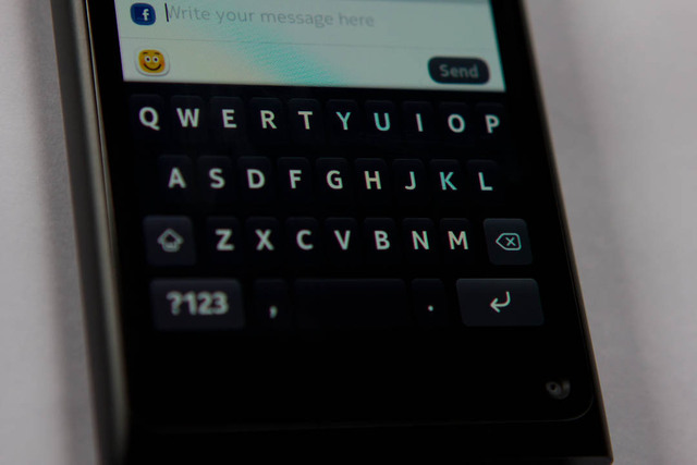
I'm sure some of you are just dying to know what the keyboard is like. I put it in it's very own section because I figured it's important to users these days, and actually is make or break for many.
Now, coming from Windows Phone I'm spoiled by the keyboard. It works fantastically. I can type fast and blindly, and it'll generally figure out my mess of stabbing at the screen. The N9 is so close to this, but something isn't quite right. The size is great, and the haptic feedback is to die for. It really feels like it's just underneath your finger.
The problem is, the auto correct isn't very good. I found myself typing "dobt" a lot instead of don't, as I was used to Windows Phone automatically figuring that I suck at hitting the "n" key. MeeGo does offer up suggestions, but it's nowhere near as aggressive. It'll tell you it's found a mistake, but won't fix it for you, whereas other devices tend to just do it without even asking. The MeeGo implementation is slightly out of reach too, others offer their suggestions along the top of the keyboard, but the MeeGo does it right above the mistake.

This said, it's not bad at all. It's by far better than the Android default keyboard, or, you know, something running Windows Mobile, but it could do with a little more TLC.
Update: I'm told that "aggresive auto-correct" is disabled by default, and can be enabled via "Settings > Time and Language > Text Input > Insert with space key." It works great, just like every other platform!
Real world use
If you've made it this far through the review, you probably plan on selling your firstborn to pick up one of these devices, but maybe you're still worried about how it stacks up in the real world? I test drove the N9 for around 8 days before writing this review, and I usually tend to hate a device more and more as time passes, but the N9 made me fall more and more in love.
Battery life, for example was outstanding; providing I didn't attempt to spend all day on Facebook chat or browing the internet, I was able to get a solid two days out of it. I've heard of other users saying that theirs have lasted more than 5 days without internet usage, which is impressive for a smartphone.
The camera did not cease to amaze me, either. I hate phone cameras. In my spare time, I'm a photographer, and am very picky about how photos come out (or even videos), and the N9 wasn't so bad, unless it was really dark. New Zealand was celebrating our Rugby World Cup win earlier this week, and I took a video in 720p to show off the phones capabilities.
Not bad, I must say. Not only is the video quality fantastic, the sound is crisp, despite how loud some of the surroundings are (especially the screaming teen girls; which would make the N9 great for concerts).
One of my favorite things was being able to be signed into my Google Talk accounts all the time, as I use them for work, and being able to flick open a chat quickly and reliably. The Facebook and Twitter integration was great, too, and the multitasking allows quick switching between each of them.
However, this is where things can get a little ugly. The N9 has this thing that it does, where occasionally it'll slow down to a snails pace all of a sudden, even though there's nothing really open. Swiping between screens will be slow, and opening an application is a nightmare. This tends to happen for maybe 10-20 seconds at a time, and only tends to pop up extremely rarely... but can be pretty frustrating.
Some of the inbuilt applications are slow, too. Opening Facebook causes the entire thing to seize up for at least 30 seconds as it downloads data, and the same thing goes for Twitter. I experienced a lot of "Facebook has frozen, do you want to end task?" prompts which I needed to ignore before I could use it, each time.

Better get used to this...
This slowness pushed me to just bookmarking the Facebook Touch website, which works great on the browser, albeit with a few strange bugs (like, you can't comment on some posts and likes show up strangely). The same behavior drove me to Twitter, too. It's worth noting that Windows Phone has the same problem. The Facebook application is rubbish right now, and is slow to launch. Microsoft fixed this by building in tighter OS-level integration, but the application is still required from time to time.
Call quality is fantastic, and volume levels weren't a problem. However, while we're talking about volumes, the thing that irked me the most about the N9 is the sound levels of notifications. On full blast, I could barely hear the text tone if it was in my pocket. Maybe this was a good thing, so I wasn't always on the phone, but it's actually pretty frustrating as I often missed notifications. Despite this, music seems to play extremely loud, and extremely well, so it must be some sort of problem on the OS level.
One last issue is the severe lack of applications. I browsed the store briefly and found a few flashlight apps, and one useful one (Peregrine, as mentioned earlier). This is the sad fate of a company that pushes another OS harder than it's own, however I don't see this as a problem as I don't actually use that many applications outside of Facebook and Twitter anyway.
I love the gesture based use of the phone, and actually would rather not go back to using a phone that uses traditional buttons now.
Final thoughts
The first thing that crosses my mind is "Nokia is crazy." MeeGo is beautiful. It's everything that every other OS isn't. There's a market for this. Why aren't they pushing it harder? I think the answer to these questions is simple; Nokia was too late to the game (even though the OS has pretty much the same features as everyone else) and didn't want to try and push into an already overcrowded mobile market.
By choosing Microsoft, Nokia was able to get out of doing half of the work on the device, and focus on making services that work, and hardware that's beautiful, however, after the Nokia World announcements this week, I'm not convinced. Nokia's phones were OK at best, and the Lumia 800 (the N9's ugly sister) has been slaughtered to Microsoft's whim. It's less powerful, has ugly buttons, no NFC, and the OS doesn't look nearly as elegant on the hardware. It's saddening.
If the N9 is available in your market, it has the potential to do extremely well. In the week that I was using it, I had a huge response to the device, with everyone from my hairdresser to a car mechanic remarking that "Oh, that's that awesome new Nokia phone" and saying "I want one of those." It's likely the price tag may get in the way of sales, though. The device is retailing at $749 USD for the handset only.
Is it enough to convince people to not buy an iPhone? Perhaps. What I've seen here is a phone that still has a future, despite being "dead" and is impressive, even to non-geeks. It's built just as good as an iPhone, and offers something that is different. It seems a lot of people are beginning to realize that they might end up being an iSheep, and are looking for an alternative, and this seems to be one of the best ones yet.
The Windows Phone Nokia announcements where underwhelming. They slaughtered the N9's elegance, and don't really offer anything over actually just buying the N9, in fact, you'll get less.
Despite it's stuttery moments, I love the N9. When I next upgrade my phone, the N9 will likely be the device for me. Sure, it doesn't have the developer ecosystem like other platforms, but it's got everything built in that I'd tend to use anyway. Before you go out and purchase your next phone, try the N9. See how it feels. You might find you're pleasantly surprised.

Huge thanks to Nokia NZ for the review device! If you live in New Zealand, the N9 is available from Vodafone here.
Update: We talked to Nokia shortly after this review and got the low down on what's next for the N9 and MeeGo. Read it here.


139 Comments - Add comment