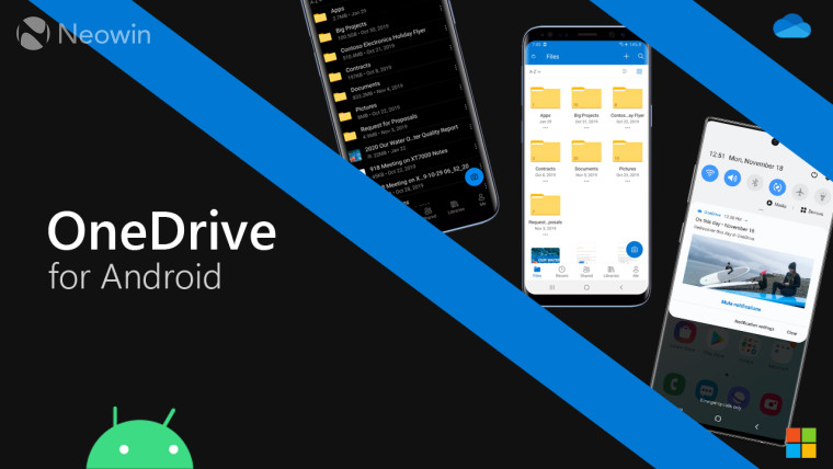
The OneDrive app on iOS received a major design refresh back in July 2019 that brought with it a new header, improved navigation and search, and new colors. The web version of OneDrive too saw a Fluent Design refresh in late 2018. Now, the Android app is receiving a fresh coat of paint with improved icons, updates that increase legibility, and dark mode.
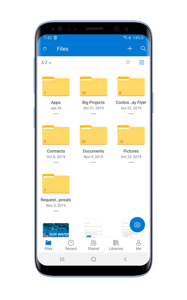
The first subtle yet welcome improvement is that to the files view. The list and grid views are receiving new icons and borders to the icons that bring a sense of depth. The firm says that it has also revised the font size and spacing between the files to improve legibility. Additionally, the scan icon has now been replaced with a camera icon to reduce ambiguity about its function.
 |
 |
 |
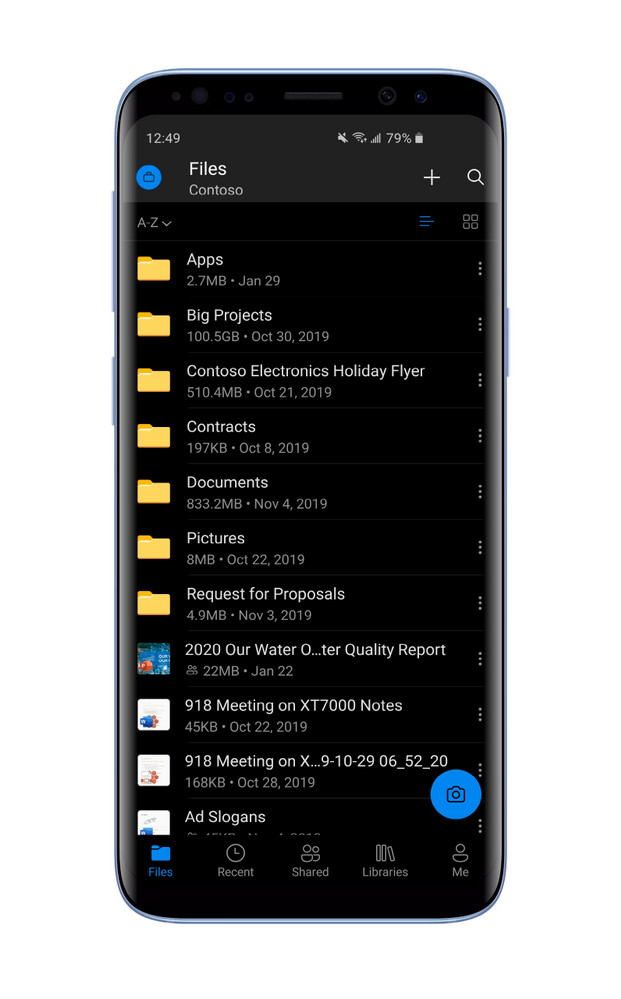
Another major feature that is making it to the Android version of the app is Dark Mode. The Redmond giant states that dark mode for the app on Android was the highest-rated and most requested on the OneDrive UserVoice. Dark Mode is beginning to roll out to all business and personal accounts starting today.
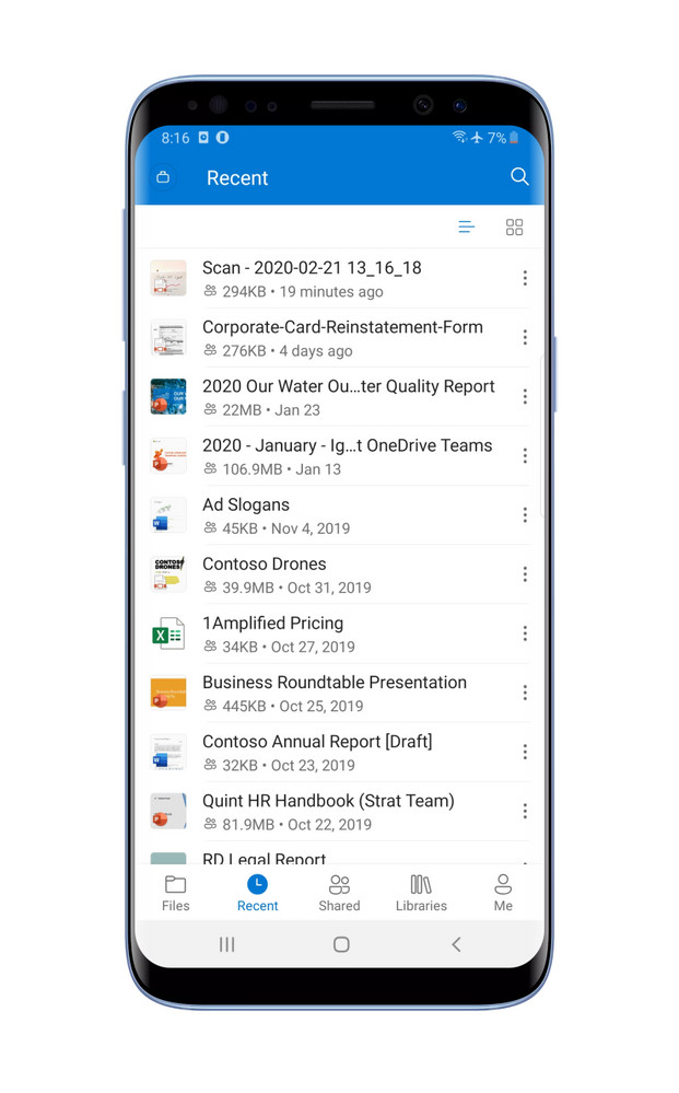
The design refresh is also bringing with it an improved search experience. A new toggle to search between only the users’ files and all files, including the ones in the users’ hared libraries in SharePoint, has been added. In addition to the improvements to search, the app is receiving ‘Recent files’ experience that is available on iOS and the web. The ‘Recent’ tab automatically surfaces all recently added/accessed files, including scanned PDFs and documents.
|
|
 |
 |
 |
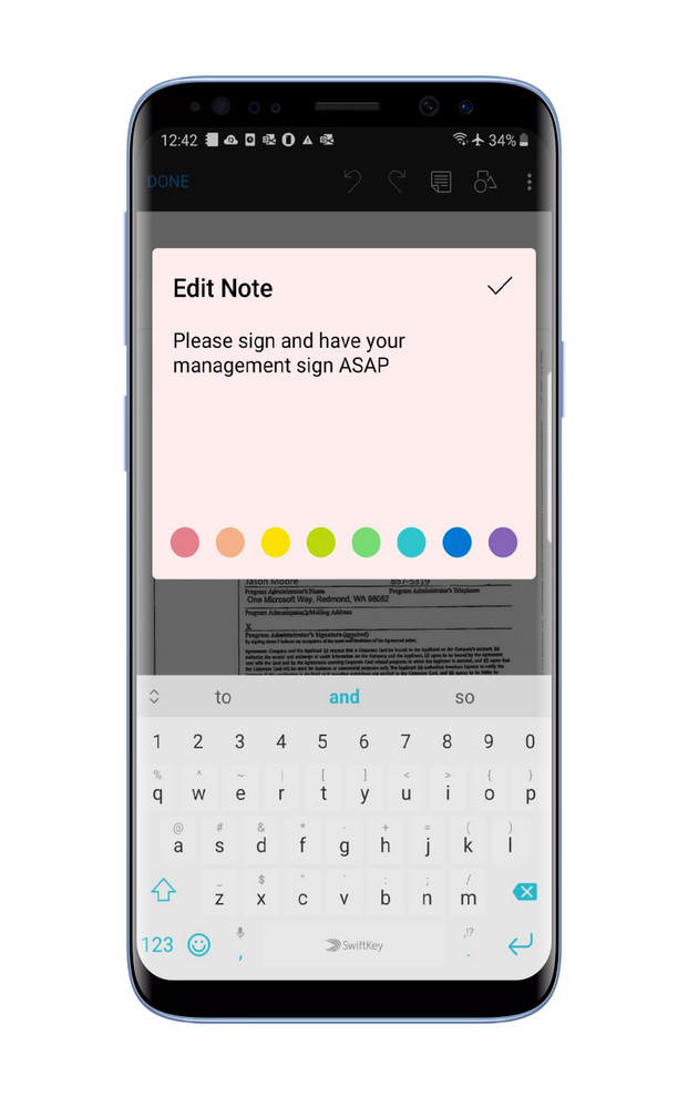
Next up, the PDF annotation tool is receiving usability improvements that make it easy to find the annotation tools. Pens, highlighters, and the eraser are now placed at the bottom of the screen. There are enhancements to the Notes feature that improve performance and make it easier to select the note color. Lastly, the Signature feature is being improved with a larger area for users’ signatures and smoother pen strokes.
For those that loved the ‘On this day’ feature, it is making a comeback on the Android app. The feature is situated in the Photos tab and surfaces photos uploaded/clicked on that specific day in the past. While some users might have begun seeing it already, it should be rolling out to more users with this refresh.
The design refresh should begin rolling out to all Android users gradually. You can head to the Google Play Store here to download the app.


_small.jpg)


3 Comments - Add comment