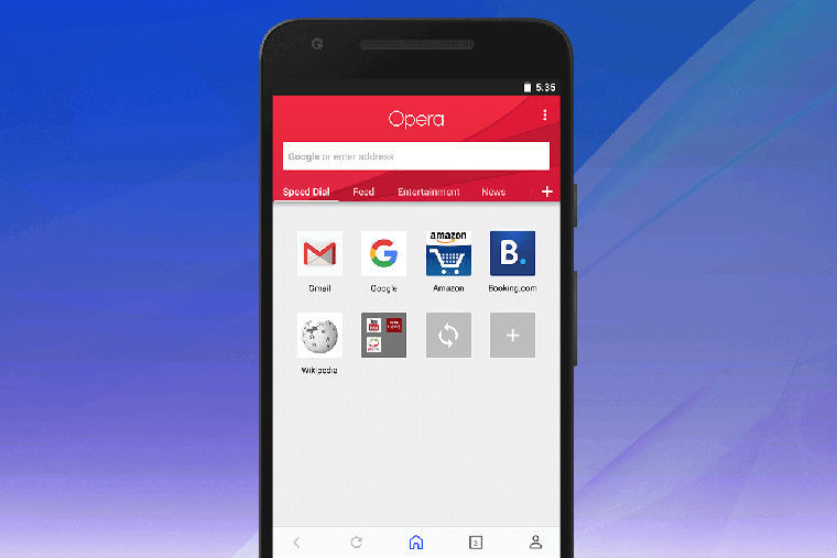
Opera for Android users will notice a big change in the appearance of their browser soon as Opera began rolling out an update yesterday. The redesigned interface is built from the ground-up and is more in-line with Android’s material design. The browser-maker says the roll-out will take time to reach all users.
The first big change is noticeable on the start page; the Speed Dial has been moved over to the far left side of the carousel with a news feed on the right. You can add news topics to the carousel with the + icon on the far right. The news feed also comes with a reader mode that you can configure in Settings, allowing for articles to load more quickly.

Next up is the three-dots menu. When you’re browsing a site, this menu will allow you to ‘find in page’ and ‘share’ the site. The menu also includes an ‘Add to’ option which lets you add the current site to the Speed Dial, Android home screen and more. At the top of the menu is the option to toggle data savings, which the browser-maker has put a lot of focus on recently. Under the data savings toggle, you can get a quick report on the total data saved. From this menu, there are also the options to access the browser’s settings or close the browser.

The last major change is the ‘personal corner’ which is accessible through the person icon on the bottom bar. From here, you can get an overview of your offline pages, bookmarks, history and downloads. You can sign in on this screen to sync up your Speed Dial, bookmarks, tabs and typed history across all of your devices.

Regarding further developments, Opera says “We are still working on bringing in options to switch between tablet and normal layouts, change the news feed language and select your download folder of choice, among other things.” While Opera works on those features, you can grab Opera from the Google Play Store and see whether you have the new interface yet.


11 Comments - Add comment