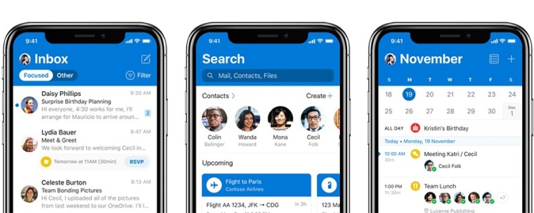
Towards the end of last year, Microsoft announced a significant redesign for its Outlook app for iOS, which began rolling out at the time. The new app introduced a new, blue header to replace the old white one, as well as a few other design changes, with aesthetics being the main focus of the update.
Now, almost two months later, the company has finished rolling out the new design to all iOS users. The news was shared by Microsoft's Michael Palermiti, who leads Outlook for iOS:
The visual changes here extend to a lot of details - the header of the app will shrink as you scroll down, and there are many new subtle animations, such as those that make messages pop out from the list when you take actions on them. You'll also find a new avatar at the top of your inbox to identify the account you're looking at, and each message will be labeled with a contact avatar so you know who each message came from. Outlook is also said to be one of the first apps to adhere to the new Office icons announced last year, but that doesn't seem to have happened with this release.
There are some functional improvements in this release, too. Creating events in the calendar is much easier now, as the app will bring up relevant dates, people, and places to make it easier to schedule the perfect time for a meeting. If you'd like to try the new Outlook for iOS, you can download it from the App Store.
Source: Michael Palermiti (Twitter) via Windows Central


14 Comments - Add comment