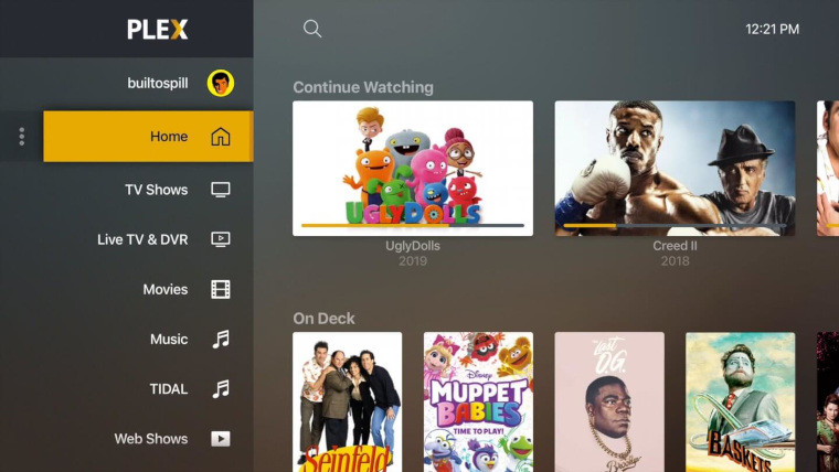
Plex has announced that it is rolling out the new UNO user interface this week for TV platforms and the web. The release on iOS is “super close” and the Android release will be rolled out last. The new interface makes it easier to search and discover content in Plex and brings back some “basic usability qualities” that suffered in the last iteration, such as more intuitive navigation and fewer distractions.
Aside from those refinements, UNO gives users more ability to customise the interface by telling Plex what you do and don’t care about. You can rearrange sources, hide them, add and remove rows from your home screen, and more. One of the customisable parts of the UI is the new sidebar which uses screen space more efficiently than the top menu. You can declutter the sidebar of all the elements you don’t care about too.

Discussing the Web app, and how it strikes a balance making it good for average consumers and administrators, Plex said:
“The Plex Web app is a bit of a special beast, since it serves as both a super popular platform for consuming media and the singular app to admin and curate your Media Servers. We’re fairly confident this app embodies the best of both worlds: ultimate customization for the media consumer and improved control and curation for the server owner and administrator. It’s always a fun balancing act between the two—and many thanks to everyone who has given feedback along the way.”
To try out the new interface, your best bet is to use the Web app as it has the updated look already, otherwise wait for your TV to get the update this week. If you’re new to Plex, you should download the Plex Media Server initially to begin running the service on your devices.


_small.jpg)


13 Comments - Add comment