Late last month, the Plex development team in Switzerland announced that they had opened the beta for their brand new Universal Windows 10 app, specifically the version for desktop computers and tablets. The team also advised that they will be "posting more info on the Mobile client soon".
Today, invitations were sent out to lucky beta testers containing a link to download the app from the Windows Store.


The noticeable difference with the new UWP app, versus the existing Windows 8 app, has been alignment of the interface with Microsoft Design Language 2. The navigation menu is now laid out along the left edge of the application while the hamburger icon at the top left expands out the menu for improved readability. Meanwhile, app controls are laid out across the bottom edge of the app.
Also, scrolling throughout the various libraries is now vertical rather than the horizontal scrolling found in the existing Plex app.


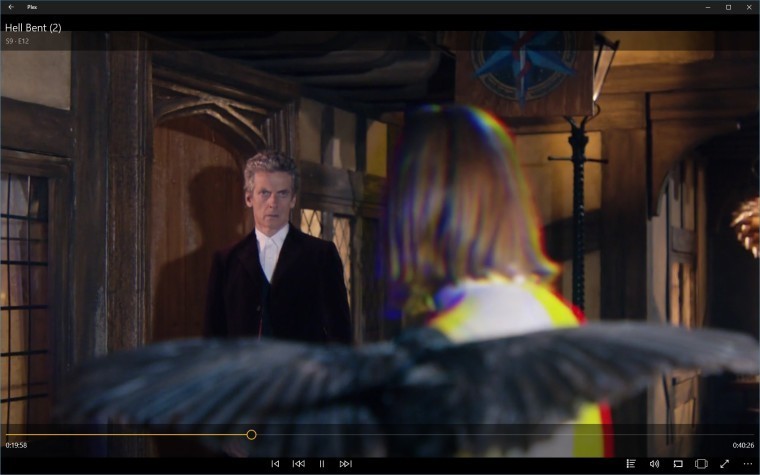
The video playback interface has also been revised with the controls relocated from the center of the app to the bottom edge. There has also been reduction of the large translucent bands overlaying the top and bottom of the image. While access to the user interface is important, the media being played would generally be of more interest to a user rather than a myriad of controls and information obscuring the picture.
For an initial release, the basic functionality of the app is fairly solid despite the list of known issues. However, you can always switch between the UWP and Windows 8 versions of the app if you encounter something that is broken.
Are you involved in the beta test for the Universal Plex app? If so, sound off in the comments below!


25 Comments - Add comment