The evolution of the tablet has been one of the most interesting, and certainly among the most significant, developments in personal computing history. Its genesis arguably lies in science fiction, with tablet-like devices featuring in movies, such as 2001: A Space Odyssey, and TV shows, such as Star Trek, giving a glimpse of what was to come.
The first devices to realise this tablet vision would not come until decades later, with the likes of Apple’s Newton, PDAs such as the Palm Pilot, and Microsoft’s ill-fated Tablet PC platform all attempting to make the concept a reality for a wide audience.
But it was Apple, in 2010, which largely defined the tablet computing experience that we know today. The original iPad set a new standard for others to follow, with a light and slim form factor, a generously sized high-quality display, a rich and diverse software ecosystem, and pricing that finally made the tablet vision affordable.
Today, tablets are available in all shapes and sizes, but it is the smallest tablets that are becoming the most popular. Devices such as Amazon’s Kindle Fire range and Apple’s iPad mini are vying for the attentions of buyers who are snapping them up with glee.
Google jumped into this space too in June 2012, with the launch of its Nexus 7, a seven-inch device manufactured by Asus. With prices starting at just $199 (£159 in the U.K.), it enjoyed broad critical acclaim, and considerable sales success – in July of this year, Google said that it had sold around 7 million units, representing around 10% of all Android tablet sales.

This summer, Google announced a new version of the popular tablet, again developed with and manufactured by Asus. The 2013 Nexus 7 sees a range of improvements over its predecessor, including an improved display, more RAM and a faster processor, but the price of the cheapest model has now jumped to $229 (£199 in the U.K.).
The folks over at Ebuyer.com have very kindly provided us with the Google Nexus 7 for us to review. Ebuyer is one of the U.K.’s largest online retailers of electrical and computer products, with tens of thousands of devices and accessories, and free delivery on many items.
Thanks to them, we’ve been able to put the Nexus 7 to the test to find out whether or not the best things really do come in small packages.

The original Nexus 7 offered plenty of bang for so few bucks, but some aspects of its spec sheet betrayed its budget-minded focus. With the 2013 model, Google and Asus have addressed many of the shortcomings of the original, improving it in just about every way imaginable.
It’s both thinner and lighter, with a narrower bezel, while considerable improvements have been made under the hood too, with twice as much RAM (2GB instead of 1GB), and a faster quad-core processor due to the move to a Qualcomm Snapdragon S4 Pro chipset, instead of its predecessor’s NVIDIA Tegra 3 SoC.
Perhaps the most dramatic improvement has been to the display, which is now WUXGA (1920x1200px) resolution – a considerable step up from the WXGA (1280x800px) of the earlier model, and now allowing users to watch Full HD videos at their native resolution. The IPS LCD is protected by scratch-resistant Corning Gorilla Glass.
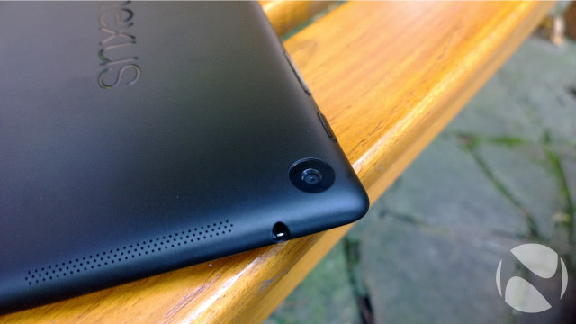
Another new and welcome addition to the latest model is the inclusion of a rear-facing camera for the first time. With a 5-megapixel sensor, it is unlikely to replace your dSLR – or even the cam on your phone – but it does add a modicum of convenience, and finally enables the tablet to be easily used in conjunction with a broader array of augmented reality apps, such as Layar and Wikitude.
While the entry-level model of the first Nexus 7 featured just 8GB of onboard storage, the new model is available with either 16GB or 32GB. Both versions come with WiFi, while a 4G LTE version of the 32GB Nexus 7 is also available.
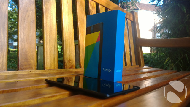
The version that we are testing here is the 16GB WiFi-only model, with Android 4.3 Jelly Bean. In the weeks ahead, Google will be making the latest Android version, 4.4 KitKat, available as a free download for the Nexus 7.
Let’s take a look at the main specs in a bit more detail:
Dimensions
200 x 114 x 8.7mm
290g
Connectivity
WiFi 802.11 a/b/g/n
Bluetooth 4.0 LE with A2DP
A-GPS
NFC
microUSB
3.5mm audio port
Display
7.02" IPS LCD
LED backlit
WUXGA (1920x1200px) resolution
323ppi pixel density
Corning Gorilla Glass
Processor
Qualcomm Snapdragon S4 Pro APQ8064 SoC
Quad-core 1.5GHz Krait 300 CPU
Graphics
Quad-core 400MHz Adreno 320 GPU
RAM
2GB
Storage options
16GB (as tested); 32GB option available
Camera
5MP rear camera
- Autofocus
- 1080p video recording at 30fps
1.2MP front camera
Battery
3950mAh Li-Ion battery
Non-removable
Operating system
Android 4.3 Jelly Bean
Upgradeable to Android 4.4 KitKat when available
Launch date
Available now

Not all tablets look the same. Apple, for example, has established a unique and recognisable design language for its iPad range, refining it with each new generation, and the latest iPad Air is the ultimate expression of that design lineage so far. Microsoft’s Surface tablets have been defined by their distinctive kickstands and colourful click-in keyboards. Nokia’s recently announced Lumia 2520 also stands out from the crowd with the cheerful colour options available.
The Nexus 7 is smaller and much cheaper than all of these, of course, and it is likely the all-important cost factor that has resulted in Google launching a tablet that is really rather unremarkable to look at. Its aesthetic design is almost soporific; stare at it for too long from any angle, and there’s a good chance you’ll feel your eyelids getting heavier.

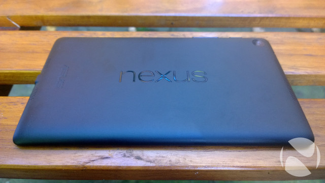
Curiously, though, there’s something really rather appealing about this no-nonsense design. While it’s undeniably nondescript in its appearance, there’s something rather mature about the look and feel, especially compared with its predecessor. Gone are the dimpled rubberised back and the not-really-metal edges of the previous model; instead, the rear of the new Nexus is made of a smooth, matte plastic which feels lovely to hold, and which is fiercely resistant to all but the greasiest of fingerprints. The Nexus logo is now proudly emblazoned in glossy lettering across the device in landscape orientation, with Asus branding perpendicular to this at the bottom of the device when held in portrait.
The changes go beyond just a new coat of paint though. The new model is almost 2mm thinner than the earlier version, and is now just 8.65mm-thick. It has lost weight too, trimming 15% of its fat and now weighing in at 290g (compared with 340g previously). All of this makes it a smudge thicker than the iPad mini, but also a fair bit lighter.

When viewed in portrait, the lateral bezels have been trimmed too – only a few millimetres on each side, but it makes a noticeable difference. The top and bottom bezels are pretty much the same, though. At the top, you’ll find the front-facing 1.2MP camera, while the bottom bezel is home to a centred notification light, at the exact spot where you might expect to find a ‘home’ button. As is the Android way these days, you won’t find any dedicated hardware buttons on the front of the Nexus 7; instead, the back, home and multitasking buttons are soft-buttons displayed on the device’s screen as needed.
The right edge, when viewed in portrait, is the only place that you’ll find any physical buttons on the device; the power button is the topmost of these, with the volume rocker below it. The placement of these buttons is slightly awkward, at least initially; when looking at the device from the front, you’ll find that the buttons are effectively on the ‘back’, and you may find yourself – as I did, at first – pushing in just the wrong place. This is one of those very minor gripes that you’ll find disappears as you become more accustomed to using the device.

On the top edge, a 3.5mm headphone jack is located towards the right; and at the very bottom, you’ll find the microUSB port for charging the device.
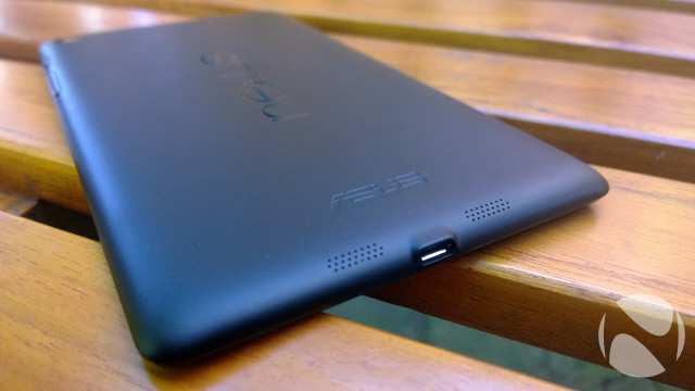
The only other visible features are to be found on the rear. When viewed from the rear in landscape, the 5MP main camera can be found at the top-right, while dual-stereo speakers hide behind machine-drilled grilles at the left and right edges.
In addition to the upgraded display (which we’ll discuss later), one particularly exciting feature that Asus baked into the Nexus 7 is wireless charging. It is remarkable that such a high-end feature has been included on such a low-cost device, and one that’s as slim as this too. It makes it all the more galling that other manufacturers such as Nokia choose to exclude this feature from some of their most expensive flagship devices.
What Google and Asus have created in the Nexus 7 is a device that, while not the most exciting to look at, feels like one from a class above. The build quality is absolutely rock solid with not a hint of flex or creakiness in its construction.
The device is lovely to hold too – the weight distribution feels perfect, and the whole thing is so light anyway that you won’t feel the urge to put it down. That’s exactly what you need in a device that’s geared towards content consumption, such as watching videos and reading e-books and websites for long stretches of time.
And its specs would be decent for a tablet that costs a whole lot more than the Nexus 7 does; at $229, the spec sheet is extraordinary.

In many ways, the most important aspect of a tablet isn’t how it feels to hold, or how its specs stack up on paper, or even how much it costs – although these are all, of course, crucial factors that will inform your decision to buy or not. No, the most important factor is the screen – that’s what you’ll be staring at while you’re watching movies on Netflix, reading the next chapter of your favourite book, or idly browsing the web. If the screen isn’t up to scratch, then everything else is pretty much irrelevant.
You only need to look at a device like the Acer Iconia W3 for proof of that. The W3 was the first ‘small’ Windows 8 tablet to launch earlier this year, and on paper it seemed like a good offering. It offered a compact form factor with a decent processor, 64GB storage, full-fat Windows 8 and even Office 2013, all with a very affordable price tag. But the display… oh my, the display. It had a bizarre coating which gave it a grainy, washed-out effect that was just plain horrid. It made everything – everything – look terrible, which in turn made using it for any period of time thoroughly unpleasant.
To put it simply, a poor screen ruins the whole experience.
The Nexus 7 has nothing to worry about here. In fact, it has one of the best displays of any small tablet on the market.
The device has a 7.02-inch IPS LCD panel with LED backlighting, and WUXGA (1920x1200px) resolution. That translates to a pixel density of 323ppi, and Google claims this makes it the sharpest display of any 7-inch tablet. It’s hard to dispute that – this screen is just beautiful.
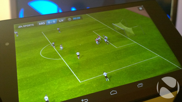
Colours appear vibrant, but never oversaturated, and contrasts are about as perfect as you could expect from an LCD. You won’t ever see the kind of intensely deep blacks that you would find on an AMOLED panel, but you won’t really mind either – the Nexus 7’s display never leaves you feeling short-changed.
There’s an impressive amount of brightness to play with too; at 100%, the screen’s brilliance is astonishing. You can easily change the brightness settings by swiping down from the top-right of the display, which opens a settings shortcut tray that offers quick access to popular options. You can also set the brightness to automatically adjust based on ambient lighting conditions; I found that the Nexus 7 frequently tended to make the display just a bit dimmer than I would have liked though.

The incredible quality of the screen makes it a stunning canvas for everything that it displays. The screen is at its absolute best when watching videos, and Full HD content looks magnificent. Videos streamed at 1080p from Netflix and YouTube appeared more or less flawless, with no visible artifacting even in densely detailed scenes, such as fiery explosions or quick pans during a car chase or space battle.
The aspect ratio of the display is 16:10, rather than the 16:9 of a 1080p video, so when watching movies or TV shows at Full HD resolution, you will see some letterboxing, with some pixels going unused above and below the video. That said, the decision to go with WUXGA resolution for the display does ensure more sensible proportions than if 1080p resolution had been chosen, which would have made the device look awkwardly tall and narrow when holding it in portrait mood. To my eyes, at least, Google and Asus made the right choice here.
You’ll likely value those extra pixels when viewing photographs – which look gorgeous, as you’ve probably guessed – or when browsing the Internet. You’ll probably want to hold the device in landscape to view web pages unless you’re happy to stick with viewing mobile versions of sites; the screen just isn’t large enough to comfortably view full desktop versions of most websites when viewed in portrait, without having to be constantly zooming in and out.

In landscape, though, the canvas is more or less perfect for reading most full versions of sites without needing to squint to see text properly. Indeed, text appears flawlessly at any size, with the sharpness and detail that you would expect of such a pixel-packed display, which makes the Nexus 7 perfect for reading.
I have never been a big fan of reading e-books; I have always had a somewhat old-fashioned attachment to holding a real book in my hands. On those rare occasions when I dabble with e-books, Amazon’s Kindle Paperwhite is my device of choice, as the e-ink displays are ideally suited to this. Nonetheless, I pushed myself to try reading a book or two on the Nexus 7, and I am honestly glad that I did. Text is rendered beautifully on the display, with a crispness and clarity that makes reading a pleasure.
The range of the display’s brightness settings means that you will have no difficulty finding the right level to ensure you can read comfortably in any environment, whether you’re reading a quick chapter in the dark before you go to sleep, or powering through a novel in glaring sunlight down on the beach. While sunlight has been in desperately short supply here in London as we soldier on into winter, on those occasions when I did read outdoors, I was pretty impressed by how well the screen coped in bright sunlight.

So impressed was I by the reading experience that the Nexus 7 became an indispensable travel companion for me during my time with it, and I would frequently be found on trains and in cafés, engrossed in literary masterpieces such as A Tale Of Two Cities and Do Bats Have Bollocks? …and 101 More Utterly Stupid Questions. Both classics.
Even so, the e-book experience still falls short of a reader like the Kindle Paperwhite, and there is no denying that staring at an LCD for extended periods causes more strain on the eyes than reading from an e-ink display. But it’s important to acknowledge that the reading experience is just one component of the Nexus 7’s abilities – rather than its only party trick – and you cannot underestimate the convenience of having a single light, portable device that offers such an excellent experience in such a broad range of areas. The reading experience is good enough on the Nexus 7 that you may well find it satisfies your needs perfectly well; but those who read more frequently may still want to purchase a separate dedicated reader with an e-ink display.
Personally, and despite the overwhelmingly positive experience of reading on the Nexus 7, I’m not quite in love with e-books enough to ditch all my paperbacks just yet. But for occasional use, I would be more than happy to read a chapter or two on it – and especially when on holiday or away from home with work, I would gladly rely on it entirely for reading, instead of dragging a suitcase full of books with me.

The 2013 Nexus 7 was the first device to feature what was, at its launch, the latest version of the Android operating system, 4.3 ‘Jelly Bean’. This week, Google announced a newer update to the OS, version 4.4 ‘KitKat’, coinciding with the launch of the Nexus 5 smartphone. Google will make KitKat available as a free download for Nexus 7 owners in the weeks ahead, but for this review, we have tested the device with Android 4.3.
That’s no bad thing, frankly, as there’s already plenty to like in Android, and the newest versions have come a long way in providing a more mature and refined user experience. As this is a Nexus, it comes with vanilla Android, featuring none of the garish or performance-sapping UI overlays that other manufacturers tend to hobble their devices with.
Google does pre-load the Nexus 7 with a vast suite of its own software though. You probably won’t find all of these apps useful, but many will be, and it’s handy to have many of these essentials – including YouTube, Chrome, Gmail, Maps, Drive and Hangouts – pre-installed and ready for use without having to download them from the Google Play store.
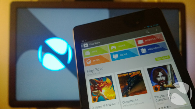
Google Play has itself matured into a much more complete and, dare I say it, professional offering since the days of the Android Market. More than just apps, Google Play has become a one-stop shop for video, music, books and magazines, and it is easy to browse and search for content. That’s hugely important, because the Nexus 7 – like most small tablets – is geared towards content consumption, and it is a credit to Google that it made the process of finding and enjoying content as uncomplicated as possible.
There are now over one million apps available on Android, and the platform’s dominance means that it is increasingly seeing new apps as quickly as Apple’s iOS. Even so, as with any app store, a massive proportion of these apps are, frankly, utter rubbish. Google’s hands-off approach to app oversight and approval doesn’t exactly help in this matter, but it is worth noting that the company has considerably beefed up security in the Play store to root out apps loaded with malware, spyware, and other icky things. That’s not to say that 100% of apps on Google Play are safe – even Google acknowledges that a tiny amount of malicious software still creeps through, despite its efforts – but the likelihood of your device being infected by an app downloaded from the official store is far, far lower than it once was.
In Android 4.3, Google brought some new enhancements to strengthen the security of the platform, the most significant of which was the introduction of SELinux reinforcement for the Android sandbox. This makes the sandbox more robust, enabling the use of security policies that can more comprehensively control the level of trust an app has, and what data and resources it can access and influence on the device.
But the list of other improvements, beyond security, in Android 4.3 isn’t particularly long. Native support for Bluetooth 4.0 is a welcome enhancement, along with Bluetooth Smart support. This includes APIs to enable apps to access your notifications over a Bluetooth connection, which opens up considerable possibilities for improving connectivity with the new generation of wearable devices, such as smartwatches and Google Glass.
The introduction of Restricted Profiles is another great feature, which builds on functionality launched in Android 4.2 to allow the use of multiple profiles on the device. Restricted Profiles is a bit like Android’s version of the Windows Phone ‘Kids Corner’ feature, enabling a tablet owner to set up limited access to a subset of the device’s apps, services and settings. This is perfect for parents wanting to keep their little darlings safe while using the device, for example.
Google is to be commended for how well it has implemented landscape support in Jelly Bean too. Every corner of the OS has been designed to work equally well in landscape as in portrait mode, including both the home screen and lock screen. This might seem a bit trivial, but it makes using the Nexus 7 that little bit more enjoyable, reducing the number of times you’ll find yourself rotating the device, which can otherwise become a bit tedious. Many major apps also support this behaviour, although most apps adhere to a portrait- or landscape-only orientation – from the likes of the U.K.’s National Rail Enquiries to Microsoft’s Xbox Music.
Finally, it is worth mentioning that Android does not enjoy the same level of tablet-focused app support that iOS (or even Windows 8.1 and RT) does. You will find that many apps that you run on the Nexus 7 – or any Android tablet – are just bigger versions of the corresponding phone apps, rather than being comprehensively redesigned for the larger canvas of a tablet screen.

A notable omission in the first-generation Nexus 7 was the absence of a rear-facing camera. If you’re anything like me, you’ll probably scoff at those who hold up their tablets to take photos, especially since the cameras chucked into such devices don’t exactly feature world-class imaging capabilities.
With the latest Nexus 7, Google has filled in this gap, with a 5-megapixel rear camera that includes auto-focus, but doesn’t have a flash. As long as you keep your expectations for this camera low, you won’t be disappointed.

In good lighting conditions, you’ll see mixed results in your snaps, whether they’re of broad, sweeping landscapes or close-ups of friends and family. The camera does a good job of picking up detail in most cases, but colour fidelity is generally poor. In sunlight, you will often find that photos appear a bit washed-out.
Consider this image, for example. I was actually pleasantly surprised by how much detail the sensor was able to pick up, but the colours are hopelessly wide of the mark:

This image – captured by a Nokia Lumia 1020 on its default settings – gives you a much better idea of what the scene actually looked like:

The white balance isn’t always perfect on automatic settings, but the Camera app will allow you to adjust this manually. The auto-focus is pretty impressive in more generous lighting conditions; it had no trouble focusing in this image, but the photo as a whole suffers due to being slightly overwhelmed by sunlight:

The Camera app itself is pretty awful if you want to do anything but point and snap the most basic photos – just tap the giant blue button to take a pic. But to do anything else, like adjust settings, you have to rely on the confusing icon-based interface that offers no real clues about what any of the buttons actually do. In the screenshot below, for example, in which you can select the various scene presets, you might think that the sun symbol represents 'daylight' or 'sunlight' settings. Confusingly, it is for a scene preset called 'Sunset'. Bizarre.
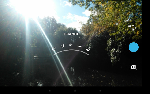
It’s not like Google didn’t have the space to include some text labels to make the interface more user-friendly either. While most tech-heads probably won’t have much trouble with this, less tech-savvy users will likely find it all a bit too confusing, and end up sticking with the default settings. It’s not the end of the world, but given that Google went to the bother of including adjustable settings and features like Photosphere, which is intended to make capturing 360-degree panoramic photos easy, it seems just plain lazy to not go the extra mile to make the user experience a bit more polished and intuitive.
Those that do venture into the settings will find various options including the facility to switch capture modes. In practice, these don’t make a great deal of difference in terms of extending the abilities of the camera; switching to night mode won’t suddenly make that 5MP shooter capable of taking on Nokia’s PureView cameras in low-light conditions, for example. Indeed, in low ambient lighting the Nexus 7’s camera really struggles, both with the auto-focus trying to lock on to the subject of your photo, and with an excess of image noise.
The noise, poor definition, and weak colour reproduction in low-light is evident in this image:

Just to give you a sense of what that scene actually looked like, here it is, captured with the Lumia 1020 on the default settings:

I’m not berating the Nexus 7 for not being as good as the 1020 at imaging, of course; let’s face it – there simply isn’t the same demand for superlative imaging capabilities in a tablet as people expect in their smartphones. At best, you’ll likely use the Nexus 7’s camera for an occasional photo, or even a video, every now and then, but rely on your phone or standalone camera to capture your special moments. The Nexus can record video in 1080p resolution at 30fps; as with taking still images, you’ll want to ensure that lighting conditions are decent unless you want your vids to turn into a blurry, grainy mess.
The front-facing camera is far more relevant on a device like this, since many enjoy making video calls and taking selfies to share on social networks. The 1.2MP cam that you’ll find up front is competent, but wholly unremarkable. It gets the job done – no more, no less – but it won’t ever impress you.

With the second-gen Nexus 7, Google and Asus ditched the NVIDIA Tegra 3 chipset in favour of a Qualcomm Snapdragon S4 Pro APQ8064 SoC, featuring a quad-core 1.5GHz Krait 300 CPU and a quad-core 400MHz Adreno 320 GPU. This is an identical set-up to Google’s now-superseded Nexus 4 smartphone, as well as some other larger handsets such as Verizon’s HTC Droid DNA and the Sony Xperia Z.
Newer devices are now being released with more powerful next-generation architecture such as Qualcomm’s own Snapdragon 800 SoC, but that doesn’t mean you should dismiss the Nexus 7 as out of date. In fact, combined with the increased RAM – at 2GB, there’s twice as much as in its predecessor – I found the Nexus 7 to deal capably with everything that I threw at it.
Navigating through the Android OS was buttery-smooth – not once did I experience a hint of lag or stutter when going through menus or loading up apps.
Where the Nexus 7 really excelled was in playing games. The gorgeous 1080p screen makes any game look stunning, whether you’re engaged in a graphics-heavy first-person shooter, or just playing a few hands of Texas hold’em. The 7-inch display is well suited to casual gaming; the larger canvas and high-resolution shows off details in many games that you might otherwise miss on a smaller 4- or 5-inch smartphone screen.
Between the higher-res display and the Adreno 320 GPU, Google and Asus have considerably beefed up the capabilities of the Nexus 7 over its predecessor. During my time with the device, I tested a variety of games on it, from casual titles like Fruit Ninja and Angry Birds, to simulations such as Airplane!, and more graphics-intensive games including Call Of Duty: Strike Team. The experience across all of these was about as perfect as you could possibly expect of a tablet; the Nexus 7 never stuttered, never got flustered, never gave a hint that it was unable to cope with what I was asking it to do. Even running multiple games alongside each other and switching between them in quick succession failed to get the Nexus 7 flustered.
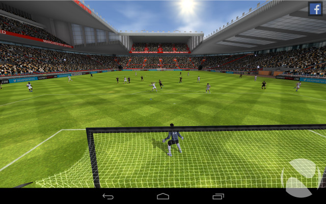
The experience of playing games was so flawless and engrossing that I frequently found myself reaching for the device more than I should – as a result, I have developed a crippling addiction to FIFA ’14. I’m not sure that the terms of my employment with Neowin will cover my stay in rehab, but hey, fingers crossed.
Given the absence of a cellular connection on the Nexus 7 – unless you’re willing to pay up for the range-topper with 4G LTE support – you’ll be relying entirely on WiFi to keep your device in touch with the world. So you’ll be pleased to hear that WiFi performance is excellent.
Android can continue scanning for WiFi networks even when the connection is switched off, which helps to preserve battery life, but when you do flick on the wireless, you’ll find that the device connects quickly, and offers excellent range too. Comparing it to the only other small tablet I had available during the review period – the Acer Iconia W3 that I mentioned earlier in this article – I found that the Nexus frequently located wireless networks that the W3 couldn’t even see, while in range tests, the W3’s connection regularly dropped out long before the Google tablet did. In many cases, the range of the Nexus extended 30-40m beyond the W3.

While the new wave of small Windows 8.1 tablets tries to convince us that mini-tabs can be good for productivity, let’s get real: devices of this size are geared for content consumption, not editing spreadsheets. The Nexus 7 is fantastic for enjoying multimedia content, but the experience is not entirely perfect.
Let’s start with the good. I can’t overemphasise just how lovely the display is, and what a difference that makes when viewing photos, watching videos and browsing the web. It’s not just about the display though – the design and build are ideally suited to this as well. At just 290g, the Nexus is light enough to hold one-handed for long stretches while reading an e-book or the latest news on Neowin; in landscape mode, you’ll find that the device is the perfect size to hold comfortably with two hands while playing games, for example.
The default on-screen keyboard also works well for thumb-typing in portrait mode for most users; when showing the device to friends and family, I observed that even those with the smallest hands were able to type comfortably like this.
The extraordinary diversity of the Android software ecosystem means that you won’t have any trouble finding apps to fill your device – but depending on the kinds of apps you like most, you may find that the Nexus 7 fills up faster than you hoped. Graphics-heavy games will easily eat up well over a gigabyte of space; Call Of Duty: Strike Team takes up a massive 1.87GB of storage before you’ve even launched it for the first time.
Storage is a pretty big problem on the Nexus 7. With just 16GB of space available on the entry-level model, it won’t be long before you find that you’ve run out of room, once you’ve installed apps and games, and downloaded music, video, books and magazines to the device.
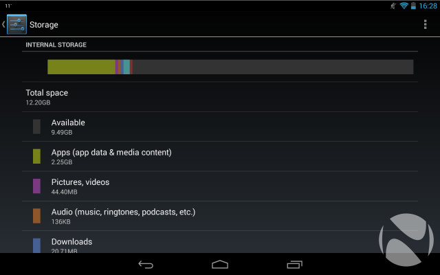
Compounding this problem further is the absence of a microSD card slot. The limited onboard storage wouldn’t be an issue – especially given the price of the device – if it were possible to expand that storage yourself with a memory card.
The limitations that this creates only become more evident when you use the device on the move. Without a cellular connection, the cheaper Nexus models rely entirely on WiFi to connect with the interwebs. As we all know, you can’t always rely on the availability (or speed) or public wireless networks – even when WiFi is available in a café or on a train or mid-flight, download speeds are often so dismal that you may as well not bother trying.
So unless you have a 4G smartphone plan that allows tethering, and which includes a decent monthly data allowance, so that you can connect the Nexus to the web by sharing its connection, you’re going to want to pre-load all of your content onto the device before going places where you can’t be sure that you’ll find reliable WiFi.
Unfortunately, with just 16GB of local storage, you’re not going to be able to fit many HD videos on the Nexus 7 if you also want to store your favourite games, music and e-books as well. Unless you want to spend a lot of your time regularly swapping out content on your device – or you know that you only intend to use it around reliable, speedy WiFi networks, so that you can stream most of the content that you need – I have to recommend that you avoid the 16GB model entirely, and pay the modest premium to get the more spacious 32GB model. Frankly, with the inclusion of a high-definition display on this second-gen Nexus 7, it would have been nice to see Google offer either a 64GB model or a microSD card slot, to accommodate more HD content.
But whether you choose to store content locally or to stream it from the web, consuming content on the Nexus 7 is an enjoyable experience. You’ll find twin speakers on the rear of the device, delivering stereo audio output; these speakers aren’t nearly as awful as you might expect for a device of this type, with good volume and decent balance, although you will still find that deep bass sounds muffled and high trebles sound tinny. Keep your expectations low on this front, and the Nexus 7 won’t disappoint. Better yet, use headphones.
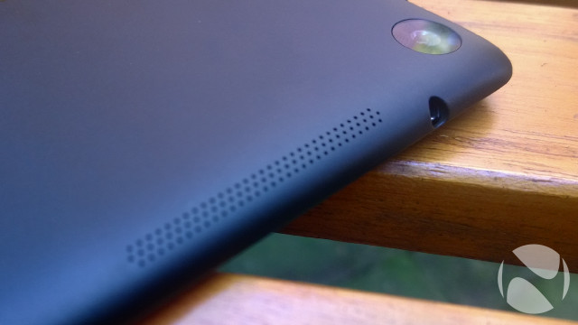
One other note: given that the experience of using a tablet such as this is so clearly geared towards content – watching, listening, reading; with occasional taps in-between – one thing that I found myself constantly craving was an integrated kickstand. When you’re watching a movie, you don’t really want to be holding the damned thing up for two hours.

With its brighter, higher-resolution display – compared with the previous model – you may well have expected Google to boost the battery on the second-gen Nexus 7. Curiously, this didn’t happen. In fact, the battery is actually smaller on the newer model, shrinking to 3950mAh from the previous 4325mAh.
In practice, the device easily managed to get through the day with sensible, balanced usage. Google claims that the battery is good for up to nine hours of HD video playback; in three tests – which involved playing a 1080p video, stored on the device, on loop from 100% battery until death at mid-brightness – the Nexus 7 averaged 7 hours, 58 minutes of life. That’s not bad, but it’s not exactly mind-blowing either.
It’s likely that the decision to reduce weight and thickness resulted in the need to use a less capacious battery, but given the inclusion of such a high-resolution display, this does feel like a compromise that shouldn’t have been made.
You will also find that playing graphics-heavy games drains the battery much faster too, so if you’re the kind of person who can’t stop playing games, you’ll want to keep your power cable with you. You can charge the device via the microUSB port, connected either to a wall socket or to a PC, although the latter is much, much slower.
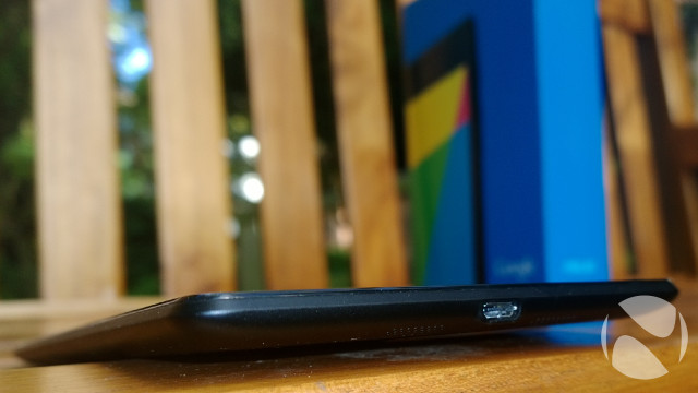
But the Nexus 7 has a hidden trick up its sleeve too: integrated wireless charging. It is rather surprising to see this feature included on such a low-cost device, but it is a welcome inclusion nonetheless. I tested it out on Nokia’s Wireless Charging Pad, which also uses the Qi charging standard that the Nexus 7 supports, and it worked exactly as expected. It’s a convenient feature, but not exactly a must-have, and on such a price-sensitive device, I would rather have seen Google drop the wireless charging and spend the money instead on improving the camera.

The original Nexus 7 offered a great package, especially for the price, but it wasn’t entirely without its flaws. With the second generation, Google and Asus have strived to perfect the formula, and while the device doesn’t quite achieve perfection, it is nonetheless a strong evolution of the product, and an incredible tablet overall.
The display is nothing short of magnificent, and the importance of that cannot be overstated. Those who buy a small tablet are rarely doing so because of some practical, functional need to get stuff done – they’re buying it because they want to enjoy content on a larger and more impressive canvas than their smartphone affords, and in a more compact and portable package than a notebook or even a 10-inch tablet can provide.
Whether you want to watch movies and TV shows, browse the web, flick through your photos, play games or just get busy with a few of the hundreds of thousands of apps available on the Android platform, the Nexus 7 will be equipped to handle the tasks you throw at it without hesitation.

There are two significant weak links though. The first is the rear camera. While we welcome the decision to introduce a cam on the back of the device with this newer model, its imaging performance is sorely lacking – so much so that most users will likely come to ignore it entirely. But let’s be honest: no-one buys a tablet for the camera, and however poor the Nexus 7’s rear cam is, it really isn’t enough to undermine the whole product.
The second weak link, however, is a deal-breaker. There simply isn’t enough storage on the 16GB version that we tested here, particularly given the greater emphasis placed on high-definition content with the upgraded screen. Given that you can’t always depend on the availability of reliable, speedy public WiFi connections, many users will want to pre-load content onto the device, and with such limited storage available – and no microSD card slot to be able to expand it – the 16GB version just won’t be sufficient for many users.
If you’re confident that you’ll only be using the Nexus 7 where you know you’ll have a decent WiFi connection – or you can tether it to your smartphone to share its 3G or 4G connection – then that won’t be a problem for you. But if not, the solution is easy – just pay the small premium ($40 or £40) to upgrade to the 32GB version. It offers all of the strengths of the cheaper model, but the extra storage will make all the difference. (And don’t forget, you can also get a cellular version of the Nexus 7 with its own SIM card slot too.)
Either way, you will find yourself owning an amazing little tablet – undoubtedly one of the best on the market today – with rock-solid build quality, strong performance and a brilliant screen, for a price that almost defies belief.
The best things really do come in small packages, after all.

You may also find these links useful:
> Buy the Google Nexus 7 16GB from Ebuyer!
> Google Nexus 7 official website
> Follow me on Twitter


41 Comments - Add comment