Microsoft launched Windows Phone 8 a year ago – almost to the day – with four manufacturers: HTC, Samsung, Huawei and Nokia. Twelve months on, that list hasn’t grown, but the number of handsets available certainly has. Nokia has, of course, led the charge in this regard; with all of its smartphone eggs in the Windows Phone basket, it’s rolled out a full range of handsets to suit various budgets and tastes.
In recent months, we’ve seen the launch of the affordable Lumia 520, the lifestyle-focused Lumia 620 and the slim mid-range Lumia 720 join Nokia’s line-up. But in the upper echelons, things haven’t changed much. The Lumia 820 remains something of an overpriced curiosity, with a mixed bag of specs that don’t quite do justice to its price tag – but right at the top, the Lumia 920 has continued to reign supreme.

The 920 has been a considerable success story for Nokia. It’s won numerous awards, not least for its remarkable PureView camera, widely regarded as one of the best ever seen in a smartphone. But despite this praise, the handset has had two major criticisms levelled at it since its launch: for some, it’s simply too chunky and too heavy. Indeed, at 185g, it’s one of the heaviest smartphones ever launched; a Vodafone executive openly criticised the 920 for this at the London launch of another Nokia handset just last month.
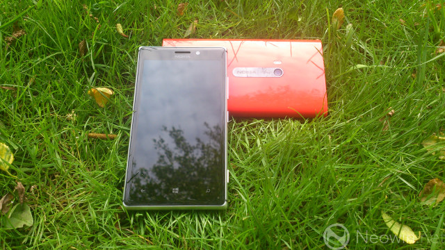
That handset was the Lumia 925, Nokia’s newest flagship. On the inside, its basic specs are remarkably close to those of the Lumia 920 (and the recently launched Lumia 928 on Verizon) – but on the outside, it’s a very different beast. Thinner, lighter and with an emphasis on premium materials and sophisticated design, the Lumia 925 is a completely new take on Nokia’s Windows Phone offering.
But does Nokia’s great light hope for smartphone supremacy really have what it takes to succeed?

If you’re familiar with the specs of the Lumia 920/928, the internals of the 925 probably won’t raise an eyebrow. There’s the same 1.5GHz dual-core Snapdragon S4 CPU and 1GB of RAM, along with a 4.5” HD (1280x768px) AMOLED screen (rather than the IPS LCD on the 920) featuring Nokia’s much-touted ClearBlack display technology. Around the back, you’ll find an 8.7MP PureView camera, while up front there’s a 1.2MP wide-angle cam.
Unfortunately, the 32GB of storage seen in its siblings isn’t standard on the 925; most models will feature just 16GB of storage, which isn’t exactly spacious for a flagship handset. A 32GB model will be offered, but its availability will be limited; in the UK and parts of Europe, for example, Vodafone will offer it exclusively on contract. Unlike the inferior Lumia 820, there’s no microSD card slot to expand storage as needed.

Another unfortunate similarity to the 820 is that the 925 has to make do without integrated wireless charging, a casualty of the company’s effort to reduce weight and slim down the profile of the device. If you want to add this feature, you can do so by purchasing an optional cover (in addition to the wireless charging station).
Let’s take a look at the specs in a bit more detail:
Dimensions
129 x 70.6 x 8.5mm / 139g
Connectivity
2G (All models): GSM 850/900/1800/1900
3G (RM-892/893): HSDPA 850/900/1900/2100
3G (RM-910): HSDPA 850/900/1700/1900/2100
4G (RM-892): LTE 800/900/1800/2100/2600
4G (RM-893): LTE 700/1700/2100
Wi-fi 802.11 a/b/g/n
Bluetooth 3.0 with A2DP
NFC
A-GPS / GLONASS
microUSB
3.5mm audio port
Display
4.5" ClearBlack AMOLED
HD resolution (1280x768px)
332ppi pixel density
Processor
Qualcomm Snapdragon S4 MSM8960 chipset
Dual-core 1.5GHz Krait CPU
Graphics
Adreno 225 GPU
RAM
1GB
Storage options
16GB / 32GB local storage
7GB online storage via SkyDrive
Camera
8.7MP PureView rear camera with Carl Zeiss optics
- Optical image stabilisation
- Autofocus
- Dual-LED flash
- 1080p video recording at 30fps
1.2MP forward-facing camera
- 720p video recording at 30fps
Battery
2000mAh non-removable battery
Up to 440h standby time (2G/3G)*
Up to 12.8h 3G talk time; up to 18.3h 2G talk time*
Up to 55h music playback time*
Qi wireless charging through optional accessories
Operating system
Windows Phone 8 General Distribution Release 2 (GDR2)
OS version 8.0.10327
Nokia Lumia 'Amber' firmware
Launch date
In selected markets from June 2012
*Manufacturer's claims

Nokia’s very first Windows Phone, the Lumia 800, established a design direction (albeit one that it stole from the MeeGo-powered N9) for the range, which remains alive and well today. The use of colour has been an important part of the Lumia design language, complementing the bright tiles of the operating system, along with robust plastics and an approach to design that ensures that Nokia Windows Phones stand out among the sea of same-again handset styles from many other manufacturers. By and large, you could debadge a Lumia handset, and still know you were looking at a Nokia.
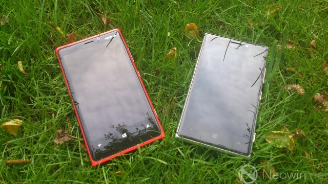
With the Lumia 925, Nokia decided to take a different approach. The colourful, heavyweight polycarbonate shell of the 920 is out, replaced by a thinner, lighter body that looks like nothing else in the Lumia range. From the front, you’ll no longer see colourful plastic around the screen; instead, a smooth aluminium frame extends around the edge of the handset.

The entire reverse of the 925 is a single thin piece of matte polycarbonate, with cut-outs for the camera and dual-LED flash…

…speaker and three contacts for the optional wireless charging cover.

Where the 820’s camera sat in a small ‘trough’ on its rear, the 925’s camera extends outwards slightly beyond the main body of the handset, resulting in a small bump. The left edge of the phone is smooth and interrupted…
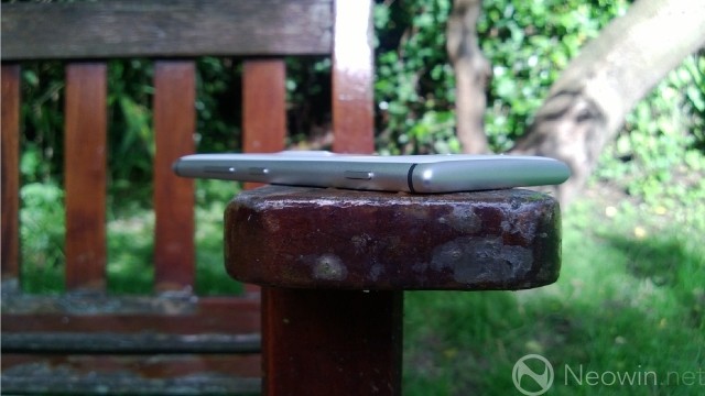
…as is the bottom, with no slots or features of any kind. The right edge of the handset features the familiar volume, power/sleep and camera buttons, all in matching aluminium.

The top of the 925 is home to a 3.5mm headphone jack and the SIM slot, as well as the micro-USB port, unlike the Lumia 920, which had this port located in the centre of its bottom edge.
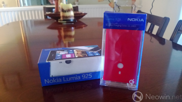
While Nokia kindly supplied the Lumia 925 for us for review, they didn’t supply us with a wireless charging cover – perhaps replicating the experience that buyers will face when they purchase the handset. If you want to wirelessly charge your 925, you’ll have to buy a cover separately, as we did for £25 GBP (local pricing may vary, but a straight currency conversion equates to around $39 USD / €29 EUR). Given that the 920 and 928 integrate this feature, it seems a bit cheap of Nokia to not include a free cover with the handset for those who buy it.

The cover includes cut-outs for the camera and flash, and on the inside, you’ll see the three contacts that connect to the non-removable battery via the cut-outs on the rear of the device. You’ll also need to purchase a wireless charging station to use this feature; Nokia supports the Qi standard, so you can use any compatible charger if you don’t want to get the official Nokia unit.

The cover snaps on easily, and isn’t too fiddly to remove. It does add considerable thickness to the device when it’s on though. In addition to the red cover seen here, white, yellow and black versions are also available, all made of the same matte polycarbonate plastic as the rear of the handset.

If you’ve ever held a Lumia 920, the first thing you’ll notice about the 925 is just how light it is at 139g. It’s not as light as the iPhone 5 (112g) or even the Windows Phone 8X by HTC (130g), but it’s still remarkable that Nokia has managed to shed 25% of the 920’s weight while preserving most of its features.

The next thing you’ll notice when you first hold the 925 is just how good it feels. Nokia has frequently talked up the use of premium materials in the new handset, and there’s no denying the fact that their efforts have paid off. The smooth aluminium frame is as good to touch as it is to look at, while the matte polycarbonate rear ensures a luxurious feel. The Lumia 925 doesn’t just look good; it feels good, it feels expensive, it feels like a handset that you want to show off.

It sits very comfortably in the hand; unlike with my 920, which often feels cumbersome when I try to use it with one hand, the 925 is easy to handle, even allowing my sausage-like thumb to glide effortlessly from one side of the screen to the other without straining. It’s curious, given that the display of the 925 is no smaller than that of its sibling, but it simply feels easier to use with one hand without over-stretching my thumb. I imagine that the greater weight and heft of the 920 simply leads me to grip it more firmly to keep it in place; this isn’t an issue for me with its thinner, lighter brother. Your experience, of course, may differ.

Your opinions may vary too on the aesthetics of the device. To my eye, the Lumia 925 is beautiful, even more so in person than on screen or in brochures. That said, I am mildly disappointed by the absence of colour in its design; the only colour variations offered are monochromatic, with black and grey versions of the handset offered alongside the white model that you see here. The black version also features black aluminium in place of the silver frame seen here.
Before the official announcement of the device, I was shown renders (which turned out to be fake) of the 925, featuring coloured aluminium frames, similar to the current-generation iPod nano, and part of me wishes that those images had been accurate. If you want colour on your 925, you’ll have to purchase a cover.
This criticism is relatively minor in the face of the handset’s luxurious design and construction. It feels rock solid, with no flex or creaking of any kind. The devil, however, is in the detail.

On my review unit, the fit of the polycarbonate rear appeared slightly off. In manufacturing, three edges of the handset fits tightly against the aluminium frame…

…but on the bottom edge, the gap between the polycarbonate and aluminium was much wider. This might seem like a minor detail, but when the handset is at the bottom of a pocket or bag, there’s a good chance that that gap will accumulate dust and lint.

It’s also worth pondering how resilient the handset will be over time. The Lumia 920 was built like a tank, and could survive an extraordinary amount of punishment thanks to its seemingly impenetrable polycarbonate shell. Aluminium, on the other hand, is far less forgiving, as many owners of the iPhone 5 will attest. I take extraordinary care of my handsets – especially those that are on loan to me – never placing them in a pocket with keys or loose change, for example – and yet the Lumia 925 has already picked up a tiny scuff on its upper left corner (see image above), which I suspect occurred while I was removing the wireless charging cover.
Potential owners would be well advised to buy a cover – even if they have no interest in the wireless charging feature – to ensure that their handset is protected, especially if it’s dropped.
My biggest criticism of the Lumia 925, however, is that it didn’t come sooner. It’s a thinner, lighter version of the Lumia 920, but it comes seven months after the 920 landed. Frankly, given how much time has passed since then, it would have been nice if Nokia had bumped up the specs in some way, but it’s actually gone the other way, stripping out integrated wireless charging, and with half the storage – except for those who opt into carrier exclusivity deals or buy off-contract – for the same price as it charged for the 920 when it launched. Cheeky.

All of this beautiful design would mean nothing if the display wasn’t up to scratch, and the good news is that Nokia has excelled itself with the screen on the Lumia 925. It’s ditched the IPS LCD from the 920 in favour of an AMOLED panel, still at 4.5-inches, and still featuring Nokia’s ‘PureMotion HD+’ branding, along with its ClearBlack technology for deeper-than-black blacks.

The display offers all of the rich and vibrant colours that you would expect of an AMOLED, but – mindful of the criticisms that such displays often attract – Nokia has included an exclusive feature, one that Microsoft hasn’t yet included in the Windows Phone 8 OS. The new Lumia Colour Profile – found under Settings > System > Display+Touch – allows users to adjust the saturation and ‘temperature’ of colours, changing how vibrant or how warm the colours appear on screen.

Nokia also touts the screen’s readability in bright sunlight, and the handset can also use its light sensor to adjust the display accordingly to improve this. In practice, the Lumia 925 performed excellently in this regard. While you’re obviously not going to be able to perfectly see everything on the screen with sunlight bouncing directly off it and into your eyes, it was still possible to read the screen with a good degree of clarity…

…even with the screen facing towards the sun.

As you’d expect of a premium handset, viewing angles are also excellent, which is great news if you enjoy looking at photos or videos with friends.

The display offers HD, but not Full HD, resolution at 1280x768px, giving an impressive pixel density of 332ppi. Fonts display smoothly, images and icons look lovely…
…although of course, if you look really closely, you’ll be able to spot those individual pixels. We look forward to higher resolution displays on Windows Phone later this year, with the GDR3 update, but for now, displays such as the one on the Lumia 925 are more than up to scratch.

Speaking of scratches, the screen is protected by Gorilla Glass 2, so you should find that it’s impervious to most minor scrapes and scuffs. That said, my review unit has already somehow picked up a tiny scratch on the display – despite best efforts to keep it away from all sharp objects – so be sure to pick up a screen protector if you want to ensure maximum protection for your display. Again, this is something that Nokia doesn’t include in the box.
As on other Lumia handsets, Nokia has also enabled ‘super-sensitive touch’ on the 925. This is an incredibly handy feature for those of us in areas where the weather can reach appallingly low temperatures, allowing users to interact with the handset without taking off their gloves – or, if the mood takes you, you can also tap the screen with objects like pens or, if you’re feeling brave enough, your keys.

In action, the Lumia 925’s display is nothing short of gorgeous. Videos look beautiful on its big screen, with colours that seem to burst out with the kind of vibrancy that’s missing from the 920, for example. Two strangers commented to me on the train about how lovely and bright the screen was, and both were startled to discover that I was using a Nokia, with one mistakenly believing it to be an iPhone.
The AMOLED screen is a perfect match for the operating system, and it’s here that the Lumia 925’s monochromatic hardware seems to make sense. The bright colours of the OS, and the explosive brightness of the AMOLED, are a fantastic contrast to the white and silver of the handset itself. The Lumia 925 and Windows Phone 8 are a match made in heaven.

We’ve previously reviewed Windows Phone 8 in depth, so if you want to know more about the operating system, I encourage you to read our full review, and my colleague Tim Schiesser’s excellent article on living with WP8 for three months.

The Lumia 925 comes with the latest version of the operating system, General Distribution Release 2 (GDR2). The most recent OS version on my Lumia 920 is 8.0.10211; the 925 comes with build 8.0.10327, along with Nokia’s newest firmware update, which it announced at the Lumia 925 launch in London last month, known as ‘Lumia Amber’. The Amber update will be rolling out to other Lumia handsets as an over-the-air update, over the next couple of months.

GDR2 brings a number of features to Windows Phone 8 users, including FM radio support (yes, it’s back!) and support for CalDAV and CardDAV. Amber goes further, introducing features such as the Lumia Colour Profile (detailed further up this review), a new Smart Camera app, and a new feature called Glance.

When the device is locked/asleep, the Glance feature shows the time and ringtone status (and charging status if the device is plugged in or on a wireless charging pad). This ultra-low-power consumption feature is entirely optional and can be customised or switched off. The AMOLED screen facilitates this feature since, unlike with LCD panels, its pixels can be independently activated without powering up the whole display. The info displayed by Glance also periodically jumps around the display – screen-saver style – to prevent burn-in.

If you keep your phone on a bedside table while you’re asleep, you can also switch it to a red version (7:08pm, I must have gone to bed pretty early that night), to prevent the Glance screen from lighting up the room and disturbing your slumber unnecessarily. To turn on or wake the device, you can either use the power button as normal, or simply double-tap the screen.
This sounds like one of those completely unnecessary features that might well have you asking “why?!” – I certainly did – and yet I’ve found it to be curiously handy. It’s a nice addition rather than a must-have, but it’s one that’s proven to be strangely useful, particularly the double-tap-to-wake function.
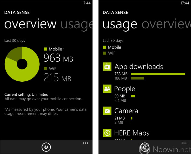
More good news is that the Windows Phone 8 Data Sense feature – previously, and frustratingly, exclusive to users of Verizon Wireless – is in GDR2, and enabled for all Windows Phone users. This feature was announced at the full Windows Phone 8 product launch last October, but hey, better late than never. (Is that the Windows Phone 8 tagline?)
In addition to seeing how much data you’ve consumed in total over your cellular and wi-fi connections, you can also view a breakdown of data consumption by each app, which is really handy in identifying any apps that might be spanking your data limit if you’re on a restricted plan.
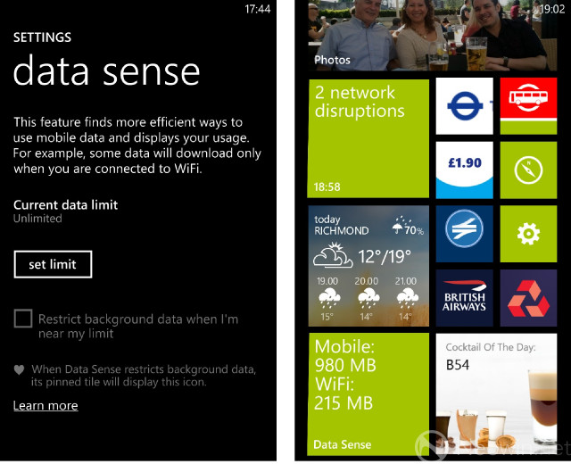
You can define your carrier data limit in the settings, and helpfully, the OS can also reduce the amount of data consumed by apps in the background when you’re getting close to your limit. Naturally, Live Tile support is also included, with a counter displaying how much data you’ve used.

The introduction of Data Sense also brings another handy feature. When he announced Data Sense last year, Joe Belfiore said that Microsoft was helping users to “try to use wi-fi instead of cellular when we can”. With this in mind, Data Sense introduces a feature to help users find nearby wi-fi hotspots, displayed on a map. You can tap on any of the hotspots to find out more about them, including the network ID and directions to them from your current location.

The Lumia 925 also comes with a bunch of Nokia-exclusive apps that add greater value to the package. Nokia has opened up many of these – notably, its HERE location services – to other manufacturers, but there are still a few that you’ll only find on the 925 and other Lumia handsets.

HERE City Lens remains one of my favourites among Nokia’s apps. It provides an augmented reality guide to local points of interest, including bars and restaurants, hotels, shopping areas and transport stops and hubs. Simply select what you’re looking for (in this case, shops)…

…then hold up your device, and you’ll see an overlay of relevant locations in your vicinity, displayed on a real-time view of the world. Hold your display horizontal, and all of those locations will be displayed on a two-dimensional map view. Tap any of the locations, and you’ll be able to find more information, including directions from your present point. Lovely.
There are plenty of other Nokia apps to choose from, such as the brilliant Nokia Music – offering free streaming audio mixes of virtually all music genres – and Nokia Trailers (movie trailers, in case you were wondering - not the kind that you tow).
The Windows Phone app ecosystem is finally growing at a meaningful pace, which means that many of the apps that people have been missing in recent months have already been deployed or are in development. In my personal experience, there are now very few apps that I really miss on Windows Phone; I now have an app from my bank, my preferred airlines, ticketing and hotel services, and the social networks that matter most to me.
But let’s not kid ourselves: gaps remain. While third parties are doing fantastic work in filling in those gaps – for a great example of this, look no further than the excellent Instance, in lieu of an official Instagram app – the absence of official apps from some big brands remains a big deal. Windows Phone’s tiny market share means that that’s likely to be a problem for some time to come. That’s as much a problem for Nokia as it is for Microsoft; while brands continue to develop apps for Windows Phone months after iOS and Android (and even BlackBerry) if at all, handsets like the Lumia 925 remain a tough sell, no matter how pretty they are, or how smooth and efficient the OS may be.
Microsoft and Nokia been working hard to reverse the negative perceptions around this problem, with high-profile promotional activities, such as Microsoft’s extensive tie-ins with Star Trek Into Darkness, and Nokia’s promotions alongside the new Superman movie, Man Of Steel. While this kind of marketing may change some minds, it doesn’t change the underlying app problem that Windows Phone still has. Little wonder that Microsoft has reportedly been offering up to $100,000 to developers to build apps for its mobile OS.

The Lumia 925 features the same Qualcomm Snapdragon S4 MSM8960 chipset that’s offered in the Lumia 920, 928 and even the lesser 820. Like its siblings, the 925 packs a 1.5GHz CPU and Adreno 225 GPU, along with 1GB of RAM.
While some manufacturers have turned the mobile specs game into a rather tedious pissing contest – “more cores, more powerrrrrrr!!!” etc – the approach taken by Nokia, and led by Microsoft in its OS architecture, is more measured. True, it means that Nokia loses out on being able to market a handset with eight cores (only to then tell the majority of potential buyers that the version they’ll get will have a quad-core processor instead), but the result is a handset that does everything that you could need it do without fuss.
The Lumia 925 breezes effortlessly through the Windows Phone OS without a hint of stutter or lag. Multitasking is as flawless as the OS allows; hopping in and out of running apps – from games to Office documents, diagnostic tools and media – didn’t even make the 925 blink. The screen is as responsive as any other handset I’ve ever used, with all taps and swipes being registered without drama.

Playing games on the device is similarly trouble-free. The large screen makes it easy to play games like Bejeweled, which require you to tap relatively small targets, while graphics-intensive titles like Mass Effect: Infiltrator play out without issue. The handset copes effectively with everything that the Windows Store can throw at it, which is really all that you need from a handset; bumping up the specs may have given Nokia more ammunition in the futile fight for on-paper supremacy, but the measure of a handset is not how it copes in theory, but how it deals with the tasks that you demand of it. In that regard, the Lumia 925 excels.
The handset also offers an outstanding array of connectivity options. Three versions of the device are offered in different markets; all support GSM 850/900/1800/1900 2G connectivity, while various 3G and 4G bands are supported by each of the three variants. The version that Nokia supplied to us for review, model number RM-892, supports 3G HSDPA 850/900/1900/2100 along with pentaband 4G LTE support for the 800/900/1800/2100/2600 bands.
For potential UK buyers, that makes this handset fully compatible with EE’s existing 4G network, and with the 4G LTE services that other operators will begin rolling out later this year.
You’ll also find wi-fi a/b/g/n (but not 802.11ac) support, Bluetooth 3.0 with A2DP and NFC (referred to within Windows Phone as ‘tap to send’). Connecting to wi-fi is about as snappy as you could reasonably expect, while sending files between phones via NFC is a nice feature to have, but likely one that you’ll rarely use in practice. Windows Phone supports NFC payments via its Wallet app, but there’s little third-party support for it.
Call quality was excellent; easily as good as any other device I’ve used. I frequently found that the maximum call volume – sometimes needed in a noisy bar or when standing outside on a very windy day – was actually too loud and clear in quieter environments, at least judging by the raised eyebrows of other people standing around me and overhearing my profanity-laden conversations when I’ve been on the phone.

“More than your eyes can see” is Nokia’s primary marketing slogan for the Lumia 925, and just like its 920 sibling, its camera is arguably the most important focus for Nokia in promoting the handset.

The PureView camera in the 925 is almost identical to the one that débuted in the 920. It features an 8.7MP backside-illuminated sensor with f/2.0 Carl Zeiss lens, dual-LED flash and optical image stabilisation. Nokia has included an additional lens element in the 925’s camera, intended to improve the quality of shots in daytime and more generous lighting conditions.
I took the Lumia 925 down to the lake in the grounds of where I live, to test drive the camera in various conditions. A sunny day, with occasional cloud cover, and numerous areas offering different degrees of light coverage offered ample opportunity to give the camera a go in daylight.

This first image is an excellent sample of what’s great and what’s lacking in the 925’s camera. It was taken just as the sun briefly disappeared behind a cloud, and the camera managed to capture an extraordinary variety of greens in the scene, about as faithfully as my eye can recall – but it’s completely obliterated the beautiful blue sky in the distance. Nonetheless, the contrasts in the scene, from the darkest near-black shades to the brighter grass and the broad range of colours in the leaves, are fantastic.

Taken from under the canopy of the trees, with less sunlight shining into the camera, this shot shows the 925’s ability to capture a massive amount of detail in a single shot. Again, the broad range of colours and contrasts is impressive, though the same problem remains, with the blue sky suffering from ‘white out’. If you look at the reflection of the sky in the water of the lake, you can see the hints of blue that are missing towards the top of the image.

This shot is something of a mixed bag. Towards the left of the image, the foreground detail is beautiful, with rich, vibrant colours and fantastic contrasts that are, frankly, truer to life than any smartphone camera I’ve seen. Even the details of the gentle wake behind the rather inquisitive duck have been faithfully captured.
But further back, things go a bit awry, with a significant loss of detail and some very fuzzy-looking leaves, while the capture of the sunlight in the background has completely obliterated any detail in those areas of the scene. Even the blue sky reflecting off the lake in the foreground gets washed into white as the camera allows an excess of light to pour in through the lens.

The camera is excellent at capturing scenes with focusing on different objects in frame. In this image, I tapped on the plant in the foreground, which captured it in all of its curious detail, including the lattice of spider webs across its leaves, while nicely blurring out the background.

In this next shot, I tapped on the background, which blurred out the plant I had previously been focused upon, but captured a fantastic amount of detail further back, with brilliant contrast across the different plants and trees, and the varying lighting cast down by the breaks of sunlight peeking through the canopy of leaves and branches above. In the far background, individual bricks on the building can be seen. Brilliant.
All daytime shots were taken with the standard ‘auto’ settings that the majority of users will use for most of their shots.
To test out the Lumia 925’s abilities in low-light conditions, Nokia invited us, along with a few other distinguished members of the media, to an exclusive viewing of scenes from ‘Limbo’, a spectacular and enormously entertaining production on London’s South Bank, featuring illusions, dance, live music and daring stunts.

The handset captured this rather moody, atmospheric shot of an unlit stage, and the band warming up in the background, although the image is rather grainy.

Once the action began, and with the 'Night' camera settings enabled for low-light, the 925 captured vibrant colours and rich details despite the relatively limited light available, with none of the graininess found in the previous shot. The live band can be seen more clearly in the background (along with a fellow journalist also testing his 925), as well as the musculature and even the ribs of the cast member in the middle of his performance.

In this shot, a similar amount of detail can be seen, with only a hint of motion blur in the performer’s right leg.
In this short video - taken with the most basic video settings - you can see that the 925’s impressive ability to capture detail and colour in low-light conditions isn’t limited solely to static images. And despite my fingers of sausage and fists of ham, the optical image stabilisation did its job in keeping the video capture pretty smooth.

When I reviewed the Lumia 820 back in February, I took two sample images in pitch-black light looking out of my window towards neighbouring buildings. The 820 struggled to capture anything other than bright light sources…

…while the shot that I took with my Lumia 920 faired a good deal better, managing to pick out plenty more detail, although the results were still far from perfect.

I took a photo from the same angle with the Lumia 925, and the results are visible in the image above. This image was taken in darkness at 23:01, over an hour and a half after sunset here in London, so pretty much the same lighting conditions as those used in the 820/920 images above it.
No, the image still isn’t perfect, but it’s a good deal better even than the impressive 920, with a much broader range of colours, and accurately depicting a blue sky rather than the yellowy sky seen in the 920 image, while the buildings are more clearly defined.
There’s clearly room for improvement, but there’s no doubting the advances that Nokia has made in making an already excellent camera even better. I’ve had the privilege of testing cameras in a huge range of devices, from Samsung’s Galaxy S4 and the iPhone 5 to the brilliant HTC One, but in terms of all-round abilities – and particularly in low-light conditions – none is as good as the Lumia 925’s camera.
It’s a stretch to state that its camera can capture more than the eye can see, but to my eye, the Lumia 925 offers the best all-round camera experience of any smartphone I’ve tested. That bodes very well for Nokia’s forthcoming ‘EOS’ handset – which will be formally launched next month – with its 41MP camera.

The 16GB of onboard storage on the Lumia 925 is pretty miserly for what’s supposed to be a flagship handset, especially when the Lumia 920 offers 32GB as standard. Yes, there’s a 32GB version of the 925, but its availability will be limited, thanks to carrier exclusivity deals. In the UK and parts of Europe, if you want the 32GB model, you’ll either have to sign up for a contract with Vodafone, or purchase the handset at full cost without a price plan.

With only my text messages, emails and apps on its local storage – plus around 100 photos and one video that I’d captured with it – the Lumia 925 that Nokia loaned to us had already seen 6.7GB swallowed up, out of a total of 14.68GB of accessible storage. According to the new Windows Phone 8 Storage Check app, 1.9GB of this was taken up by the ‘System’, with 3.4GB of apps. As a result, even without any music or videos on to the device, I was already down to 8GB of free storage, with no facility to extend local storage via a microSD card. Frankly, that’s pretty poor.
Frustratingly, this meant that I had to be selective in loading up the music that I wanted on the handset, instead of just dumping my music across in one big chunk. Even though I did this the old fashioned way – plugging it into my computer and using drag-and-drop to load music onto it as a connected device, rather than using the tedious Windows Phone app in Windows 8 – it still took ages to pick the songs and artists that I wanted most on the move. Ultimately, a lot of time was wasted on a problem that I never had with my Lumia 920.
Still, while the experience of getting my media onto the handset was less than stellar, at least the playback of that content was excellent. The included headphones – identical to those provided with the 920 – are a joy to use. Comfortable to wear (with a range of buds included to help you find the perfect fit), they offer clear playback that strikes a great balance between avoiding shrill tones in the treble range, and pumping out heavy bass without descending into abstract thuds.
Audio enhancements and adjustments are available via the settings, but I never found it necessary to tinker with these, as the standard settings suited my ears pretty well. Those of you with more distinguished ears may disagree, but I think the majority of users will find the default settings more than satisfactory.
On the 920, the external speaker is positioned on the bottom edge of the device, so that when it’s flat on a table, the sound is directed outwards. On the 925, the speaker is on the rear of the device, so the sound is directed downwards when it’s on a flat surface. Although Nokia has installed two tiny ‘feet’ on the rear of the handset, to prop it up very slightly when it’s on its back, audio playback quality hovers between sounding muffled and echoed.

Video playback is stunning on the HD display, and the PureMotion HD+ technology that Nokia has baked into it generally does a pretty good job of keeping up with the action in fast pans and high-detail scenes such as explosions or high-speed chases. Even in relatively monochromatic scenes, the display succeeds in showing off the contrasts between different shades and lighting effects.

With more colour on screen, the display bursts into life, with an amazing amount of depth, and fantastically vibrant images, as you’d expect of an AMOLED panel. High-definition content – both local and streamed, such as the trailer for Star Trek Into Darkness shown in the images above – played flawlessly.
As with other Windows Phones, if you want to watch video stored on your handset, you’ll need to ensure that you sync it in a compatible format. MKV files, for example – a popular format for hi-def video – isn’t supported, but you shouldn’t have any trouble with WMVs, DivX-encoded AVIs or H.264-encoded MP4s.

Like the 920, the Lumia 925 features a non-removable 2000mAh battery. As with most modern smartphones, you should find that a sensible, balanced amount of usage gets you through the day, but you should expect to charge it every evening.
With routine usage – checking emails, sending texts, making a few short calls, occasional web browsing, half an hour of casual gaming and a couple of hours of music throughout the day – the Lumia 925 made it to the evening with juice to spare. If you’re the kind of user who spanks their battery hard, playing music all day and spending hours on graphics-intensive games, you’ll need to make sure you keep your charger handy.
The Lumia 925 features the Battery Saver mode seen in other Windows Phone handsets. This optional feature extends the battery life of the handset when remaining capacity has been depleted to 20%, killing background apps, dimming the display brightness and switching off push notifications until the handset can be charged.
You can also extend the life of the battery by tweaking various settings. Switching off Bluetooth and NFC functionality – which most people won’t be using on a regular basis – helps in this regard, as does changing your email settings to check for new items in your inbox every 15 or 30 minutes, rather than getting them pushed to your handset as they arrive.
Charging via a USB cable connected to a computer is possible, but slow; charging via a wall socket is considerably faster, as is the wireless charging feature. As mentioned above, you’ll need to purchase two optional accessories to take advantage of this feature: a wireless charging cover, and a Qi-standard charging station.

Nokia’s charging pad is a pretty non-descript item to look at; in addition to the black version seen here, various coloured options are also available. I was fortunate to get mine free in a promotion when I purchased my Lumia 920, but you’ll have to buy one separately for around £40 ($63 / €47 – local pricing may vary).
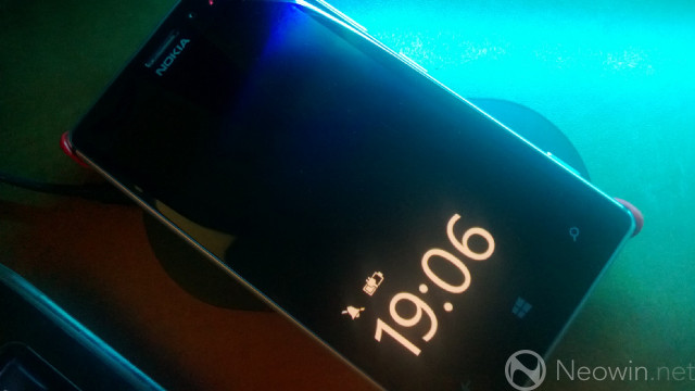
The wireless charging cover is another optional extra. Since Nokia didn’t provide one with the Lumia 925 that they loaned to us for review, we purchased one separately for £25 ($39 / €29 – local pricing may vary). It easily snaps onto the rear of the device, and then it’s as simple as placing the handset onto the charging pad to begin juicing up the battery.
This is a great feature to have, but given how much it costs on top of the handset, for many users, it simply won’t be worth the considerable expense. I maintain that it’s pretty cheap of Nokia to not include a free wireless charging cover – which also acts as a protective cover – in the box with the phone, considering the 920 and 928 both include integrated wireless charging.
I’m also not convinced that the trade-off in removing that feature from the handset itself was worthwhile. Nokia claims that the 925’s body is 8.5mm thick; given that LG has been able to cram wireless charging into the 9.1mm-thick Google Nexus 4 – a handsome and extremely capable device in its own right, and a much cheaper one, at that – I’d have expected Nokia to work harder to strike the right balance between thickness and integrating what it considers to be a key differentiating feature into its flagship device.

When I first met the Lumia 925 last month, I liked it. Holding it in one hand with my Lumia 920 in the other, it made an incredible first impression. Essentially, it was the same handset, but in a thinner, lighter and arguably even more beautiful package. As soon as I picked it up, I was impressed by how luxurious it felt, how light it felt, how different it felt.
But there’s no denying the fact that underneath its beautiful new clothes, it’s essentially still a 920, and it’s a bit of a shame that Nokia didn’t seize the opportunity to give the hardware a tune-up, seven months on from the launch of its predecessor. It’s more disappointing that, in some ways, the specs have taken a step down, with the removal of integrated wireless charging, and the baseline model featuring just 16GB of storage. Hardly fitting for a flagship model, especially at the price that Nokia and its carrier and retail partners will be asking you to pay.
And yet, there’s still so much to like about the Lumia 925, besides its premium feel.
The display isn’t Full HD, but that doesn’t matter – it still looks absolutely stunning and video playback is up there with the best of any handset.
It doesn’t have the most kick-ass specs on the market, but that doesn’t matter; the hardware does everything you could ask of it, and frankly, that’s the true measure of a handset’s competence. Spec sheets are immaterial if the experience doesn’t live up to expectations in practice, and in that regard, the Lumia 925 excels. Its performance never left me wanting, and it never disappointed in completing the tasks that I asked of it.
And the camera may not have the largest megapixel count, but that really doesn’t matter; the Lumia 925 has the best all-round camera experience of any smartphone I’ve used, offering excellent low-light performance and visible improvements over the 920. Indeed, in terms of all-round abilities, and factoring in the all-important user experience, the 925 is a more complete package than even Nokia’s own 808 PureView with its mighty 41MP sensor. It’s incredibly exciting to imagine how Nokia will improve on its imaging prowess in future handsets.

"The Lumia 925 isn’t just the best Windows Phone by far; it’s also one of the best smartphones available today"
The weakest link in the 925’s offering is, as with other Windows Phones, the app ecosystem. Major gaps are, slowly but surely, being filled, but there’s no denying the fact that Windows Phone remains the third or fourth ecosystem for brands developing software for mobile platforms. It’s a big ask for customers to buy into a platform that doesn’t get the latest apps quickly; apps – and games in particular – have a short half-life, with the next big thing always just around the corner. Nokia and its customers celebrated when Draw Something and Words With Friends made it to Windows Phone, but by then, these fads had largely passed, with users on other platforms having moved on to other novelties.
It’s a reality that can’t be ignored, and without significant improvements, the Lumia 925 is unlikely to win over those who have already glossed over Windows Phone, and who are eyeing up an iPhone or one of the vast numbers of Android handsets – and that’s a terrible shame.
The Lumia 925 isn’t just the best Windows Phone by far; it’s also one of the best smartphones available today. It’s proof that you don’t need to have the most insane specs on paper to provide an excellent all-round smartphone experience. It’s proof that, in a world of me-too handsets, it’s still possible to offer a device that stands out, with beautiful hardware design and an incredible camera that allows real people – not imaging experts – to take amazing photos. And it’s proof that, even for all the difficulties – and, yes, failures – Nokia has endured in recent years, it’s still got what it takes to put up a damned good fight.
When I first met the Lumia 925, I liked it. Now that I’ve spent more time with it, and even in spite of its flaws, I think I’m in love. I’ll never be able to look at my 920 in the same way again.

You might also find this stuff useful:
> Windows Phone 8 operating system review
> The verdict: Three months with Windows Phone 8
> Lumia 925 info at Nokia.com
> Follow me on Twitter
...and finally:
Neowin would like to offer huge thanks to the cast of Limbo – a co-production between Strut & Fret Productions, Underbelly Productions and the Southbank Centre – for extending such rare permission to photograph and record their performance. Limbo headlines the London Wonderground festival on London’s South Bank until September 29th. Tickets are available from £10.00. You can find out more about the show at limbotheshow.com.


34 Comments - Add comment