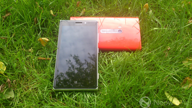
Nokia’s Lumia 925 made a great first impression when we got some hands-on time with it at its launch in London last month. When we reviewed it last week, it only impressed us more, and we declared it not just the best Windows Phone by far, but also one of the best smartphones currently on the market.

That’s pretty good going, considering that the Lumia 925 is essentially a reworked version of the Lumia 920 that launched seven months ago. In that time, the 920 has won a good deal of praise, not least for its brilliant 8.7MP PureView camera, but it has also attracted its fair share of criticisms, especially with regards to its chunky bodywork and significant weight.

With the 925, Nokia attempted to address both of these concerns, ditching the slab-like polycarbonate body of the 920, in favour of a much sleeker and lighter handset design. While the 920 weighed a mighty 185g, the 925 weighs 25% less at 139g, thanks to the use of lightweight aluminium in its construction, paired to a thin but sturdy piece of polycarbonate plastic on the rear.

The work that Nokia has done in slimming down the device is most obvious when viewing the two handsets side by side. The Lumia 925 is noticeably thinner than its chunky sibling; the 920 is 10.7mm thick, whereas the main body of the 925 is a good deal slimmer at 8.5mm, although this is still someway off the “world’s slimmest handset” that was announced yesterday.
Other key differences are notable at the base of the handsets. While the Lumia 920 has two screws on the bottom for engineering access, the 925 has no screws anywhere on its external bodywork. The 920 also includes its microUSB port on the bottom, along with its external speaker, but the bottom of the 925 is featureless; nothing to see here but smooth aluminium.

On the 925, the microUSB port is located at the top of the handset, along with the 3.5mm audio jack, and SIM card tray.

The 925’s speaker is positioned on the rear of the device, along with contacts for the wireless charging cover (more on that below), and the camera.

Unlike the 920, the 925’s camera protrudes from the main body of the handset, resulting in a small ‘bump’.

As a result, when the 925 is laid down flat on its back, it ends up propped up very slightly by that bump. That said, it does at least ensure that the handset doesn’t move around while you’re tapping the screen – that’s not such an issue with the 920, but certainly a flaw of the Lumia 820’s design, which seems content to spin all over the place when it’s on a smooth surface like a desktop.
Typical of Nokia’s Lumia handsets, the left side of both the 925 and 920 are devoid of buttons…

…while the right side of both devices is home to the familiar camera, power/wake and volume buttons.
One major difference between the two handsets is wireless charging. While Nokia touts this as a key differentiating feature of its flagship handsets, the 920 integrated this feature into its bodywork, whereas in the 925, it’s become a casualty of the company’s efforts to reduce the handset’s profile.

Wireless charging is still an option on the Lumia 925, but if you want to take advantage of this feature, you’ll need to purchase a wireless charging cover, which also acts as a protective external shell for the handset. The cover clips on easily and grips the handset tightly, but makes the package a good deal chunkier.

Viewed side by side, you can see that adding the wireless charging cover to the Lumia 925 makes it about as thick as the Lumia 920. The 920 could get away without a cover, thanks to its seemingly impenetrable bodywork; given that aluminium is much less forgiving of drops and scrapes, you’d be well advised to ensure that you purchase a cover for your 925. Despite my best efforts to take good care of the review unit that Nokia sent to us, I still somehow managed to scuff the aluminium on the device, albeit only very slightly.

The cover actually makes the 925 slightly wider than its older brother too, so the benefits of having a much sleeker handset compared with the 920 are, in some ways, lost by the addition of the cover, although even with the cover on, the 925 remains a good deal lighter than its sibling.
Like the 920 itself, the covers for the Lumia 925 are offered in various colours; in addition to the red version you see here, yellow, black and white versions are also offered. They’re made of the same matte polycarbonate as the rear of the device itself, and carry subtle Nokia, PureView and Carl Zeiss branding.
The 8.7MP PureView camera in the Lumia 925 is more or less identical to that of its brother, although it has an additional lens element to help boost the quality of images in daytime and more generous lighting conditions.
To find out more about the Lumia 925’s camera, and pretty much everything else about Nokia's new flagship (well, at least until the company announces its EOS Windows Phone with 41MP camera next month), be sure to check out our full in-depth review.


25 Comments - Add comment