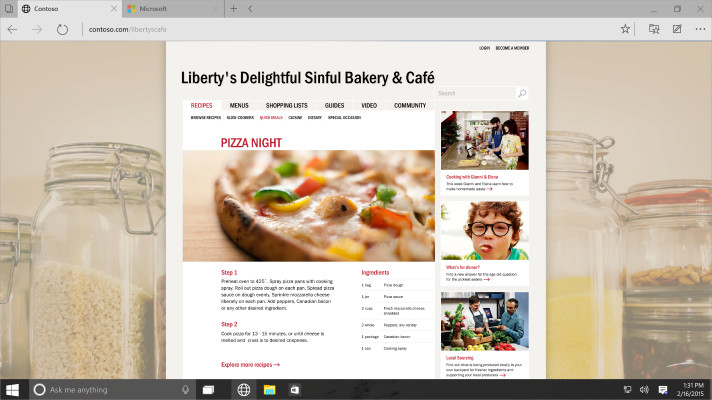
Not long ago, we got the best look yet at Spartan and while the browser will be coming in the next release of Windows 10, information about the UI is still a bit sparse. If in the last leak, the title bar had you a bit squeamish, by turning on the 'experimental title bar' you can see what the browser will likely look like when it ships.
We cropped the two different title bars below and as you can see, the 'experimental' title bar looks significantly better and does away with the unused space at the top. This shouldn't come as a major surprise as Microsoft has already shown off this type of title bar in Spartan previously and in other apps too.


The 'experimental' title bar was shown off when the company first announced Spartan but as you can see from the image below, either not all features have been implemented in this build or there have already been refinements to the user interface. If you look at the image below, which was shown off at the January Windows 10 event, you can see some differences in the interface.
For example, in the top left corner, we see a button that looks to be for a new window, but in the versions of Spartan that have leaked, these features are not shown. There is also a back arrow in the image from the January event next to the 'new tab' button, and that button is not present in the leaks either.
If you take a look at the video that showed off Cortana within Spartan, you can see that the 'experimental' bar is already turned on, but there are still UI differences than what was shown off back in January.
These are subtle differences and may be showing features that are either not implemented yet, or may not ship at all. For those who like to watch these types of things closely, it's something to keep your eye on.


58 Comments - Add comment