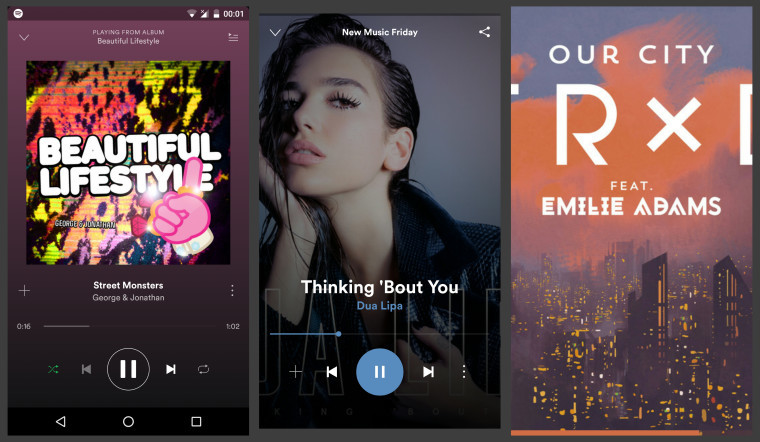
Spotify is one of the most popular music streaming services around - at last count, back in September, it had over 40 million subscribers, up by 10 million in just six months. The company is now testing a revised mobile app design that makes album art more prominent - but which also makes some changes to the user interface that might not please everyone.
As Android Police reports, it appears that Spotify has been performing A/B testing of the design changes with a limited group of users of its Android app, as the revised design hasn't appeared for everyone.
The changes focus on the 'now playing' view, making the album art full-screen with a fade-out effect towards the bottom of the screen where the controls are displayed. Tapping the screen hides the controls leaving nothing but the album art visible, along with an unobtrusive progress bar at the very bottom, showing how much of the current song has played.

However, as part of the changes, Spotify has replaced the queue button with a share button instead, while the shuffle and repeat buttons have been removed.
It's not clear if Spotify intends to implement these design changes for all users, if it will stick with the current layout, or if it will find some middle ground that strikes the best balance between old and new. If it does introduce these or similar changes, it will certainly be interesting to see how they're implemented across other platforms too.
Source: Android Police


17 Comments - Add comment