In 2017, Microsoft first introduced the Fluent Design system, a design language refresh that would be released over time, generally as part of feature updates for Windows 10. Since then, numerous applications such as Groove Music, Skype, and more have had various Fluent Design elements incorporated in them.
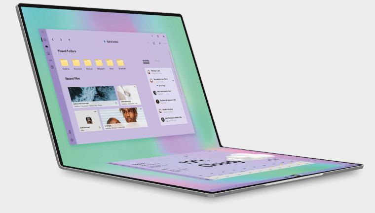
While the File Explorer in Windows 10 hasn't had a lot of major design changes in the past, the legacy version did get a dark theme option last year. Now, a new concept by Behance user Cage Ata has emerged, re-imagining File Explorer with Fluent Design implementations.
Dubbed 'Files', the concept for a completely redesigned file managing app caters for foldable Microsoft devices that might crop up in the future. Moreover, it detaches itself from the traditional layout for files, particularly photos, allowing users to stretch and shorten icons - with file names optionally turned off. An accompanying dark mode, much improved in terms of look, has also been featured.

Similarly, three new modes have been imagined for the app, including Carousel, Studio, and Review. These would enable interesting new ways for users to view files, make minor changes and edits on the go, and reposition images to create a mood board. Lastly, a variety of color options would be offered to personalize your file manager the way you want.
We have seen interesting new concepts for File Explorer emerge in the past as well. Although they do offer a unique perspective into how users imagine or may want it to look like, as always, there is no guarantee that these concepts will even minutely resemble any redesign for the application that may come out in the future.
Source: Cage Ata (Behance) via MSPoweruser
Would you like to see File Explorer with this sort of design in the future? Let us know in the comments below.


45 Comments - Add comment